Suggestion: Make it possible to setup Buy Order CONTRACTS for Blue Print COPIES.
Keywords: Contracts, BPC, buy
Notes: Atm you cannot buy BPC via contracts. When you setup a Buy contract, the system selects the BPO which does not exist for specific items like drugs, faction ships, pirate ships.
2 Likes
Suggestion: Make it actually known via tooltip info or a red x that you can remove added items in this contract menu step:
Keywords: UI, contracts, create contract, buy contract
Notes: How is someone supposed to know that they can remove the added item if there is no indication whatsoever that says you can do it? You actually have to have arcane knowledge that you can double click this line to remove it from the list.
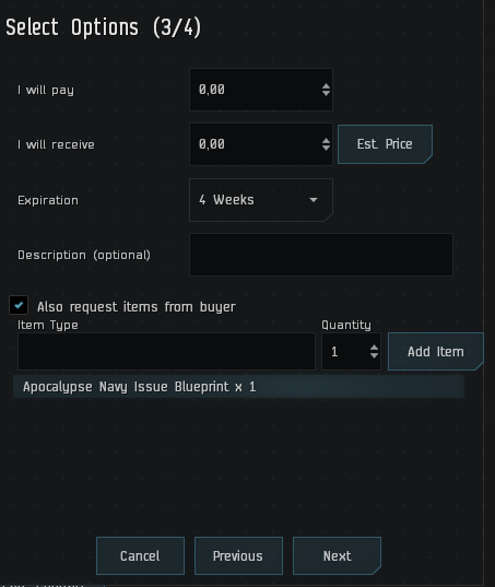
1 Like
Suggestion: In any money transaction instead of writing like 251 000 000 you can just write 251 m and it will automatically change it to 251 000 000 the same for B for billion or for rich folk T for trillion. And also you can use the dot (.) to write stuff like 2.5m for 2 500 000.
It will for sure improve any kind money (or even some items) transfers, since you will never need to double check if you typed one less or more zero.
Also if you want to add thousand you can add it as K, or millions as KK, some people will prefer that since there are MMO’s that already use that method for money transfers.
I need to add that I have no experience in any kind of programming, I don’t know how hard would it been to add it to the game, but for sure I know that it will be an amazing addition to the game that will make isk transfers (or items) much easier for every level of wealth.
5 Likes
Suggestion: Make Regional Market and Map icon on the NeoCom more different,
Keywords: UI
Note: Both icons look like a graph/line made of multiple segments, my brain needs to pause and make a consious effort of distinguishing them. More different graphic/icon would remove that friction.
Suggestion: Ability to see time a contract is accepted (as well as what time it was issued)
Keywords: contract, contracts, market
Note: after having some issues whereby some contracts were picked up and took almost the whole 24 hours to be delivered (even though the m3 size was small) I like to offer bonuses for quick delivery.
So I enter a note stating “extra x million isk id delivered within x time of pickup” only currently I can only see what time a contract was issued, not what time is was accepted. This would be useful for offering incentives to couriers
Suggestion: Reposition group of selected skills in the skill queue
Keywords: skill queue and plans management
Note: When managing skill plans or skill queue its tedious to move related skills one by one so they train in sequence
There are only two options to add skills: front or back. Once all skill levels are added they can only be removed or dragged one by one to another position. I think it would be nice to be able to select a group of skills and drag them together up or down. I tried various key combinations and apparently such functionality is not present.
Is it possible to add a new skill to the queue not at front or back but at position of a skill I selected in the queue?
Reposition group of selected skills in the queue
- In review
- Rejected
- Accepted
- Released
0 voters
Suggestion: Stop greying out scan UI when editing extractor program
Keywords: pi ui visibility
Note: When entering extractor program editor the scan UI gets greyed out and becomes almost unreadable against planet surface in the background
This is how it looks on barren planet:

Just don’t grey it out and it will be (almost) ok:

It is necessary to use the scanner while in extractor program editor, to determine if there is better deposit density somewhere else or if is it better to reprogram for different resource and avoid relocation. When it is greyed it is hard to see what to click.
Please don’t tell me to switch to solitaire because I am too old to see properly ![]()
Stop greying out scan UI when editing extractor program
- In review
- Rejected
- Accepted
- Released
0 voters
Posting a poll isnt going to get an answer from ccp fyi
You are right in 50%, and I too hate the size of the poll area compared to the rest of the post. Unfortunately there is no size control for it. If there was a compact look to choose I would definitely switched that.
(I will submit suggestion for that ![]() Don’t worry not in this section. This one #technology-research:feedback). And here it is.
Don’t worry not in this section. This one #technology-research:feedback). And here it is.
Now, be honest with me:
Are you 200% positive you would not get excited if @CCP_karkur clicked (or better yet connected this thread to some triage backlog via bot that sniffs for staff-only polls and clicks accordingly) on one of those damn polls I so stubbornly and meticulously weave into my QoL suggestions?
If anybody else would like to place polls in their QoL’s, here is the code I place in mine:
[poll type=regular results=always chartType=bar groups=staff]
# Text that follows 'Suggestion: ' from the very first line of the suggestion post
* In review
* Rejected
* Accepted
* Released
[/poll]
Suggestion: Auto close in-space container windows when emptied.
Auto close wrecks, cans and other in-space container windows when you hit “loot all” or empty them manually. Add an option to keep them open, so miners don’t get wicked mad ![]()
Suggestion: Allow contract creation from personal hangar on behalf of corp
Allow creation of contracts “On behalf of [corp name]” from the personal hangar (where you do not own an office). Right now you have to contract the items to your corp, then have another corp member accept them for corp to get them into corp deliveries. From there you can create a contract on behalf of the corp. Maximum cumbersome!
Suggestion: Allow binding/unbinding the control for Aligning in Space
Keywords: Double click align in space
As is double click to align in space is painful, you can get a false input simply by panning the camera and having the option to unbind this or bind it to something else like every other keybind in the game would be great. Bit of a problem to start randomly drifting off into space.
1 Like
Suggestion: Improve the NES just a little bit so it doesn’t annoy me into avoiding it.
This comes in two parts, they’re both very low-hanging fruit:
Fix the search box in the NES so it actually does something. Right now it’s broken and does nothing but taunt me, I’d really like to type “punisher” or “$SKINNAME” and browse the results I want to see.
Make the ESC key UX in the in-game store more intuitive. Change how ESC works in the NES UI so that hitting ESC with a preview window open doesn’t quit the store entirely but rather closes that one item. If I have an item open in the store I automatically hit ESC when I’m done looking at it because my muscle memory says that this closes pop-up dialogues. Instead I end up quitting the store completely and my browse → buy loop is interrupted and I’m usually annoyed enough that I don’t go back in. It’s honestly a surprise every time, I feel like this is standard UX almost everywhere else.
If the NES UX were just a little bit easier to use I’m pretty sure you’d sell more stuff. Help me spend my space money in peace.
Suggestion: in-space UI element highlighting is extremely hard to see in illuminated clouds, do something to improve things. This could be allowing a custom in-space UI highlight color, changing the UI highlight color to the inverse of the background, etc; so that the selected target (and any other selections like this) are always high contrast/visible and I can see what I’m doing.
2 Likes
Suggestion: The SKIN preview window could use keyboard navigation back and forward through the list of SKINs. Making me hunt for each skin with the mouse and click is crummy UX, I just want to browse the SKINs with a minimum of effort.
Something as simple as up/down or left/right to go forward/back through the various SKINs in the preview window would be great.
Suggestion: The contract Search needs a new column “goes through low sec”.
Keywords: UI, contract search, high sec islands, low sec, null sec, courier contracts
Notes: You can filter couriers by “Only Current Security”, which filters out any contracts that originate or end up in low/null sec if you are in high sec, but this filter does not exclude any contracts that have unavoidable low sec or null sec in between 2 high sec locations. The results list shows a high sec starting and high sec end point, which is quite counterintuitive. If CCP ever works on this menu again, such a column should be added and simply have a checkmark if a contract has low sec on the way (regardless whether avoidable via different route settings or unavoidable in cases like Solitude or certain Lonetrek, Essence areas for instance).
Only one suggestion per post, and you may possibly want to edit them to follow the format.
Suggestion: Fix highlighting of UI elements when using the Tab key to navigate various windows.
I can use the tab key throughout the game to select various elements to interact with, unfortunately what I see when I do this and what I’ve actually selected are often two different things.
As an example: I can hit the Tab key to switch between the various elements of a confirmation dialogue (like a trade confirmation popup, or a “do you really want to place this market order” window, or a contract window) but the UI highlighting doesn’t actually change to show me what I just selected. This could lead to a Very Bad Time™ if one weren’t paying attention as hitting Enter at any point executes the thing you have selected, even if you can’t see what that is.
Fortunately I have most sequences of inputs memorized, but I suspect a lot of players don’t. As an aside this popped up during the Photon UI update, the game was pretty consistent about showing me what I had selected previously.
3 Likes
Suggestion: When opening the “Personal Assets” window with a hotkey always focus the search input field if the search tab is open (or just always ![]() .)
.)
Hitting Ctrl+T to open asset search is fast, hunting for the search input field with the mouse so I can type and actually find my stuff is too slow.
This could be generalized to any window with searchable input if the search tab is active, like the regional market. That would help a ton too.
1 Like
Suggestion: bring back dragging items onto the neocom item hangar icon.
In the past, we could drag items from e.g. our ship cargo window directly onto the item hangar icon on the neocom. Stuff was moved without the need to actually open the (hangar) items window. No clue why this feature was removed. Dragging it onto the neocom icon saves capsuleers time and also saves server resources, since the hangar items do not need to be loaded with the opening window.
3 Likes