When I tried on singularity, I reached 60% after just a few evaluation tests. And now I’m almost dropping below 50%. At least half of the “right” ones are too hard for us, and some of the points are not that convincing.
After the set is updated, I wish there’s an option where we can start fresh, setting rate to 50% and start brand new evaluation process, to get rid of our poor history.
And to help us doing this, can you post some statistics about our samples? like the rate of exoplanets, how many have only one points, how many have periodic points, and how long is the period? I think some prior knowledge would help a lot.
The tutorial needs is the ability to re-analyze a sample when I get it wrong. Without the ability to see how to use the tools to find what is claimed to be present in what looks like noise, it is difficult to learn what I’m missing.
The next problem is that people can find patterns in noise that aren’t really there. This process would benefit from some analysis of statistical significance of the supposed transits.
@CCP_Sledgehammer while I’ve noticed a big improvement after the fix, I’d like to just drop a few thoughts:
We really need the option to fix the y-scale. Speaking for myself, the way that I mostly detect the dips is by zooming in and then scrolling the bar from one side to the other, allowing my eyes to pick up on possible differences in the average values. This task is absurdly hard when the y-scale keeps changing.
On the samples I fail, I check the folded analysis and they are usually a jumbled mess. There are some where the dip is noticeable, but the vast majority of what I’ve seen can’t even begin to describe a dip.
Similarly, many individual dips, that the analysis says are there, are still indistinguishable from the rest of the wave pattern. What I’ve noticed is that there are few, within the same pattern, that actually are dips. I get the feeling that the rest of them are done just by correlation with a few sample dips, and extrapolated to the whole sample. This makes our analysis rather frustrating.
Along the lines of the above points, the current iteration of this doesn’t seem entirely compatible with the concept of a purely visual analysis. Not contesting the difficulty levels, but if we are supposed to perform a visual scan, we could use a few other visual indicators, such as:
Possibility of having different colors for different samples in folding mode;
Zooming function in folding mode;
Perhaps a way to have a line showing the average value along the sample? (just a thought)
Love this project’s concept and idea, but it feels to me it could still use an iteration or two.
I noticed that at the bottom of each plate there is a reference number that goes along with the analysis. Is it possible to somehow have access to visual database based on those numbers that each Capsuleer has looked for and found transits in?
Besides all these things Kiauze pointed out that would be helpful while analyzing, I’d still be interested in feedback from the scientists in some way, shape, or form.
It’s slides like these:
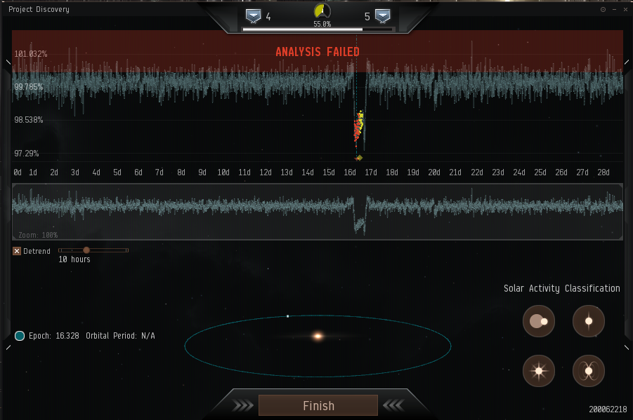
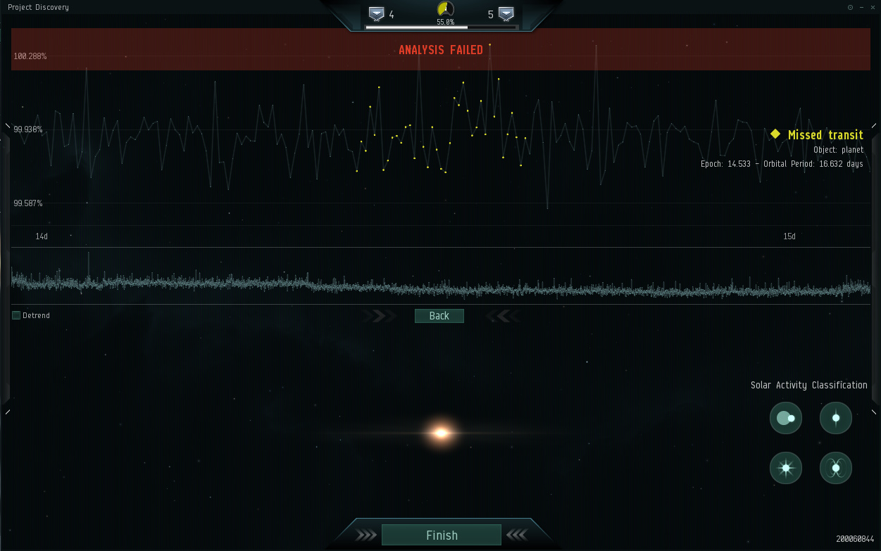
Considering some of the current evaluation samples, it would be nice to have a function to report what looks like incorrectly aligned transits and transits that simply does not show in the data range available. I’m assuming some of these are much longer than we can see in game since there are examples like this which shows orbital periods even though there is just one “transit” in the data to analyze.
When zoomed in and scrolling across the whole graph, can we have the option to lock the Y axis? It seems to adjust the scale based on the min and max values in the zoomed area which can sometimes be distracting when looking for patterns.
Yeah, I’m having issues where Project Discovery is telling me there are a bunch of transits that were never clearly visible to begin with in some of the samples. Sometimes I would see obvious transits but then the system tells me I’m wrong despite using the detrend and folding tools.
Whelp, the reset help me, unfortunately I still seem to be in the same evaluation hell I was in last night; my last six samples were of the variety that caused my nose dive yesterday =/
since reset, lots of problems, everything is much harder and much more precise. here’s my growing chart of not understanding whats going on. it would be great to get some feedback.
As B.B. King said “Let the good times roll, let them roll right along.” With the latest patch, we aren’t beeping every exoplanet at the checkout register by far.
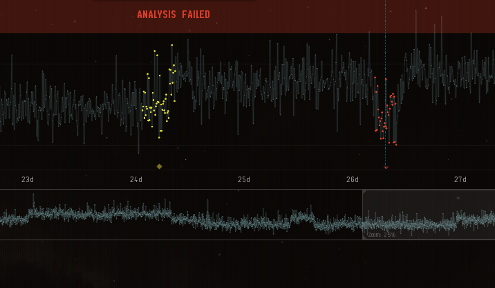
Here is one I just failed. I zoomed in on one of the supposed light ‘dips’ so CCP have an idea of what we’re expected to see. This is quite literally indistinguishable from the rest of the graph. Some of the ‘dips’ are actually ‘peaks’ as well. Either this is broken, or the scientists behind this seem to think we’re willing to do hardcore science work without getting actually paid for it.
Get outta here with this crap. I’ve got better things to do with my time than fail some minigame for a few cheap skins. I hope no one was expecting some science to be accomplished with this.