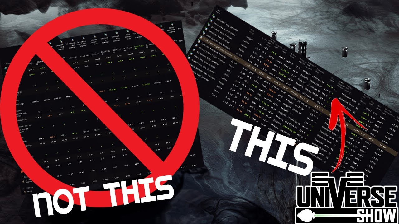
Horizontal alignment is better, but the new filters are hideous compared to the old way filters were applied. Still a horrible feature but Ashteroti has to defend it regardless.
He doesn’t have to. He’s just telling people how to get close to the way it was before.
I will ABSOLUTELY criticize things if I don’t think they are good. My goal is the best EVE Online possible. The point here is myself and many others failed to notice this option and instead panned the change outright. I made this video to help people fix the problem they were having. If you still don’t like it, still criticize it (I think it desperately needs a horizontal scrollbar)
still horrible change
@Ashterothi Thank you for the video.
In my humble opinion, the Compare tool has been improved. It will really help to sort all items and save time too. Looks better too.
It does not show that there is content outside the window edge? ![]()
If so, this really becomes a theme as they do the same in the Corp Projects
Going back to this quickly because the new system really is not helping anyone:
Better Inertial Modifiers are red and worst modifiers are green. CCP cannot code properly.
Just a reminder that Abyss mods still cannot be compared and this is unacceptable.
The one thing you lost was actually useful (reordering columns)
The default configuration of vertical alignment shouldn’t even exist, but you could at least leave it optional
The “top” one is coloured green but that doesn’t mean the best one … it’s just the highest value … might want to put some actually useful work into it and make the best one coloured green.
Wow. Just wow.
Been unable to play for a bit, so I hadn’t seen this new “feature”.
I used to need to have ‘arguments’ comparing the Eve in game compare tool Vs the compare tool in PYFA.
I would regularly argue that the in game compare tool was actually better, more convenient and the the filtering options made displaying the necessary information more clear.
I am so glad that after this change, the new compare tool completely ceases this argument.
How woefully bad the new compare tool is, doesn’t even need a compare tool to compare.
I am quite sure though, that the old compare tool would have been much faster and more succinct in comparing the 2, and would have shown just how unnecessary this waste of coding time was.

