Suggestion: Custom/Manual Orbit Paths. Right now, it seems pretty random how the orbit path is set. I’d like the ability to specify that I want to orbit exactly in the plane, or vertically directly over the top, or tilted at 45 degrees… and to specify the point from which I begin the orbit. A solution similar to Q+click. So select item, orbit @ distance, on this plane, beginning here
Suggestion: Alter or Change color of PI Factories missing materials
Keywords: UI, PI
Note: Factories that have missing materials are hard to spot, it’s just a slightly different shade of yellow. Certainly not suitable for colorblind people. Suggest to make it more obvious
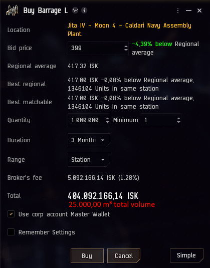
Suggestion: Ability to see volume in Buying Dialoge Window
Keywords: ui, market, buy orders
Note: useful to know how many items you can buy to fill your hauling capacity
I know there already is a suggestion to see the volume in m³ in the multibuy dialoge window, but I would suggest to even add it to the normal and advanced buy-dialogues, no matter if instantly buying or placing an order.
Suggestion: Highlight (color) added skills when creating/editing a Skill Plan
Keywords: ui, skill plan
Note: Easier to see what is added to skill plan
When creating/editing a skill plan, I see my current skills on the left/center pane (white dots), and whatever is added to the skill plan is not reflected. It would be nice if the added skills would be highlighted (colored) in a similar way it is done in Skill Catalogue when skills are currently in the skill queue (blue)
Extra note: keep the yellow dots for Omega skills as it is usefull when creating skill plan for Alpha vs Omega. I feel my personnal skills (white and blue dots) are irrelevant when creating a skill plan. I’m not creating a skill plan for me.
Suggestion: Tool to replicate settings between characters and accounts. Keywords: UI, settings, character, account Note: Managing settings across characters and accounts is a complete pain. Copying oddly named files in a hidden directory is problematic and damn near impossible for the uninitiated. If there happens to be a game instance running, that too is a problem.
Having a tool to push settings to other characters/accounts by NAME not ID would be appreciated.
Suggestion: Change the settings files to XML or like readable format. Keywords: UI, settings, character, account Note: Determining subtle differences in settings between characters/accounts is impossible. Sifting through all the windows and tabs via the UI looking for the difference is painful.
Changing the format would allow third party tools to run and visualize the differences.
is there a possibility to increase or decrease the size of the notifications history window, or the amount of messages in it?
i have not found the options for it. I hope someone else also likes to have the notifications history uncleared, and would appreciate this ability in User Interface. I strongly hope, the addition in options for the user could be implemented without much difficulties to you, the UI team.
is there an option to lower the amount of messages in notification history that a single move of mouse wheel jumps through?
Chat is very well optimised, mouse wheel can scroll through that effectively, similarily the log messages. I hope something like that could be implemented towards optimisation to the notifications history window.
my problem appears when having large amounts of notifications in history.
Suggestion: Limit the rate of scroll for each turn of the mouse wheel inside the Notification window.
Keywords: UI, Notifications
Note: You can still you the scroll bar on the side, but that’s obnoxious.
When I am looking through my recent kills/losses to link to someone in chat, I find it really hard to use because each click of the mouse wheel scrolls through like 25 notifications. Also, when opening up the notification bar and scrolling down immediately, the window will sometimes scroll at lightspeed down to the bottom of the saved notifications. This is very annoying. Thank you for @Stupid_Mertie for bringing it up!
Suggestion: Price selected when creating a market order
Keywords: multibuy, market
Note: This is already a feature when you are modifying an existing market order. It would be nice to just be able to type in the price you want rather than having to delete the price and then type in the new price.
Suggestion: The Holds & Bays should open that bay / hold selected which is tracked
Keywords: UI, inventory
Note: The main goal is to see, how much free room I have in a bay or hold in m3. As an alternative, it could work in such a way that the existing tooltip receives additional information with the values of the quantified current and actual capacity. Or if you can set the tracked value, percentage filled, m3 filled and m3 available selections.
Suggestion: The Survey Scan Result window filtering
Keywords: survey scanner, ui, list, filtering
Note: For better asteroid management it could be useful if the result list could be filtered by showing only the already targeted asteroids. This could be a postfilter checkbox, which hides the not-targeted asteroids, while checked. Another small improvement: mark the asteroid in result list from the targeted ones, which is selected outside in the result list.
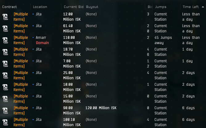
Suggestion: The Auction timer for how long is left on the Auction should be a Live Countdown.
Keywords: Quality of life, contracts
Note: It’s very hard for a player to know how long is left on an auction when the lowest number he can get is “Less than a day” which can be anything from 23.59 hours to 1 minute left.
Auctions would be so much more exciting if they had a live countdown as they have on Ebay so that you can see exactly how many days, hours, minutes, and seconds that are left on the Auction.
If that is hard to implement contracts should at the very least have more timer options for the last day so that you at least could know how long is left within a half hour accuracy.
I could imagine this is intentional, because players come from different timezones and they don’t want people to wait to the last second to then place their bid. It would put players from Australia/NZ, Asia etc. at a several disadvantage, since most contracts will probably be set up US/EU Timezones and then also expire at these Timezones.