Suggestion: Reimplement indicators on fields and buttons to reenable tabbing navigation in windows such as the contracts window.
Keywords: UI, tabbing, navigation, indicator, focus
Notes: Before the deployment of Photon, windows with buttons and fields would clearly indicate when they were focused so that you could easily use tabbing navigation. I made this suggestion back in October '22 in the Photon feedback thread but obviously nothing has been done yet to alleviate this rather glaring oversight in UI functionality.
4 Likes
Choose a skill from your queue and show info. On the top right of the show info window there is a blue +, mouse over this and it tells you toward the bottom of the info the time it will take to be trained, taking into account the skills listed before it in the queue.
2 Likes
Suggestion: Put the button to close a window in the same spot . At the moment the button seems to move around depending on if the window is maximized or not.
Suggestion: Dont highlight or animate modules if they arent active. For example if i lock onto a rat, the turret module will begin flashing. This tells me its active, but it was flashing because it was not active. Kinda confusing. Seems to be an issue with civilian modules.

Suggestion: Stack things in inventory when clicking “Loot all”
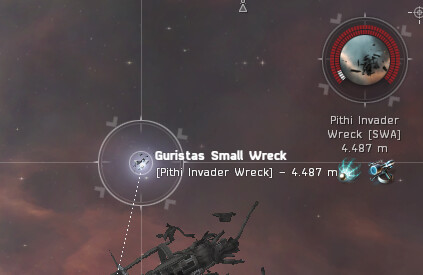
Suggestion: Give wrecks a different color HP bar. I almost destroyed this one because at first glance it looked like any of the hostile targets.
(The final boss in Cash Flow for Capsuleers was a statis tower? come on!)
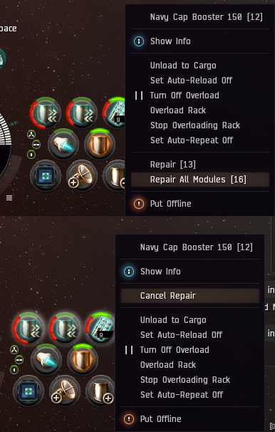
Suggestion: Add “Cancel Repair All Modules” Button
keywords: ui, heat, gameplay
Note: very useful in any PvP situation - maximizing the downtime while jammed was never as effective!
We have a “Repair all Modules” Button - that is super handy. But why is there no “Cancel Repair All Modules” Button as well? I would have big use for it in PvP situations.
One can repair all modules while in warp for example, and cancel the repair when landing on a grid where the modules will be needed again - instead of canceling each module individually, a “cancel all” button seems only logical.
2 Likes

Redo this as the OP says so that karkurs algorithm will see it properly
Suggestion: Double clicking on a transaction in the “market transactions” tab of the wallet should open the regional market window for that item
Keywords: Market, Wallet, Usability, Convenience
Note: Double clicking an order for an item in the “your market orders” window already does this, it would be a nice convenience if the market transactions in the wallet log did the same.
Suggestion: Make the Sell Item price dialogue consistent with ‘Modify Order’ by starting the dialogue with the price field text selected so the user can type immediately without hitting Ctrl+A first.
Keywords: Market, Usability, Convenience, UI Consistency, PleaseSaveMeFromMyself
Note: This always almost catches me, I’m so used to immediately typing the price after clicking ‘modify order’ that I always think “Sell Item” behaves the same way. It doesn’t; the Modify Order dialog opens with the price text selected so you can type straightaway and replace the price. The Sell Item dialog starts with the cursor in the price field but the price text isn’t selected and the cursor is at the end of the price after the ISK cents position. To input a price correctly you either need to backspace through the entire field or quickly hit Ctrl+A and then start typing to input a value properly. What this means in practice is that you click sell item, type in a price really fast (which does nothing because the initial state places the cursor after the cents position and input validation sends your keystrokes into the ether) then hit enter and the game sells your item for the default suggested price just above whatever the highest buy order bid is at the moment. You almost never want to sell at this price, it would be far better if the default here were lowest sell minus one price increment. I see a lot of items dumped on the market like this where someone has made the mistake of rushing through this window too fast and this UI quirk has tripped them up.
Suggestion: Add a wishlist to the NES and notify me when items on my wishlist go on sale
Keywords: Store, Money, Convenience, Usability
Note: There are so many skins that I forget that I wanted one by the time it goes on sale. If there were a way the game could remind me of Cool Skin XYZ when it went on sale I’d buy more of them. I’d also probably get some mileage out of a “PLEX are on sale!” reminder if PLEX went on said wishlist.
1 Like
Suggestion: Add several new hotkey shortcuts (unbound by default) that open their relevant window and focus the search box so the user can start searching immediately without any hunting for things with the mouse. “Personal Assets > Search tab > Search Box”, “Regional Market > Browse tab > Search Box”, “Inventory > Search Box”, and both “Market Orders > Sell > Search Box” and “Market Orders Buy > Search Box” would be extremely helpful keyboard shortcuts. “Locations > Search Box” and “Contacts > Search Box” might be viable hotkeys too.
Keywords: UI, Search, Navigation, Convenience
Note: In a couple of previous suggestions I’ve mentioned that making the search box focused when certain windows are opened would be a nice UI improvement but I think it would be even better to add a handful of new hotkey binds that can accomplish the same thing but are more “opt-in”. This would allow the user to specifically choose to search somewhere (very quickly!) rather than assuming that they want to search as the default. You can ignore my previous requests, this would be way better.
Suggestion: Locations In System window should not capture keystrokes after radial menu use
Keywords: Accessibility, Keybinds, Cloaking, Bug
Note: I have Highslot 1 with my cloak bound to T. I jump into lowsec under gate cloak with Locations In System already open. I mouseover a gate tac, press/drag/release mouse1 to manipulate the radial menu choosing Warp To. My warp begins and my gate cloak drops. I press T.
Expected behavior: Cloak module toggles.
Actual behavior: I remain uncloaked. The Locations In System window attempts to select the first bookmark beginning with the letter T.
I suggest starting key capture only once the mouse presses and releases within the Locations In System window, or skipping capture for a short time after radial menu on its entries.
1 Like
Suggestion: Drones window max drone count is wrong on low-bandwidth ships
Keywords: Drones, UI
Note: My Taranis has 10 m3 drone bay and 10 mbit drone bandwidth. Even though I have Drones 5 I expect the window to say “Drones In Space (0/2)” when I’m flying it.
2 Likes
And they wont see this. Come on, read the OP. Suggestion is one sentence. Thats all their algorithm is looking for
1 Like
Suggestion: Keyboard navigation of the market quickbar is extremely unpredictable when navigating out of a folder; make keyboard navigation go to the next visible item up or down the list regardless of folder hierarchy
Keywords: UI, Market, Usability
Note: This one feels like a regression post Photon-UI, I don’t remember the quickbar behaving so poorly in the past. At the moment it’s a crap shoot whether you leap all the way to the top of the quickbar or all the way to the bottom whenever you navigate up from the top item in a folder or down from the last item. This would be way more intuitive if you just moved to the next visible item in the quickbar. It would be helpful, from a usability perspective, if keyboard navigation skipped over collapsed folders - I have a lot of junk in my quickbar for various purposes and I don’t always want to step through all of it, just what’s open at the time.
Please let me turn off AIR popups.
Let me unbind cash shop, redeemable items, and daily login rewards from the neocom.
Stop active yet unbound windows from taking up space on the neocom, I don’t need an extra box saying that I have my d-scan open, and another for my probe scanner for example.
In general clean up the clutter on the neocom thanks.
1 Like
NES Store, redeemable items and login rewards are marketing tools. I doubt that they will ever be allowed to be removed from neocom.
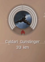
Suggestion: Electronic warfare icons on targets
Keywords: UI, target, electronic warfare
Note: It already exists in the overview and would be useful to have it on the target as well
Electronic warfare icons (warp disruption, webbing, neuting) are present in the overview. You can see which enemy is applying which type of electronic warfare on you. The summary of all applied ewar on your ship, just above the capacitor, is good for providing an overview of what you’re dealing with. However, there is no indication in the targeted ship box on what ewar that target is applying on you. A set of mini icons (the same ones as in Overview) somewhere next to the target’s ship icon would be useful.
5 Likes
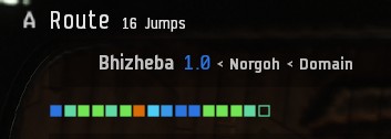
Suggestion: Differentiate station destination in the current system from station destination in the next system in Route.
Keywords: UI, Route
Note: Both the station destination in the current system and one jump away have the same icon in the Route, which can be confusing.
The icon for the station destination in Route is an empty square, regardless of whether the station is in the current system or one jump away. It would be nice to differentiate these two situations, for example, by using an empty square icon with a slightly thicker border for stations which are in a different system.
5 Likes
You can hover over the icon above the capacitor ti see which ships etc