Over all, it is a bit more pleasing to the eye, besides some of the things mentioned in other posts, undocked button, subject in mail line and a couple of others.
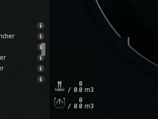
I had noticed in the fitting window, it is nice having the info button easily accessible for each mod, however many times I would be trying to click info on another mod, but it would hit the scrolling bar and then it would jump up to another area in the mod list. If there was just a little more space between the I in the info, and the bar, could probably prevent that.
Also you can’t appear to move the Info button when resizing, it always moves right next to the bar.