If your going to ruin eve at least put a marker like the effect ones on the current hud to tell you what enemies are attacking your drones. it seems like you wouldn’t mind more space being taken up in the first place.
Yeah the yellow boxing situation with NPCs isn’t very clear. [Especially with drones.] Also yellow boxing can denote an NPC is shifting their attacks to another target on grid…sometimes its another player or NPC they consider a bigger threat than you.
Also the “threat” circle for Red Boxing/ attacking NPCs…doesn’t really give you good information on which target is the most urgent target to eliminate.
It might make D scanning more interactive…but I know…alot of people don’t like hitting the D-scan button like crazy.
I can see the argument of rigs and other equipment or even settings where…you set D-scan to passive…[someone pulses you know something is out there.] or some sort of consistent sweep active mode. For balance sakes would be set to specific amounts of time between cycles. With manual mode still be an option with more clear options and capacity for slipping. Where the cycles are slower and consistent. But if someone is set to passive…they know you are there. [Very bad downside in wormhole…because then someone might switch to manual to beam ride on you…and find you.]
I could get behind D-scan changes…if there were a few different options on the table…offensively and defensively…passive and active. So its not something that is just used and abused especially for bot defense. And considering we now have ways to tinker with D-scan ranges…I think there needs to be more granual options in that sector of this game.
Yeah…why hasn’t Fenris ever really considered more factional themed UI options?
This would be something fun adding to the depth of the game immersion, or even player customization options. Or heck an alliance/corp puts out their “official” HUD UI option. [How many spy alts would you catch with that. XD]
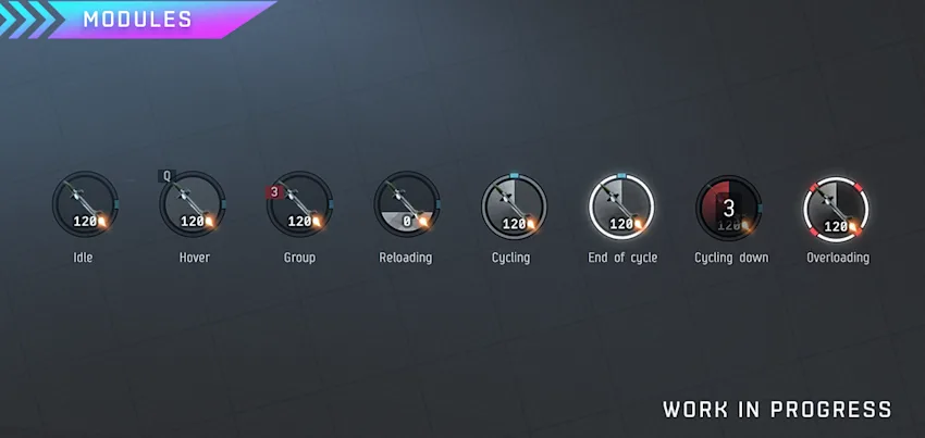
Adding my voice to the nonsense of the “overheat” icon being a lightning. In just about everywhere, from real life to highlight your phone battery being recharged, and in game to refer to cap recharger, a lightning often time refers to “energy” (and sometime to hazard).
What kind of image can refer to “heat”? Fire, maybe? And what about the icon that look like heat wave in the CURRENT fitting window? Why not use the same icon? And if you change one, make sure to change the other as well. Because consistency.
For some reason I don’t have permission to post on this specific discord discussion so here’s my 2 cents. So I like the look (as in style) so far. I especially like IDEA of the radar, though part of me is wondering if we aren’t getting too much clutter on the screen. I am very glad we will be able to move the individual pieces around.
I personally would like to “break free” the HUD and move it to a totally different screen. (see attached photo ignore the fancy set up) If that’s even possible.
What we ACTUALLY need is better ways to organize all the windows we need to have open.
Overview, Drones, Fleet, Watch List, Chat, D-Scan, Anomalies, sometimes I break my overview tabs into other windows to track stuff better.
I may like the radar but we strictly speaking don’t NEED it. No new player is going to manually control their speed so that element didn’t need changed. While i like the new look of things the way the info is presented I don’t like much. What was so wrong about the old Health Bars. They start white if they’re full and turn red as you loose them A needle is much harder to see. The Heat management is meh, I control most things via keybinds so none of that’s gonna affect me i think. I don’t think its eye catching enough to draw my eye that oops this ones burning up.
When multiboxing or playing on different accounts, I want to easily share or load a saved UI between accounts. Ideally, this could include a dynamic update feature so that any UI changes are automatically updated on all accounts/clients that use the layout.
When I resize or move a second or third client to another screen with a different resolution, I want to be able to easily select a saved layout to align to the smaller client window: less clutter, smaller windows. Then when I move the client(s) back to the original size/window, I want to be able to load my normal layout.
When I am performing an activity that does not need as much visual clutter, I want to be able to easily load a saved layout then switch back when I change activities.
A lot of useful things have been said already that voice my concerns regarding the functionality of this proposed UI or HUD.
I’d like to talk about the aesthetics: to put it bluntly, it looks like a bland mobile game or any other random space game. It looks flat and sterile.
You mention wanting to bring the UI in line with EVE’s aesthetic. But this functional, worn, gritty look IS part of EVE’s aesthetic and identity.
The new look just looks…soulless, I’m afraid.
Furthermore, I’d like to emphasize that the new radar is such a small window, in 2D, that a player will always get more information by simply zooming out and rotating the camera.
One flick of your mouse wheel and a bit of rotating, and you can see whatever you want to see in full screen 3D, rather than looking at the tiny radar screen in 2D. At any zoom level you want. No need to tinker with that at all.
I am concerned that this new radar screen just adds more clutter and visual noise to an already cluttered screen. There’s so many windows one wants to have open already: the overview, chat, local chat, drones, D-scan. Then there’s objectives hovering on the left.
The screen is already so full, why take up so much space for something you can see much more clearly already?
Capacitor:
I like the capacitor glow and overall look
the hitpoint thing is alright but maybe the thing turning red could use a bit of work
EHP makes more sense of course since people will get surprised by how quick their armor drops that was half the size of their shield
maybe displaying the resists in some way (more/brighter glow?) would do the trick Speed Indicator:
shortcut + scroll for speed change would amazing btw.
and the speed limiter working as it should → setting a speed at which it doesn’t accelrate anymore instead of setting a top speed (takes same time accelerate to a slower speed) Module States:
looks cool pls give rightclick + reload to emp on next cycle
the current module cycle indictor makes things feel unresponsive since it isn’t really synced a lot of times
the mod behavior/bug to turn off when trying to heat on next cycle but something else is repairing would be great to get rid of too
Overload interface im not sure about… 99% of people wont use this and the 1% that will use it by accident and get frustrated why the mods don’t turn on Inventory
very nice to have a better way of checking your cargo especially when you got your other stuff in compact mode Mini map
i like it totally makes sense to move these maps together being able to click and set desti or at least hover and see what system the chokepoint is or so sounds amazing Consumables
yeah obviously great to have!
dragging another same slot booster in should replace the other one
would be amazing if we could get rid of the lag when using all the boosters…
booster bay is only good if it doesnt mess with fits and stuff
another bay isnt really what we need i feel
overall very nice and kinda excited to look at something fresh after all these years!
Define what “dot” means in speed part of HUD: a separator for thousands, or decimal separator? Suggesting, as in the example image, the speed of 12.635 (if thousands) m/s is crazy, for any ship…;
On the minimap, make the movement vector point to the “North” of map - always in default (possibility to change that…), as if not, situationall-awarness is still much reduced (remember Google maps compass icon…);
Please, make the capacitor circle full-fill the inner circle, as it is more visible., and there is space.
o7 to all the people of good-will!
P.S. Overall: support for the ideas, look, practicallity, and the initive(s).
This is a huge improvement to the UI even just with what you’re showing already.
The minimap is going to be amazing for the 3 types of situational awareness needed - grid, system and travel. I really hope you’ll add customization features like toggles to show labels for certain things such as stations and/or gates in system mode and system names in travel mode.
Re. saving layouts, the ability to change layout with a click without reloading the entire client would be amazing so you can have dedicated small gang, abyss, explo, mining etc. layouts. This would need to be able to change all windows including overviews. Bonus points for context relevant auto swapping of interface layouts such as “in mining ship load mining layout, zoning into abyss load abyss layout, zoning out of abyss load general layout”.
Please look at a controller (steam deck) optimized version too. Separate (configurable) radial menus for each joystick would be awesome. Check Path of Exile 2 for a game with two different layouts, each optimized for kb+m or controller so both get something completely designed for their control method. Eve doesn’t need something quite so extreme, just a couple optional extras that can be toggled on if controller is detected and PoE2 has a lot of great ideas you could borrow from.
Clearly showing that your ship has more shield/armor/hull HP then the others is very nice for newer players (HOWEVER, when locking a player it shouldn’t show that the target has more of shield vs armor as this gives information about your ships systems you may not want to give away)
Also I don’t feel all dividers should be removed from the HP. With each bar now being of variable size it can be hard to tell the % of HP you have left. Being able to tell that I am at 25% shield would be nice without having to guesstimate what 25% of a randomly sized bar is.
Pulling out the heat bars is a great improvement as I feel many people didn’t even realize they existed (Change the lightingbolt to a thermometer as it is a better icon for heat imo). I also love that hovering over the “heat rack” button shows what mods its going to heat.
I love the capacitor recharge meter having such information at a glance is super useful
Booster slots/groups are so huge, incredible change maybe I will finally remember to take my boosters before I blow up now!
What should be Improved:
I agree with the issues laid out about the utility buttons however I feels like nothing has changed and they are just taking up more space now; why is the autopilot button smaller? I wonder if it would make sense to also place autopilot next to your route?
Why is the capacitor so small?; make it take up the entire space in the center there
The bloom on that capacitor is crazy, it should not be so blindly bright I cant read it.
The speedometer is nice, but I would like if there could be a compact version that goes below the medallion like before; The tick marks on it are also useless clutter, have 3 or 7 marks, no need for like 100 marks. Also to help newbros put some indicator at 75% for warp alignment.
The safety button should have a compact mode to bring it back to the way it looks now (just a dot), the extra line is just wasted space.
Why is the thermal shield amp shown as an active module?
General Comments:
The map is cool ig but I don’t see myself ever using it.
System Map: how does this provide any useful utility? The planets and such would be too small to click to be viable but if I open the map bigger just use the actual system map at that point
On Grid: “An object might be close by, but from the Overview alone it is not always obvious whether it is above you, behind you, or on the other side of the grid.” From this image it doesn’t seem like this does anything to solve the problem listed. The current tactical overlay does a better job then this.
Metro map: I could see some use of this one however I feel this only has like 1 or 2 niches and I don’t feel it is worth the screen real estate to me.
It was mentioned we will be able to hide elements and some elements may have compact modes; this would be huge, this needs to be part of the first version of the UI drop as all elements should have this in mind when being made.
Unsure if it was considered but just like other HUD elements transparency should be able to be adjusted
For the active module icons; this is just a picture so I cant see the animations however all cycling states should still continue to go in a circle. I am specifically mentioning the reloading here, I know filling the circle looks better but when it gets near the top it can be hard to tell if it has finished reloading or not, imo.
What is the little blue dot on the side for?
When cycling is should be very obvious when the next cycle will hit, it looks like a radar animation rn with a huge trail. I need to be able to tell where in the cycle the module currently is. You already have an outside circle; you should keep the way mods show cycles similar to how they are currently as it better informs me of the cycle status then what is shown here
The biggest suggestion I can recommend is I feel yall should lean really hard into the customization: give multiple different options for most elements in the HUD and allow us to move and snap them freely around to allow everyone to tweak it to the way that fits them best. The worst feeling ever is having something work worse for someone after a change and them having nothing they can do about it.
Overall I am pretty resistant to change however I am aware of the aging look of the HUD and it could definitely use a spruce up. I actually feel I could get used to most of these new elements and enjoy using them which is way better then I can say for Photon UI which I still have many gripes about.