
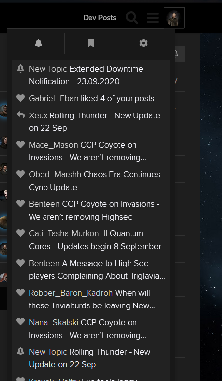
Whoever came up with this should go back to UI development school.
Before this update you could just double click on your character to get to the preferences display, now you have to go to a different button and then click yet another time to get where you want to go.
Unnecessary mouse movement, clicks and more unnecessary busywork on an already questionable experience.
- Double clicking should open the preferences part so that it is easily accessible. I still have to click somewhere else to close the drop down menu anyway unless I want to move my mouse back to the char pic from wherever I went to close it now.
- The menu should open at the same height as the character picture to avoid unnecessary mouse movement. I don’t need to see the useless Dev Posts button when I have this drop down menu open.
- Instead of Preferences, I should see Activities as 3rd Option because this is where I want to go most of the time. Notifications is pointless unless I have been away for days. Activity is where I go to see what I posted and if I forgot to add a red dot somewhere.