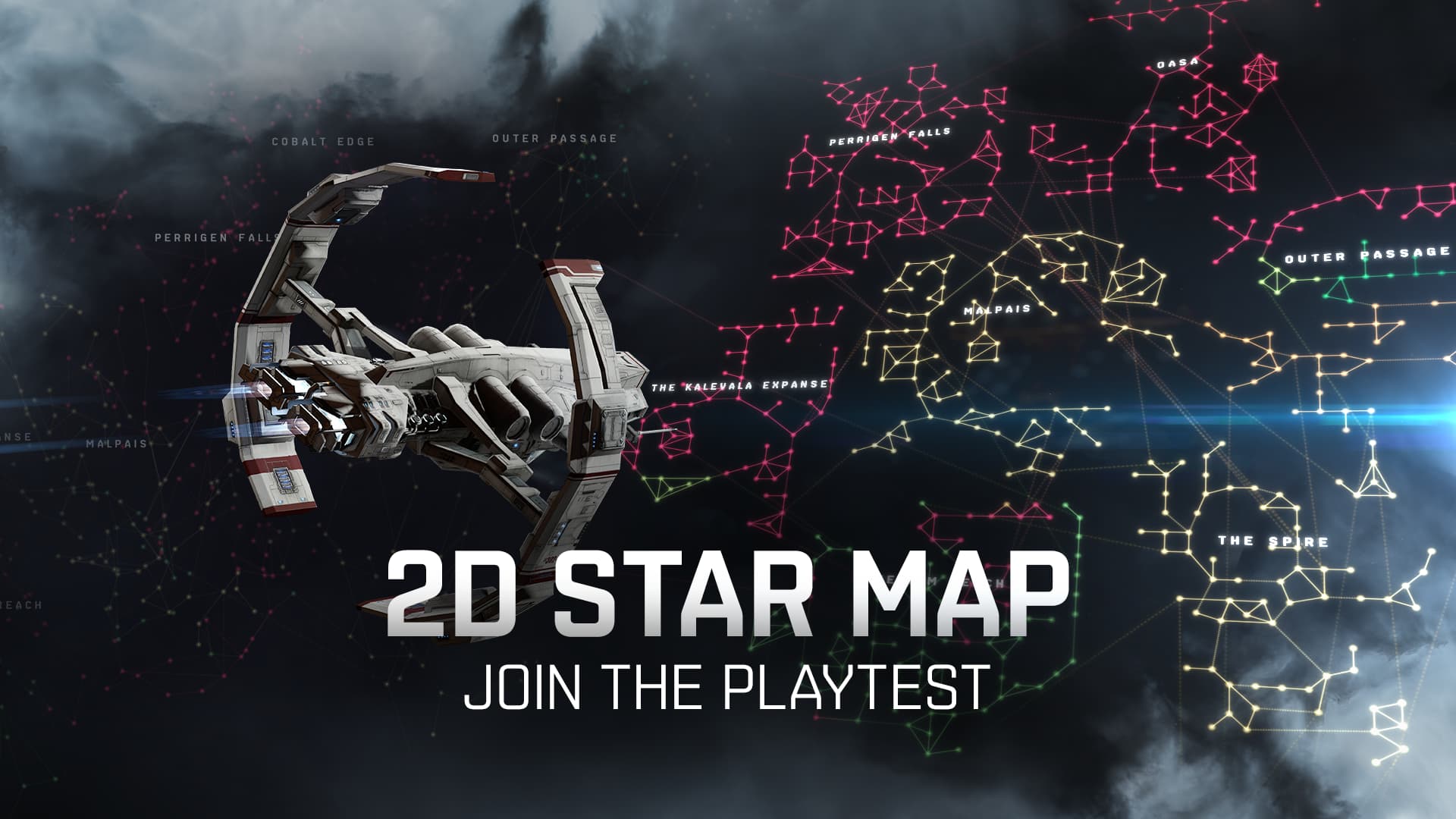
We are planning a masstest on Singularity from September 27th until October 1st to test the new 2D map that we demoed at Fanfest, as well as a few changes to Project Discovery.
What exactly is being tested?
In this playtest we’re focusing on the 2D map and a new way of visualizing filters through pins. You’ll find a new mode on the map which displays the universe in a new, flat, layout. We’d like your feedback on how usable and clear these changes feel in practice, specifically:
Readability and ease of use
Zoom levels and navigation (of the map)
Intuitiveness and usability of the filters and how they’re displayed.
How jump range is visualized
What you won’t find (at least not yet!)
These improvements are in progress, but not included in this test are:
Scaling of data visualization on the 3D map.
Filter customization tools.
Tips and Tricks for the map!
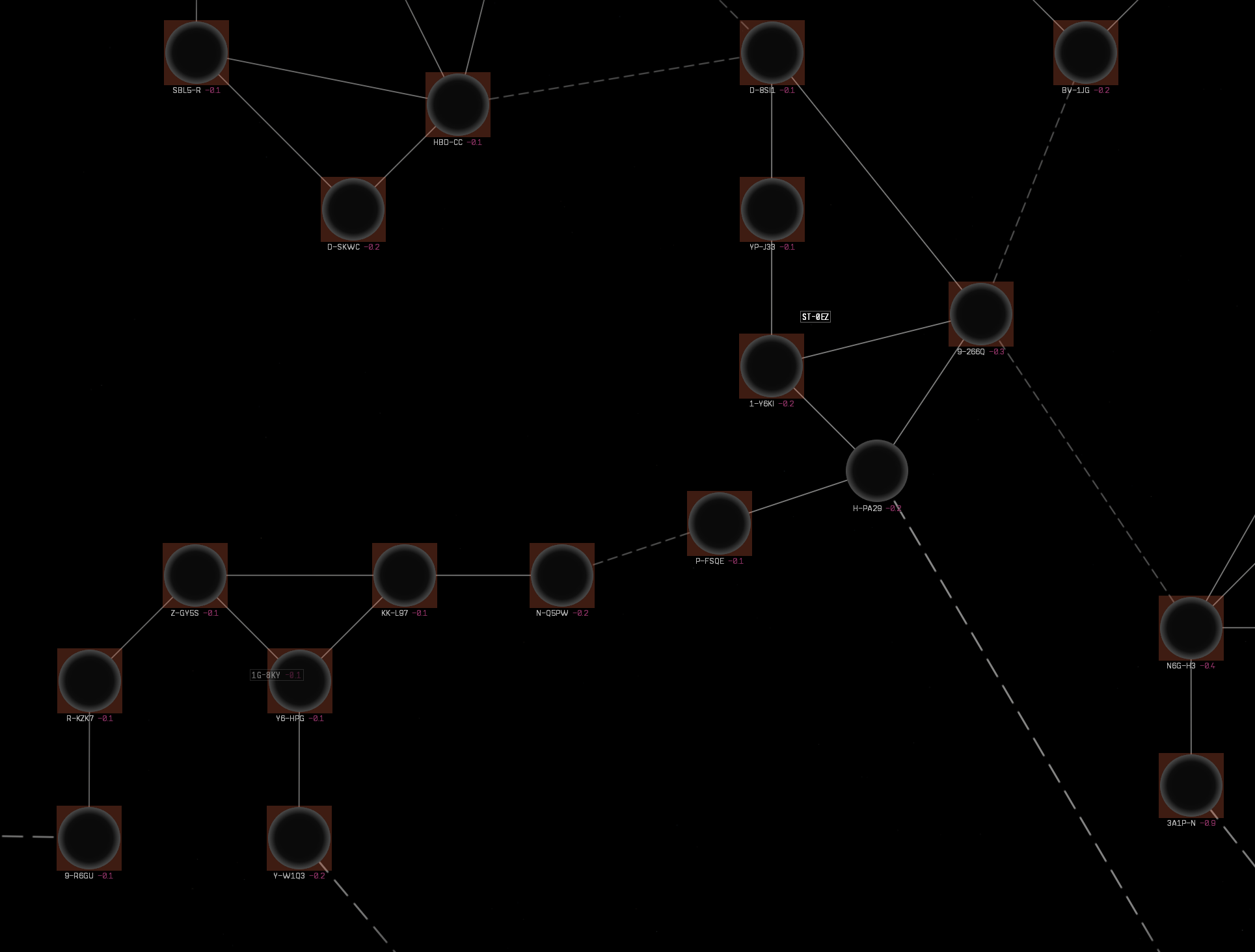
Holding down ctrl while viewing the 2D map at mid-zoom level will show filter data for every system
Only selected filters are available for the test
Data on the map is fake - since Singularity isn’t a live server, we did add in data to aid in visualization.
Other filters, such as industry indicies, don’t show results on the map
Some general filters, like station count, assets, planets, etc are accurate.
The jump range visualization on the 2D map is a work in progress. We’re working on improving how systems in in jump range are visualized on the 2D map. The current design is a work in progress, being tested for functionality
When moving the camera by clicking on a distant object, pins that should be grouped remain visible individually while the grouping indicator is also displayed. This is a known issue and should not behave like this.
Project Discovery
We’ll also be making some tweaks to Project Discovery that we’d love your feedback on.
How scores of individual submissions to gold standard tasks affect your overall accuracy score
More diverse variety of gold standard tasks wider variety (more clusters, more special cases etc.) for those with a higher accuracy score in Project Discovery
How to connect to Singularity for this test:
Change the server from Tranquility to Singularity in the bottom right corner of the launcher and log in as normal. The last mirror was on the 17th of September.
Maybe we can come up with a new name for this new map? As it shows dots and lanes between them maybe “dotsandlanes”? Seems a bit too long and cumbersome. Maybe “dotslanes”, definitely better but still not the best. Let’s shorten it to Dotlan perhaps?
I really enjoyed the old exoplanets one. It was kinda fun and fit with the game’s whole vibe (you know, space and stuff). But this virus one is just terrible. Even with the improvements that have been made over time, its still extremely annoying. It also isn’t really space themed, and I feel like people are absolutely beyond burned out on covid stuff.
One of the most frustrating parts of it is trying to get the final line to connect back to the starting point when forming the polygons. I find myself more often than not creating a point I didn’t mean to that’s too close to the end point to connect it properly and have to start the poly over. It would be nice if there was a better “snap to” effect when closing the polygon. It requires far too much mouse precision and the cursor covers the point you want to connect to, adding to the frustration.
Please, for the love of BoB, get rid of this thing entirely and give us a space themed objective?
Is this work also improving the data display of the new map in 3D to an actually useful design as well, or will it continue to be the unhelpful, unusable, sabotaging trainwreck?
No idea what I did, but all the logos disappeared. It looked cool for the first minute with all the sov pictures.
It would be nice if the 2d map showed systems in jump range more clearly. Maybe a white circle around each system in range while sitting in a jump capable ship would help.
Also I don’t see a button for it, but I hope the old 3d map will still be available. It’s much easier to understand what’s where for jump drive use and planning.
Is there going to be new rewards added to Project Discovery? This change looks like it just makes it harder to complete (it’s a brain dead activity right now and easy to do whilst on fleets or mining)
Especially when you hover around the edges of the Jump Range, the lighting up unreachable systems interfere and make the border between in range and out of range unnoticeable. There is a special highlight effect placeholder, but it’s hardly visible. The white ring from Dotlan would be better … Or the ring in the highlight color of your color palette, as there are also lots of white ring systems when there’s no data, which would make seeing the white ring harder.
First test conclusion: Nice view, easier to read when you see numbers, interesting steps in the right direction. However, the color palette really MUST be fixed and be as vibrant and wide as in the classic map. Performance of this map needs to improve dramatically to get rid of lags. The mushiness of the data in the far zoom level needs to be dealt with, in the 3D and 2D view alike.
First thing I notice: I often have to zoom in and out fast on the original map. The displaying of first the colored circles than the faction lags the zooming in and out. Please, in the code, prioritize zooming in and out above updating the detail level. Also Scalding Pass needs a bit of breathing room.
So far I’m a big fan, I would probably use this like 99% of the time over the 3D map for my typical gameplay. A few things to point out though.
I agree with the previous comments that the numbers/icons for whatever filter you’ve picked could be shown from a further zoom than they currently are. I would rather see smaller numbers from a wider area than pan around.
In addition to this point there also appears to be some missing interaction when on the zoom level just after you no longer see the numbers. You can right-click on systems to do actions like setting destination but the mouse doesn’t change and indicate that it is clickable and the system name doesn’t appear either which makes for a kind of weird interaction:
Excited to see how this looks once the colour scaling stuff shown at Fanfest (or some version of it) is introduced as it would be nice to see hotspots at a glance rather than the somewhat all-or-nothing approach there is right now.
I don’t do a whole lot of capital jumping but listing the fuel and fatigue for each system in range is a nice touch. This would be an incredible tool for things like blackops if the map live-updated with fleet members movements as you can watch from the blackops for where hunters are without having to rely on third-party tools. Unfortunately a quick test seems to show they do not update unless you toggle the modes and even then its massively delayed.
Anyway, keep up the good work. Looking forward to seeing the finished product
system cost index isn’t truncated, the numbers are displayed much too long
when zooming out, the circles with the data in it disappear too fast. I’d like to be able to at least see an entire region on one screen, even the biggest ones. If space is an issue, shorten the length of the connections instead.
always show the system name under the circle
always show all regional data
clearly mark the border systems that lead to another region
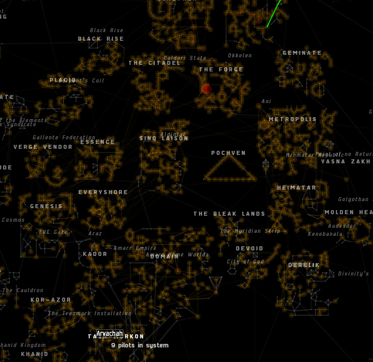
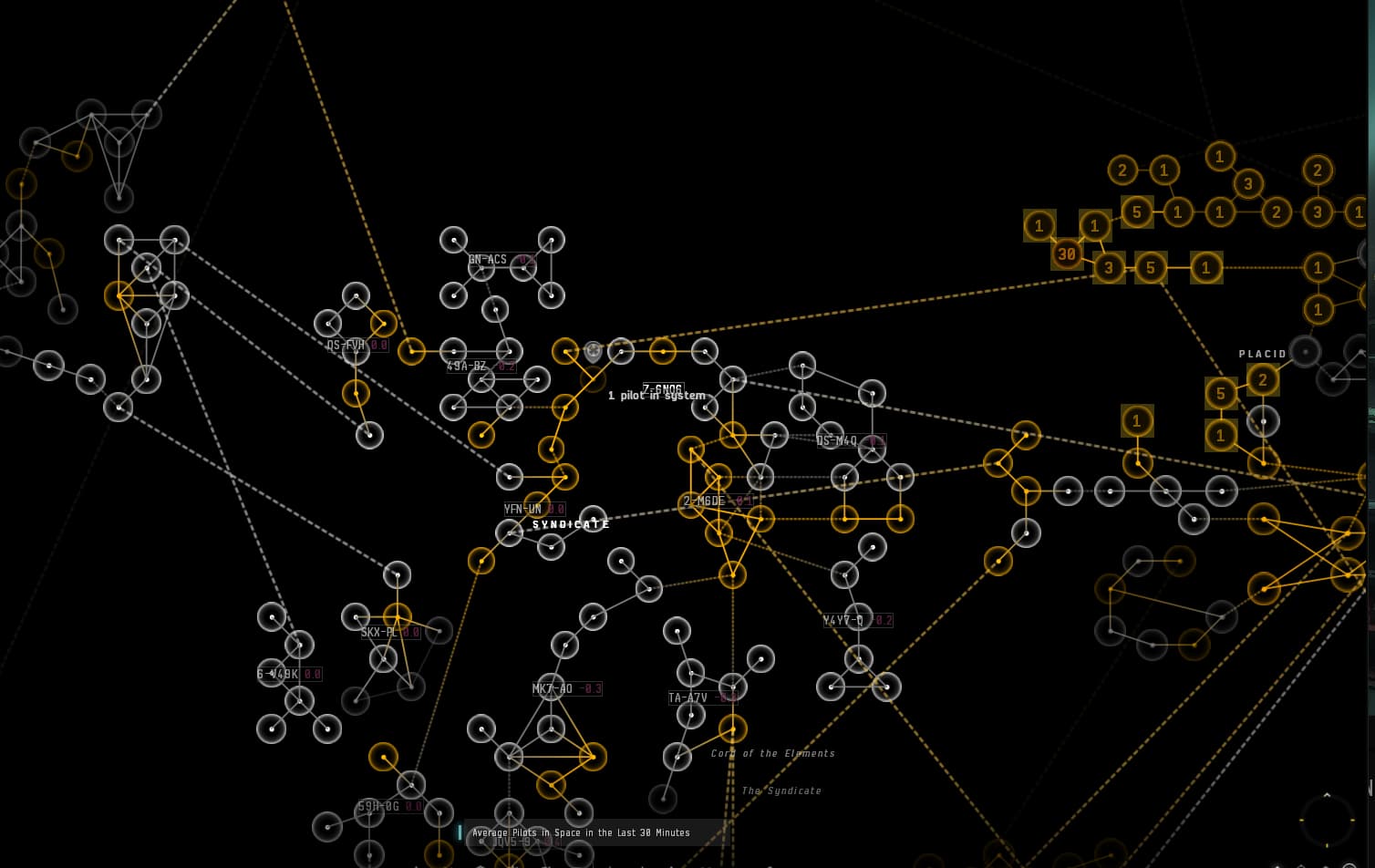
THIS is what I see when max-zoomed out for Domain, filtering by security status:
As you can clearly see, the system names aren’t displayed and there are systems not shown at top or bottom, so I have to drag the map around and hover over the systems to actually get their names. Also the connections to the neighboring regions aren’t clearly visible.
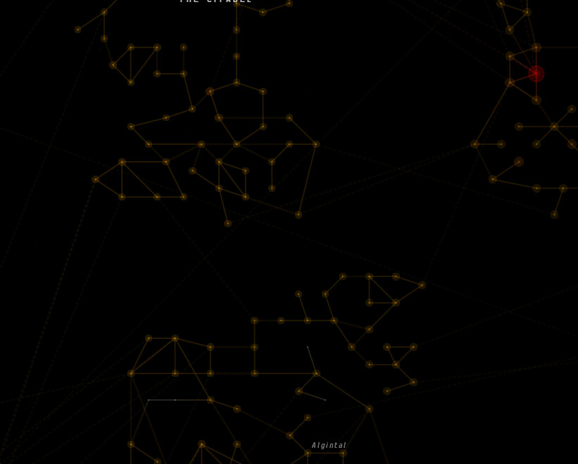
THIS is what dotlan shows me for the same region, same filter:
When for that Project Discovery app for smartphone with multiple minigames for different science applications that you announced some fanfests ago? (2022? 2021?)
Idk. I think this whole thing is a conspiracy. New Eden has always been flat. Its like 2 sheets with matter in between. Aura wants you to believe its been 3D this whole time. We’ve been lied to. I took my P900 camera and was able to bring stars back from disappearing over the horizon on the planets that rotate. Don’t drink the quafe!
The hand-placement of systems is very impressive and quite handy.
Obviously I subjectively see a few improvements, but that should be a dedicated thread honestly.
To be synthetic with the feedback: Lots of care given to intra-region jumps, not a lot of care given to regional stargates.
It really feels like your process was to have a human hand-place the systems region-per-region without any idea of the regional stargates & of how they would interconnect. And it shows.
Displaying data inside the circles is good idea, but it is weird to have the icons only display near the cursor, it feels like viewing the map through a flashlight cone.
Having to “scan” the map with your cursor is very very bad.
Love the creativity behind this choice though, it’s unconventional ideas like this that can make the map become great.
The numbers inside the system circles dissapear too early when zooming out, please consider adding them to the 3 zoomed-out graduations remaining before the circle themselves dissapear.
Likewise, the system names dissapear too early. Please allow for more zooming out before removing them.
The range of colors is still too narrow.
Of all the colors to chose, red yellow & red yellow green is probably a nightmare for colorblind people with Protanopia and Deuteranopia, which should be about 90-95% of all colorblind people.
It would be nice to use custom colors for NPC factions. Blue for Caldari, Yellow for amarr etc. Sure, you can’t do that for player sov (yet!) but curating/hard-coding colors for NPC space should be a very good idea.
Love the little numbers instead the system circles, but then again, why is the color range so narrow?
For instance, the “Systems I’ve visited” view. Half of the map is red. 12 is red, 102 is red. Most of the nuance is still lost.
I would like to suggest a new option for the lines. You could put it in the “Layout” window that pops at the bottomw left: Color lines by security status.
The security status info is one of the most useful for some people.
Have the line cut in half, which each half colored by its origin system sec status. Or a gradient, or a fixed distance instead of half, idk, whatever.
Have this setting override the line coloring of all filters. This way, the security status info is preserved for each filter. (I know it persists if you zoom quite a lot through the system names, but that’s too much zoom required)
I can’t stress enough how impactful it would be to have the sec status information persist for all filters.
It could serve as the backbone onto which people would orient themselves
Having to “click” on labels to enable some map features is too much.
For instance, constellation names and average security status, only display if you click the region label.
Why not display all nearby labels?
Alternatively, since clicking will center the map anyway.. Why not have the “selected region” be the one closest to the center of the map instead? It could update dynamically and seamlessly as the player moves the camera around. Without requiring manual clicks & forced camera movement.
Minor feedback:
Factional warfare score inside the circles don’t mean much, but are an excellent idea.
Should be replaced with the capture percentage.
Please consider adding a split circle to represent capture score
Likewise for insurgencies, good idea! But having two filters for corruption/suppression is such a pain. Please consider adding split circles as well. Though it this case it should be two halves of the circle that gradually fill up independently.
Unrealistic feedback:
Being able to make the map leave the game window & go to a separate monitor would be critical in helping cover functionality provided by third party tools. But I know that it’s a completely different beast to implement, compared to adjusting map displays.