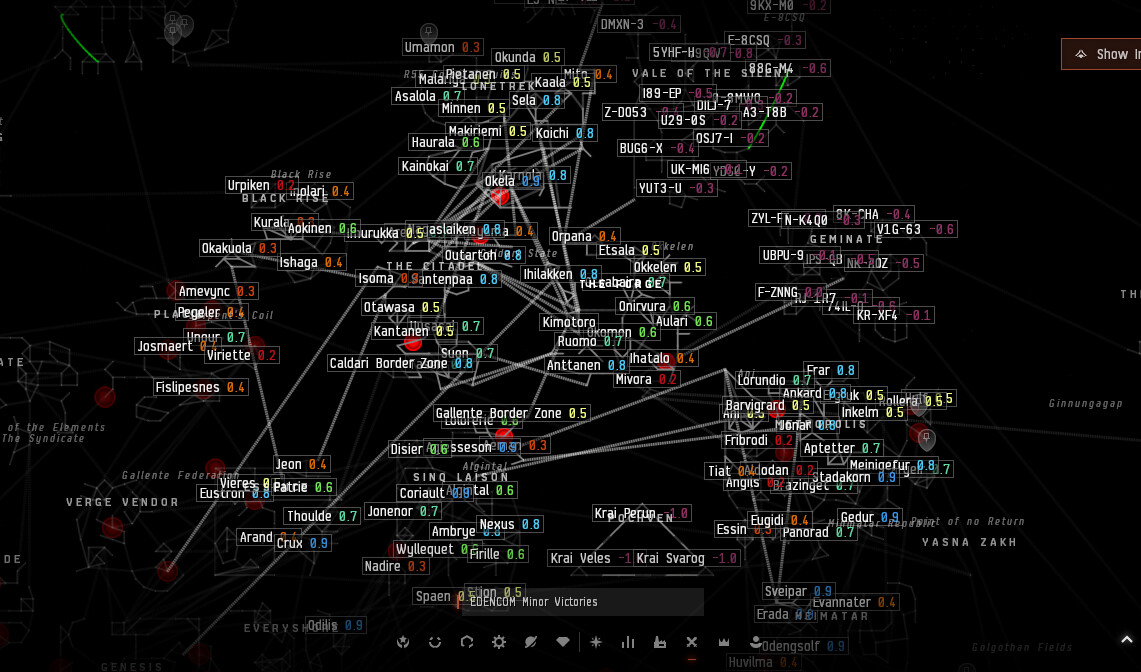
Please give us the option to remove the jump bridge links with access(green lines) on the 2d map. It clogs up the map for no reason imo. The image is just to show how ugly the bridge links make the map look.
I was looking at the new map when jumping between 2 systems that had a very long “line” connecting them. When the map perspective shifted from looking at me in the old system to me in the new system it didn’t do it in a smooth gradual fashion, or “blink” (there in old system 1 instant and next I’m in new system), instead it stuttered step as if the “blink” was broken into multiple chunks, which was a bit disconcerting. That’s not something I’ve experienced with the current map.
Played around a bit more. I thought it felt familiar; it is pretty much DOTLAN’s layout. I see others already noticed this. I appreciate that! If custom filters turn out to anything like as useful as DOTLAN, I might use it.
Another thing that’d be nice: some way to get the small filter bar in fullscreen (seems the smaller version is tied to windows mode at present). This really wouldn’t affect me since I’d use the windowed version to force it above my numerous “always on top” windows, but a button for small/large filter bar would still be nice.
It’s very pretty. I’d like a big print of it (supposing the under/overlapping regional and const gates could be corralled so the map as a whole is more legible at a glance).
Seconding another request: a dedicated region view mode which indicates where regional gates lead. If you do this you could go one further and also include Wollari’s combined region maps.
Could be good but I am mixed, I checked the current in game map and it seems readable, the dots could be brighter (close to white instead of mid gray). its not as readable as uniform dots but having it look like a actual star map with actual distnace does look visaualy cooler even if its less pratical to reading things.
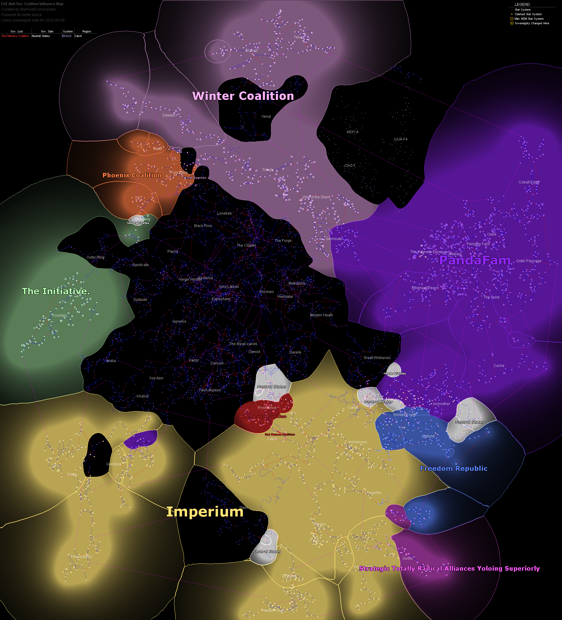
The nu version seems to have uniform space between systems which helps in readability. While the ‘real’ un-simplfied map does look cooler in looking like IRL stars, most (all) of the times when people look at the map for data its top down https://www.verite.space/maps/coalition/coalitioninfluence.png so the 3d aspect is not utilized that much. And Dotlan which loads of people use is 2d and simplified Map: Syndicate - DOTLAN :: EveMaps so its not that radical shift if people already reached the conclusion they want things simplified and 2d for looking at data.
Its rarely needed for most players but the 3d version helps with knowing if something is in range with caps being the map is 3d and shows true distance between things. So a sort of important thing but most regular cap people who do regular trips (and FCs) develop knowledge of what is in range of what. So the upper crust of people who do use caps and the upper upper crust who jump drive regularly the in game 3d map is of moderate use and more just a visualization novelty.
When it comes to jumping normal ships by gates, the distance inside of a system matters way more than between the stars even if that is a real thing, because jump gates the distance makes no difference on time. Even of big nullsec alliances who can feild caps regularly, most commonly fleets are subcaps by a margin of at least 10-1 and feels more at times to 100-1 and that one time most of that is being on standby, so knowing and seeing what gates to what matters more then capital jump distance.
Not the newest of new Bros, but my total play time really isn’t all that high with taking a long break only a few months after starting the game the first time so from that perspective I have to say that I am liking the 2D option for the map. I was never that good at using the 3D one.
I do have a high score in project discovery so i messed around with it for a bit. My comment on the changes are that they do add a bit to the experience for a little bit at least. It seems, at least as far as I could tell, that there were not that many new variants to the arrangements. After a bit of time I found myself recognizing most of the patterns presented.
My main comment for project discovery would be that if it is something that is going to become more complicated going forward that at least for clusters that are more complicated that it would be nice for the reward to be higher (exp or ISK) and/or adding rewards past the 650 skin. Maybe even adding another tier above the superior flow containers once above a certain level that provide more skins or more chance at the higher class ships I’m only missing 12 almost all of which are carriers, titans, or dreadnaughts.
Secondly related to that the rewards as they exist make it not worth it to participate past 500 really and if it takes more time per attempt due to more complicated patterns its going to become even less worth it than it already is.
I assume that the vast majority of Capsuleers who participate never go beyond 500 and many more probably don’t even make it there considering the total time investment it takes to make it there due to skill point requirements at the start. Then the limit of submissions per minute. Then the total limit per day. Depending on what the goal for the project is from a gameplay perspective there are plenty of options to improve it just depends on how you want it to expand it.
It defiantly helped me when I was new make enough ISK to fly new ships sooner than I might have been able to otherwise. I think this is its only real benefit at the moment beyond enjoying having some skins to start out with as well.
Providence. Flip it upside down. If it isn’t obvious upon a glance at the area, highlight the NNLX-K constellation to see why.
Have you tried flipping Wicked Creek sideways? Might fix a lot of it’s connections with Insmother…
Pochven should be an equilateral triangle… this disquiets my mathematical heart and might disquiet the Triglavians too
The voids on the map: Try to align them so that most void is between empire space and null.
Dotlan has made maps for combinations of certain regions, and for the FW zones. Take inspiration from those.
To be honest, anyone who doesn’t live in the areas has no clue about any of the connections in say, Dal or Essin. If the gates aren’t symmetrical, don’t force the map to be.
And a little one to end: the constellation FY6-NK, especially regarding the stargate that enters the constellation.
I filled out the survey but figured I would also post my twitch vod of when I was testing out the new map in real time. Time stamp is 03h43m if it doesn’t auto load then.
So, after poking the map, i have some feedback for you in the form of some requests and some bugs
Requests:
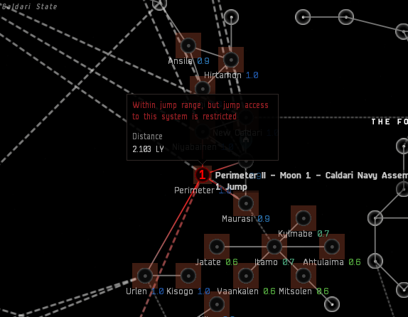
Highlight all systems in jump drive range
Add ability to let others in fleet see systems in range if there is a bridge able ship in fleet
Add more zoom steps when using the mouse wheel to zoom on the map
Ability to deselect current location so that system names don’t constantly cover parts of the map
Bugs
Odd brown square around system icons
New map states i can jump in to Pochven
Map stutters quite badly when going between certain zoom levels
So i get what you guys are aiming for, and a couple of things are improvements, like seeing how far a system is away for your JD and the fuel it will use to get there, but, the lack of a jump range bubble is highly annoying and the fact that even when fully zoomed out the systems near you are still fully shown which covers things when viewing statistics like pods destroyed in the last hour
This “area around the mouse cursor highlighting” also gets extremely distracting if you’re trying to use the UI buttons at the bottom as the highlighted systems follow the mouse around near the buttons instead
All in all i am still very much of the opinion that a flat map in a universe that actually makes use of all 3 dimensions for gameplay mechanics doesn’t really work, also, i am disappointed that you did not lay out Pochven the same way my map does (thats a joke it just means my map is wrong, but i’m not changing it lol)
Was the 3D map really that much of a pain point for new players to justify needing a 2D map? could we not just improve the 3D map we currently have instead?
When showing the number of services for something in a system would it not be better for it to say “x locations found” rather than records?
Also, when searching for something specifically would it not make sense to hide all system labels that don’t match the thing you actually want to reduce visual clutter?
When viewing impounded items could you not add a context menu option to then open the correct asset location so you could view what is impounded there?
Also doing the same for things like opening the PI window if you want to view planets etc, if we are redesigning the map we may aswell go full QoL improvements
Not my idea, but I think it would be useful to have a filter with Agency Window Information. Specifically:
Current ESS value amounts: So roaming ESS fleets can easily distinguish which areas to raid.
NPC Kills in the last 30 minutes.
Mining in the last 30 minutes.
Structure anchoring or unanchoring. (With some delay added)
Cosmic Anomalies and Signature counts: So that explorerers can plot routes for scanning. Or find where wormholes are.
Addtional features ideas:
Additional functionality would be great if you could mark for your corporation or alliance anything specific about a system. Such as whether there is a wormhole connected. Personal and sharable notes on specific systems. Pings and etc.
Visual: It would be great if you zoomed in and the systems that have higher counts of players be a larger red bubble, and fewer would have smaller ones. So you could easily distinguish where the higher counts are.
I wish the system colours ( the same ones that appear on the ‘route’ and in the overview ) for any system would also appear in space itself. In space, all gates are just white, as is their name. I think every distant gate should be coloured ( and the name too ) with the same colour that’s on the ‘route’ map. It would be a proper visual representation of what’s already in the overview.
Yes that is how it works, why would you expect to be able to yeet things without losing anything? that isn’t how the game is designed and this is not what the test server is actually for


