NEW FONT

When I read stuff like this I still feel like I forgot to put up my reading glasses. And I don’t have reading glasses as my near sight is near perfect. (far sight is another matter :sunglasses: )

afbeelding

  • ‘Notification History’ on top looks fuzzy.
  • timestamps (such as 2 days and 20 hours ago) are perfectly clear to read for me.
  • ‘War update: blablabla’ looks fuzzy again and looking at a lot of text like this makes my eyes tired.

CCP, please do something about it, as this new font is not enjoyable to read. I like the font, but not the execution.

2 Likes

Seems a reason it seems blurry is due to the poor kerning as shown where a letter following “f” seems to merge with it. The very short descenders don’t help with legibility either.

There’s ■■■■ all wrong with the new font.

Oh ■■■■■■■ please. I’m no fanboy, but literally Christ on a cracker.

1 Like

QA means quaffing ale, not quality assurance.

1 Like

Seems the font was changed again, the newest font is still better than the last, but still nowhere near as good as the original

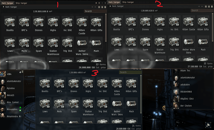
1 was the borked font, 2 is the “current” font and 3 was the OG font, as you can see 3 is still by far the cleanest font but 2 is getting there, just need to fix the issues on curved letters and we will be back where we started :stuck_out_tongue:

4 Likes

Can we please have the option to change the text color to white? Everything is gray now, person who speaks and his comment kind of all mesh together.
Gray is very hard on my eyes. Thanks

3 Likes

Looks like the font needs just a bit of sharpening in the corners. But very minimal amount.

Very good comparison.
Old font was the best as seen on number 3

Was it different before?

It did surprise me to see that names of people are the same colour as the text now, but I don’t remember if it was different before. (The fact that it surprised me is suggesting me that it was different before, but I don’t remember how it used to be exactly.)

1 Like

Please bring back right click menu font size option. :pray:

3 Likes

It did make it to TQ, it was hotfixed minutes later and removed when the forums and reddit was spammed with furious people.

It made it to TQ with game breaking glaring bugs that were brought up when it was on SiSi.

CCP chose to ignore the feedback they were given on how it was broken and pushed it to TQ anyway. Pretty much the same thing with the font. Font was on SiSi, tons of negative feedback, they pushed it anyway.

For as how the jump gate animation was completely and utterly borked;

If you jumped a stargate, an ansi, or cyno the animation would play out in it’s entirety even after you loaded the grid.

Meaning, depending on your computer and connection, you were stuck in limbo for at minimum 8 seconds after appearing in local. Meaning you lost 8 seconds of your jump cloak timer, 8 seconds to evaluate a grid if you jumped into a gate camp, etc.

Although, while in the animation you could still warp to things off your d-scan window. You couldnt use the overview, because even though you already loaded grid, and the overview refreshed and actually loaded all of the ships/structures/etc, the client would then hide the results on the overview until the animation finished playing, even though you were already in system and on grid.

If you jumped a cyno, you would just be sitting there motionless until the animation finished playing.

If you jumped a gate or ansi and happened to click to fast, you would become decloaked, and would be able to be locked and killed before you could even see the grid, because you were stuck in an animation that shouldn’t be playing.

It also meant, if you ever jumped a gate at the same exact time as someone else you would never be able to catch them if they had a sub 8 second align time, as they could jump the gate and warp off a random structure or celestial from the d-scan window while the animation still played.

If you were a hunter, it meant 8 more seconds that your targets have to align out and get safe. In a game plagued with synchronized bots all landing on a citadel at the same time from multiple random directions it gave them even more of a safety net to operate.

But, seems this is what CCP does, Povchen for example, seems CCP just rushes out unfinished, untested ideas that haven’t been fully fleshed out to meet deadlines or whatever while ignoring any feedback from the player base. It’s a shame.

3 Likes

You should make the same font on the forum so that no one reads it or visits it.

5 Likes

this new wreck icon. :man_facepalming: :man_facepalming: :man_facepalming:

What happened to it?

The text in the right-click drop down menu seriously needs to be larger.

2 Likes

it has a new festive look. maybe we get some with santa hats on christmas.

Cant really get used to it, best option was to remove the changes to the font.

1 Like

WE
NEED
THIS
OPTION (BACK):
RIGHT-CLICK CONTEXT MENU’S FONT: LARGE!
THAT’S ALL!
THANKS!

YOU’VE FRACKED UP GOOD TIME, EVERYONE IS TELLING YOU, WHY YOU DON’T SIMPLY GIVE US WHAT WE’RE ASKING FOR, IT’S ALMOST A GODXAMN MONTH! YOU DON’T EVEN DESERVE TO BE CALLED DEVS!

3 Likes

Can we have the old font back, or at least improve this one to make it more readable? The new font is a headache for a lot of people.

3 Likes