
In general: much too dark, without the option of setting different colors for the background foreground UI. (or at least I didn’t find out how)
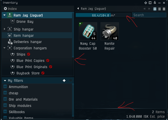
The red arrows mark places where I assume that there are lines delimiting different functional areas of the window, but are completely invisible. that is not good, and very confusing for the eye.
Compare that to the old version of the same window, with much better contrast, easy to identify different functional areas.
This needs to be changed, at least with a user changable Background/Foreground colors for window elements.
I cannot stress this enough: The state of the Photon UI that is pictured at the top of this post, is very unpleasant for me to look at. The barely visible contrast between window areas stressfull to the eyes.