Now that people have calmed down (hopefully), I’d like to propose we revisit the ‘red dot’ controversy. As you may know, the red dot was implemented to facilitate spotting new items within inventory, but it was removed due to intense political pressure from lobbyists. Although many players were outraged by the color red, I believe tensions could be alleviated by using a less strident color and a smaller dot. Perhaps light green or grey?
Here is a sample graphic image which I allow CCP to use FREE OF CHARGE. I call this pink dot.
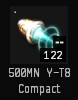
Here is an alternative option (I call this green outline):

@CCP_Swift I am so sorry to bother you again, I’m just trying to help. NOT TROLLING HERE! ![]() Perhaps if someone on the design team were to review the images above, it might at least stimulate a constructive dialogue. That’s all I’m trying to do! If I were on the CSM, I’d bring it up myself, but all I can do is post here and hope for the best. As a sign of good faith, I’ll leave you with one more option (grey circle):
Perhaps if someone on the design team were to review the images above, it might at least stimulate a constructive dialogue. That’s all I’m trying to do! If I were on the CSM, I’d bring it up myself, but all I can do is post here and hope for the best. As a sign of good faith, I’ll leave you with one more option (grey circle):
