We all talk about new players this, new players that, but lets be real.
The UI is tabs, trees and grids circa Windows 95.
They need to stop Fing around with lame content and update the UI before they get invited to a tech museum as a display.
We all talk about new players this, new players that, but lets be real.
The UI is tabs, trees and grids circa Windows 95.
They need to stop Fing around with lame content and update the UI before they get invited to a tech museum as a display.
Totally. We need a UI ribbon, like when they updated Excel a few years back!
Maybe some things are better left alone 
I need to insert a row . . . is that on the “insert” tab? No . . . “page layout”? No . . . Oh, here it is on “Home”. Obvious.
Now where is VBA? Hmm . . .
There was a card game called “bridge” - it was hugely popular. Younger generations weren’t interested in it and it just faded away. We may have to accept the possibility that this Eve game is not going to appeal as much to new game players. We can continue to enjoy it together until we all die off.
You do know most MMOs have a similar looking retention rate right? That’s hardly unusual.
As for updating UI. Everyone loves to say it, no one can actually design a better one that gives all the current data without getting too busy. (unless you have giant screens in which case you are not the standard player)
Depends what you mean by ui update…
No. Just no. In my opinion, EVE has one of the best UI of any game. Probably not the very best, it still has room for improvement, but it’s definitely top notch. Well stacked, customizable and clear. If it ain’t broke, don’t fix!
You guys and your overly complex mindset! Here, a pretty easy to make and efficient UI design perfect for EVE…
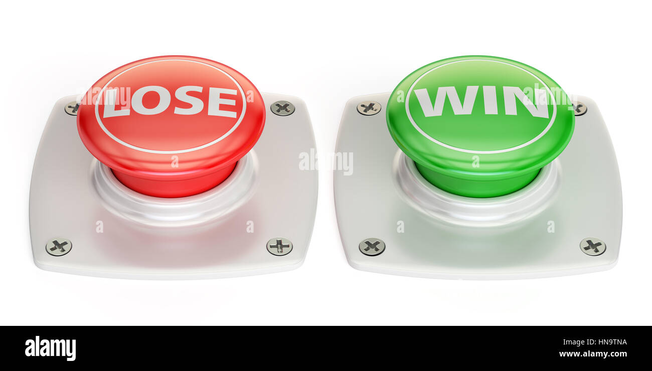
Note: It is actually random at a 50:50 chance each press whether a button will grant you the stated result or the opposite. 

That only works in null fleets 
I once played a space game that had a nice colourful UI and detailed icons instead of this dreary drab. There were no gongs nor red dots and the game didn’t cater as much to low effort clowns.
I wish I could remember what game that was, I’d love to play it again.
 Last I have seen most modern mobile apps are just “tabs, trees and grids”. Last I have seen most modern operating systems are nothing but “tabs, trees and grids”. Even sci-fi movies display UIs that are just “tabs, trees and grids”. Even for a low effort troll post, I do not get where got the idea that “tabs, trees and grids” are a bad thing.
No, “Win” button is actually a “Log off” button.
People who’s only gaming experience are console games with “streamlined” games (because console players) have a hard time adapting to games that require more than pushing X or left thumb stick.
What a terrible idea.
Mark my words, CCP wouldn’t know where to start with the UI without completely ■■■■■■■ it up beyond repair.
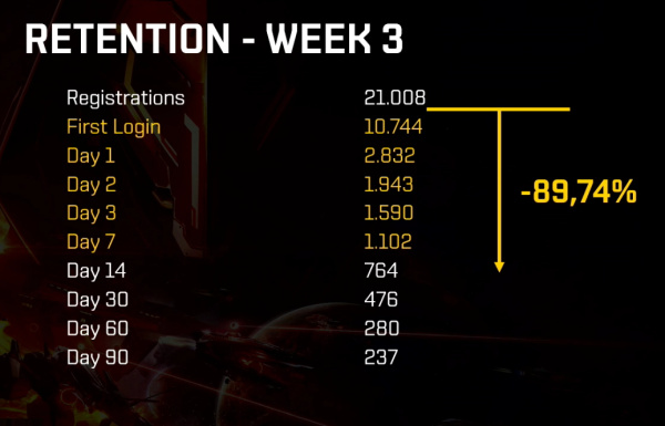
Half of registered players don’t even login. Maybe do something to that instead?
Haha, good one ![]()
On a serious note, they invested a lot of effort to build a nice ui latetly. Unfortunately it was just for their space casino and not for something relevant to the actual game. As always.
I am happy with the UI and the amount of screens to pass through to be up to speed with the various items and their process.
I am also impressed with the graphic details when you max the settings and sit at a star.
If I had to choose which part of the game to keep up to today’s standards I would pick what’s outside our ships and stations.