I have endured you all these years, I’m not going to play it anymore, and more than pay for it!
6 Likes
Remember the developers dont play trhe game ? This is a proof.
8 Likes
Market orders - why do i have to acess them via the market window? There is SO much space on the sidebar - please fix this!
And theres a bug too - i docked the order window to my wallet window but after closing that it doesn’t remember this, so i have to go via the market again…
4 Likes
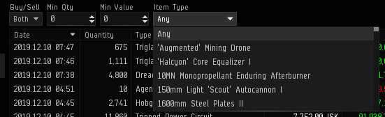
Yeah, can’t say I’m a fan of the new Market Transactions tab. Search box filter at top has been removed, replaced with a pull-down box… nowhere to click/drag items to to filter for them (was very clunky, new method perhaps just as bad).
But what is REALLY bad is the player making the window as LARGE as possible to see as many transactions on the first page as possible, and then having to wheel scroll with 8 scrolling movements to get from the top to the bottom of the first page of transactions (100 results enforced, non-configurable)… it used to only show around 22 or so results, and ALL could fit in one window, with NO NEED for scrolling… simply meaning you could easily advance page by page to see the results of your latest transactions.
Then, just to make it worse, the buttons to move back/forward through transaction pages have been moved from the top right of the window (above where the scroll bar is now) to bottom left… and so essentially couldn’t be further away from the scroll bar if you tried (where’s next? out on the launcher?) … requiring moving the mouse from one side of the window to the other to view each and every page’s results.
Put these things together and what you get is a totally unnecessary change that brings no improvement in functionality, but introduces more required inputs and movements for the same job. This is the very essence of bad design.
PLEASE, put it back the way it was so that no scrolling is needed to see the first page of transaction results AT THE VERY LEAST…
Harry Starkus
21 Likes
in adition to this - can’t enter my marketorders directly from here anymore. the tabs “give isk” and “automatic pay” are quite useless here
Market window:
change of colors is really bad, the colors are almost not visible anymore
market orders are opened by a new button in a new window instead of in a tab in the market window, can’t see any advantage from this change.
BUT I STILL CAN’T FILTER MY WALLET/ORDERS BY HUBS / STATIONS !!!
That really would be an improvement.
5 Likes

3 Likes
I can’t access my own wallet. Access denied to this wallet division it says. FFS it’s my personal wallet!!
3 Likes
It’s mine now!
HAHAHAHAHAHAHAAHAHA!
*runs away*
8 Likes
A dropdown to search with? SERIOUSLY?
20 Likes
They’ve started spamming HyperNet links in Jita.
Now they’re in Perimeter.
They’re expanding at a significant pace.
This isn’t even funny.

This is on-topic, no matter what you gambling haters think.
12 Likes
Yeah, because apparently that’s faster than just typing a few letters!

5 Likes
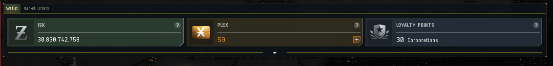
The wallet is demonstrably worse.
The three big blocks at the top for isk, plex and lp take up too much real estate and are not resizeable or removable. Personally, in over ten years of playing I have not used plex or lp even once and just dont need them up there taking over such a big part of the screen.
There is no way to resize the market transaction window without dragging the corner of the window. I mean having a little icon shaped like a box in the corner of a window that allows you to resize to full screen has been standard for something like 30 years? And now to resize your window to full screen you have to play with the corner of the window - dragging it a little at a time until you have it just right?
The market transaction tab has no item icons and uses a super small font - which makes it very difficult to read.
There seems to be significant lag between when items are purchased and when they are posted to the market transaction tab. There is a big delay between when items are purchased and when they show up in the portal.
My market orders should be accessible from the wallet - why is there so much space on the side given over to such useless things as “my shares” but stuff that is used every day - “market orders” is not included?
As a separate issue - in the market tab - the colors light blue and light green used for my orders are all most invisible so as to be effectively meaningless. Do you guys actually look at the stuff you do before you put it out? or is it just some sort of random thing where you bang your hands against the keyboard and press send? I mean comeon - this was obvious.
In short, with all the stuff that’s broken, why does CCP continue to insist on playing with the stuff that works, which no one asked them to work on, and making it worse?
10 Likes
What is this for?
Why would i want to have this open? It’s ugly, it’s useless and i already see myself popping an aneurysm when i accidentally klick this arrow for the thousandth time…
21 Likes
It looks like you went through a lot of effort to put PLEX in the middle of the screen with a ‘buy now’ button, while adding no new functionality to the wallet…
11 Likes
Am I blind? Where is the search bar for sold/bought items where I could drag the item name? Do I seriously have to use the list? It is also too hard to see your own orders now.
8 Likes
Can we get a UI redesign for the calculator next? I don’t think it’s been updated in ages and I’m sure it can be reinvented with a dropdown menu to input the numbers or something.
23 Likes
Actually logging into the forums for a second time just to re-iterate the levels of “■■■■ you” for re-adding gambling.
9 Likes
ohh fu…, ccp are you serious? i can’t refresh my marekt transactions anymore ??
6 Likes
Bugs. Crappy UX. Sub-par NPE.
But look at how pretty the Hypernet and its tutorial are!
Unbelieveable how development/design time is spent at CCP.
6 Likes

8 Likes