-
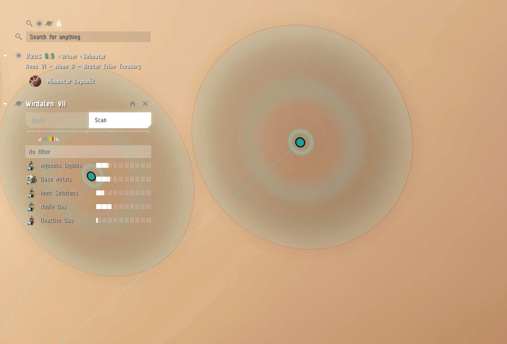
How can I disable Light Background in the PI view? It’s impossible to see the icons depending on what planet you are looking at. Would be great if you could globally disable light view for all windows.
-
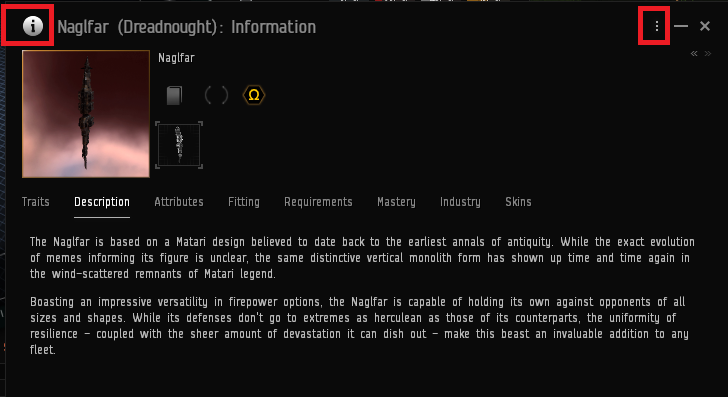
Who decided it would be a good idea to have all the necassary functions of the information window hidden behind those three little dots and the GIANT info thing is just for design and serves no purpose.
It’s not only my old habit, it’s simply bad design. I needed 10 minutes to figure out how to copy external killmail information the other day. And that’s just BAD! Maybe include a right click menu on the info icon, that has no porpoise other than to take up space in the first place @_@ -
Ship tree background doesn’t fit into my color sheme. Would be great if it was tinted differently.
-
The most annoying of them all:
Chat channel highlight colors. I have some channels that are highlighted for whatever reason and I always find myself in the wrong chat channel.

I’m in local but it looks like I have a different channel selected.
It’s so ■■■■■■■ annoying, please please disable those very bright highlights x)
This is the only thing that makes me really ■■■■■■■ angry, because I wanna be in 30+ channels and write in all of them but it’s so annoying to even see which channel you are currently in and nevermind posting some extremely important intel in Local chat… -.-’
I’ve seen my communication to other players go down drastically. Since the update I’m not even bothering with corpchat anymore, because it’s just so annoying to switch channels and keep track of them ![]() And everytime a buddy sends me a fitting It takes me at least 3 seconds to find the corp channel because somehow I have now tripple the amount of chat windows, because the titles take so much space @_@
And everytime a buddy sends me a fitting It takes me at least 3 seconds to find the corp channel because somehow I have now tripple the amount of chat windows, because the titles take so much space @_@