Intro
I like:
- How the locations window will put bookmarks of the system your in into a folder at the top
- How you can make chat windows as slim as you like
- And how the readability of some text is slightly improved thanks to increased kern and greater contrast
Those are nice changes. Unfortunately, however, I have a few… hundred gripes with it. In fact, if I’m being honest, I’m praying that the new U.I. doesn’t get made mandatory (like the new skill window). But, rather than sit here and complain at you, how about I get into the constructive feedback.
First up, please, please, please prioritize usability and readability before aesthetics. I don’t care what it looks like if it’s frustrating to use.
I want a U.I. to:
- Make it easy to find the information/buttons that I’m looking for, especially in tense situations
- Make it easy to take in the information I’m looking for, especially in tense situations
- To result in as few mistakes/misclicks as possible, especially in tense situations
- Be as compact as possible without throwing the other considerations out the window
- Be as customizable as possible
Now with the issues…
Objectively Bad Stuff

Drone window can still fail to display useful information
- So, the old drone window design also sucked. Instead of improving on that, however, you carried forward the design flaws of the old window, and made it slightly worse by decreasing compactness on top of that.
 Sigh.
Sigh. - On the left is the old design. On the right, is an example of how the window could actually be improved to ensure that all useful information is always displayed. Of course, my design fails to account for different themes and transparency options, and I think there is still room for improvement for the font, but it does illustrate the problems with the current design, and how things might be improved.

- I don’t know if this was a bug, or fixed, but I was unable to replicate it in order to take a screenshot. However, I’ll still mention it, just in case. The location window wasn’t highlighting its icon in the neocom when it was opened, but instead creating a new generic icon in the neocom.
 This is a small thing, but please fix the misaligned icons.
Compactness
Everything I’ve looked at so far is less compact than the old overview -and this includes the compact versions of windows. This might not be a huge issue for some guys, but it definitely results in a worse and more frustrating user experience for people trying to play on smaller resolutions. Note that any loss of compactness is an unacceptable solution for those playing at small resolutions because we’re already fighting the U.I. at those resolutions. So, even small losses of compactness, can result in significant annoyances, such as the inability to see everyone in your watchlist, see the health of all of your deployed drones, and having to do more scrolling through your overview. For many players, there is no wiggle room on this. Photon has to be at least as compact as the old U.I. And if it can be made more compact without sacrificing other considerations, even better. And I promise you that players will not give a crap if it looks prettier, if it’s more frustrating to use.
Additional note concerning multiboxer scum
And do note that the reality of the situation is even more complicated for multiboxers. We try to organize each client’s huds in ways that take into account the hud layout of other huds (such as to minimize eye and mouse movement), we typically have a lot of stuff going on, and we typically like to shove a ton of crap on screen. Long story short, even small issues concerning compactness, readability, and customization tend to get amplified for us. So, please do not underestimate how important this stuff is to us.
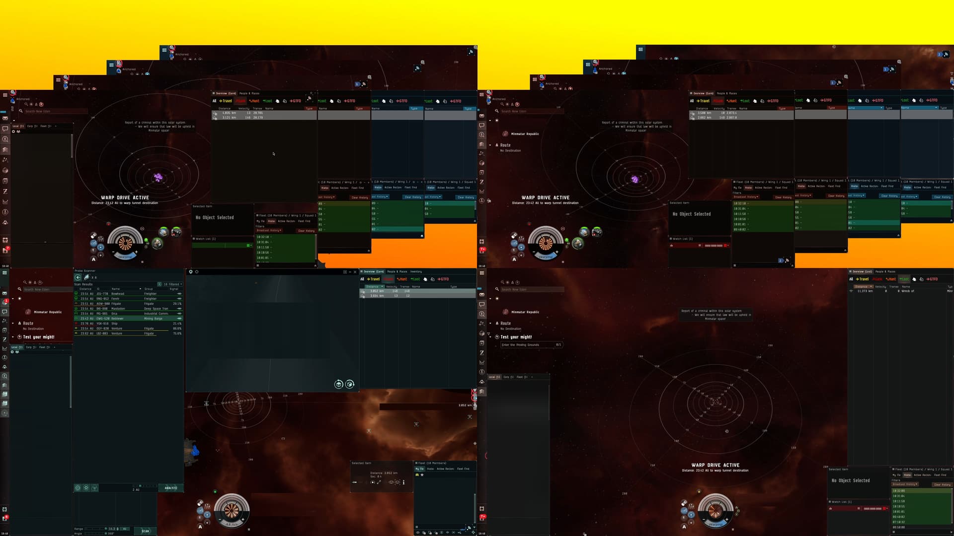
Client tiling method that I use in PvE (some clients are missing watchlists)

Client stacking method that I use to gank


Non compact version of inventory (which shows the inventory tree) displays fewer columns and rows in the same amount of space
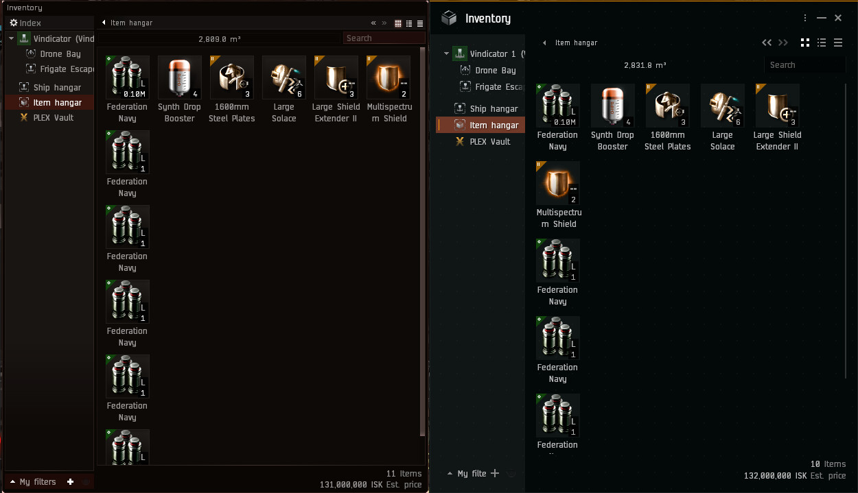

Additionally, the previous screenshot shows that fewer tabs can be displayed in the same amount of space. However, I do think the readability of tabs is slightly improved. So, is it possible to increase the number of tabs shown without sacrificing this improvement to readability? In fact, you can save some space by doing stuff like:
- Making it optional to display the number of people in chat in the tab
- Giving players the option to use icons and/or abbreviated names for window and chat tab names (i.e. “Loc” instead of “Locations”)
- Giving players the ability to rename tab names to whatever they want
- Giving chat creators the ability to make tickers for their chat channels (similar to corp tickers)
- and/or making short names for non-player created chats
Also, stop making the neocom worse. In addition to the resource loading icon, we now have 3 unremovable buttons, a skill queue that takes up more space for no reason, and Photon displays fewer icons in the remaining space than does the old Neocom. ARGGGGGGHHHH.
Readability
I have no doubt that this is a difficult task. You have to deal with different resolutions, font sizes, themes, levels of transparency, people with dislexia, astigmatism, and other vision problems, and different display hardware. So, I do not envy anyone given this task. However, there is certainly still room for improvement.
Certain things are still kind of hard to read (such as the number of items in a stack), and some programs have super smooth and crisp fonts that I would love to see replicated in Eve Online. I can only speculate as to why this is the case (i.e. font smoothing in windows), but you can definitely see a difference in the same fonts/settings when you use them in different programs/games. So, I was hoping that Eve online could be made to look as crisp as the text you’re reading right now.
Also, stop creating “prometheus map rooms.” A bunch of useless graphical flare might look cool, but it makes it harder to find and take in the information that you actually want.
Customization
I’m sure it will require more work to give vets more flexibility to customize their huds. Moreover, you have you also have to make sure that you don’t give newbros too much rope to hang themselves with (i.e. turn off graphics, or close important chat windows without knowing how to reopen them). However, the needs of Eve online players can vary dramatically depending on personal preferences, play styles, the display hardware available to them, the number of accounts they multibox, and the display solution that they use (i.e. Eve-O preview, Isk-Boxer, client tiling, client stacking, Bordered Windowed, etcetera). We want more customization. Yes, we like the freedom you’ve given us so far… but we want more.
Wishlist
Big Stuff
So, there are certain things that players have been asking for. It would be nice if we could get some of those things. Here is my list of stuff (plus a few extras).
Toggle switch for double click in space to align.
I know I’m about to throw a wall of text at you, but it does require explanation, and it is an issue that many players have had (and there would probably be even more complaints if more players understood what was happening).
So, when mouse buttons begin to fail, they can begin to erroneously register double clicks. Now, this is a problem that can happen in any program and OS environment, however, the control scheme of Eve is such that it creates an infuriating amount of opportunity for failing mouse buttons to result in unintended actions (namely, clicking and dragging in order to rotate the camera can result in double clicks that cause your ship to go flying off in space).
Of course, this is a hardware issue on the players’ end. However, avid gamers can wear out mouse buttons in extremely short amounts of time (for me, it’s six months), and a button that is starting to cause problems in Eve can be just fine for most other games and programs because the control scheme doesn’t lend itself to erroneous inputs. Now, I personally buy new buttons to solder onto my mouse when the old one wears out. However, not every has solder skills, and you’d be saving your player base a lot of frustration and money by giving them the option to disable double click to align in space or otherwise allowing them to customize the control scheme (i.e. mouse 4 to align).
[details=“Allow players to reposition all the “system info” section of the hud”]
I’m talking about the system info, route planner, daily tasks stuff that is permanently anchored to the top left corner of the screen. Fixing it in place either limits players ability to customize their huds, or forces them to hide hud elements that they would otherwise want to display.
[/details]
Hotkeys
- Loot Wreck - this is the last thing that I use the selected item window for
- Unfit Item- (i.e. hotkey + Left Click) great for if you need to refit from PvE to PvP in space in a hurry, for players that use travel fits, and for players that refit for different content. Make items automatically go into the main hanger bay when docked, or the cargo bay when undocked.
- Assign Drones - I know this one would take some finagling, but there are ways to make it work (i.e. hotkey + left click on name in watchlist).
- Cancel Repair/Cancel All Repairs- great for getting back into the fight
- Make Target Lock hotkey work with the drone window- helps to lock up and get reps to drones that have agro
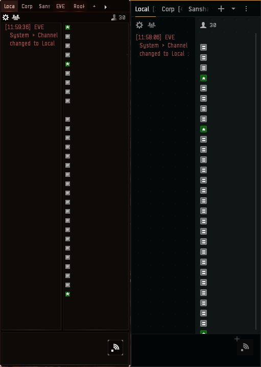
The ability to close unclosable chat windows
I don’t care if you make them automatically open up for newbros like rookie help does. But give older players the option to completely close them when they want. Between local, corp, alliance, fleet, and sansha incursion chat channels, it’s possible to wind up with FIVE unclosable windows.
Easier to pause training
The ability to start training on a toon without having to log into the toon that is training in order to manually pause his training. Just create a dialogue warning that says something like “starting training on this character will pause training on the other character… unless you buy MCT,” or something like that.
- Ability to put the Capacitor Donut wherever we want
- The ability to save and share custom keybinds
- The ability to share client settings (i.e. zoom direction, dynamic movement, graphics settings, duel requests, etcetera)
- The ability to save custom graphics presets
- The ability to save, share, and switch between hud layouts
- The ability to use different overviews on different toons on the same account and profile
- Change it so that when I move the position of locked targets on one toon, it doesn’t move it for all toons on the account
- The ability to change profiles without having to relog
- Make selected overview tab on the new overview stand out more
- Stop making fleet finder disappear when it fleet. Players do sometimes need to switch fleets (i.e. overflow fleet), and you’re forcing them to go hunting for what they need in a new location.
Low Priority Stuff
Allow option to set disable light background by default.
This is a low priority thing because it’s mostly a one time annoyance, but why do I have to disable light background on every window and chat that I open?
Allow us to set global chat options
Every new chat I open, the first thing I do is set to show text only and show compact member list. Why do I have to do this every time? Why can’t I set a default for my chat windows?
Stop resetting camera angel when jumping
It is mildly annoying when the game resets the camera angle every time you jump.
Collapse button collapses the unique thing, but not the redundant thing
Fleet Window–>History Tab–>Collapse button can collapse the broadcast buttons, but not the superfluous strip that unnecessarily reiterates the last broadcast made, which is redundant information.
Ability to reposition borderless window clients
This one is a low priority because there are 3rd party workarounds. But I thought I would mention it.
Potentially Controversial stuff
Input buffering for modules that haven't finished cycling.
For example, if you stop your guns from firing, you have to wait for them to finish cycling before you can tell them to fire on a new target, or load a different ammo. This is annoying for most weapon systems, but is particularly aggravating for weapons with low rates of fire. Thus, it would be nice if you could immediately tell your guns to load a new ammo/fire on the next target, and then have them execute that command at first moment they are able to.
More audio alarms and cues
i.e. alarm when module is about to burn out, or a noise when a bastion mod is about to cycle (similar to how boosts make a subtle noise before they cycle)
Okay. That’s it for now. I guess, let me wrap up by saying…
Please prioritize function over form. I don’t care how pretty it looks if it’s frustrating to use.
- Make it easy to find the information/buttons that I’m looking for, especially in tense situations
- Make it easy to take in the information I’m looking for, especially in tense situations
- To result in as few mistakes/misclicks as possible, especially in tense situations
- Be as compact as possible without throwing the other considerations out the window
- Be as customizable as possible
