TL;DR: Change Agents button design.
I know it’s a minor issue, but it irks me.
For the UI an asymmetric design for the buttons has been chosen, with the bottom right button cut off.
Example:
![]()
This asymmetric design was started, I think, with the introduction of the new Agency, where the bottom right and top left button were both cut off on all the buttons:
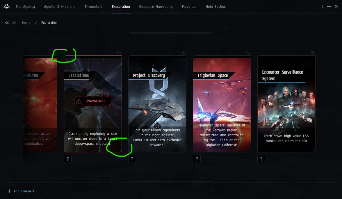
I think it looks pretty neat.
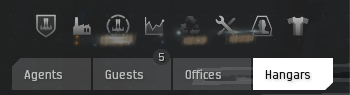
However, when is everything consistently designed to be asymmetric, why is the ‘Agents’ button (visible when docked inside a structure) like this?

That’s symmetric! ![]()
I’m nitpicking here, I know, but why not be consistent and pick the design choice you started with the Agency and change it to be like this:
(Example of my paint skills)
Or alternatively, don’t remove a corner from the Agents button at all. Either way would be another step towards a consistent unified UI experience.