I assumed it was supposed to be smaller, but it really is about the same size, or wastes even more space - I don’t really understand.
What is the goal?
I assumed it was supposed to be smaller, but it really is about the same size, or wastes even more space - I don’t really understand.
What is the goal?
The goal is “compact”.
I give it a solid D- in doing that. Compared to the “normal” UI, it’s somewhat smaller in some cases…but it needs to be compacted a lot more.
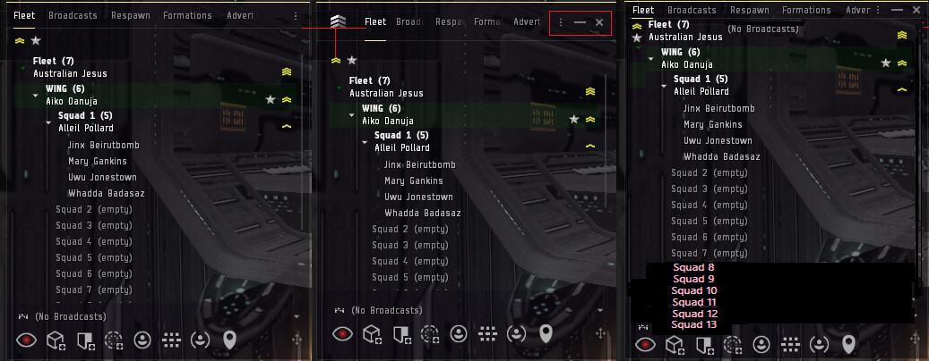
Below, you see the compact version on the left, and the normal version in the center. There is very little difference, and the most noticeable issue is the removal of the buttons to minimize or close the window. The compact mode does show two additional lines, but it could do much better without removing any buttons.
Both versions waste a lot of space, and a better compact mode is on the right - I found space to add 6 more lines in the same space.
====
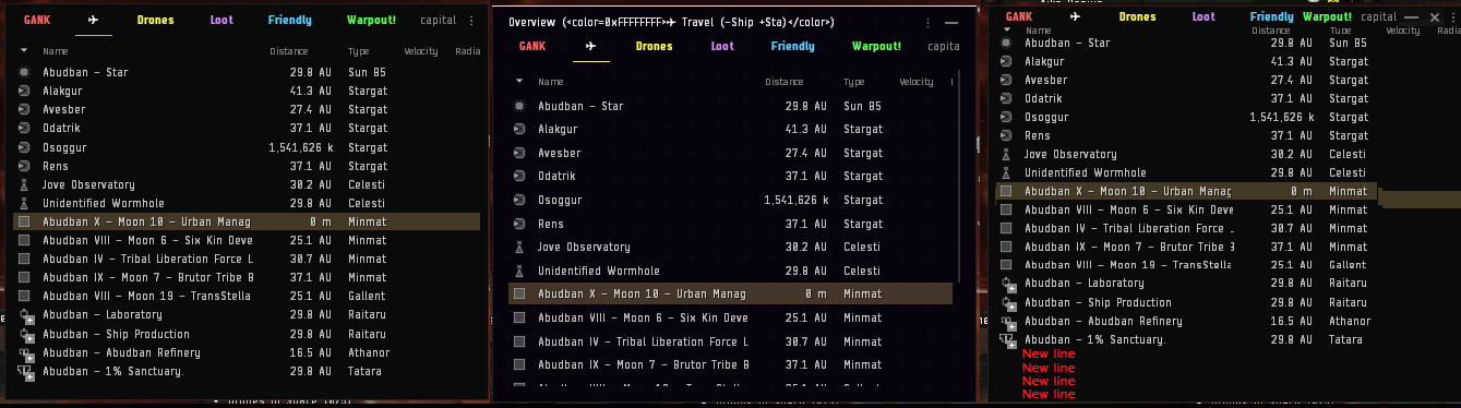
Likewise, the Overview could have more lines, within the exact same space, and there is no need to remove the buttons to minimize and close.
Compact Mode is not intended to be compact. It is intended to make the UI obfuscate even more information, make it even harder to use and the experience even more inconsistent within itself.
“Never attribute to malice that which is adequately explained by stupidity incompetence.” (c)
Goal is to have a checkbox, so CCP can say - “our new UI have compact mode!”, making it actually useful is not a priority.
For the inventory it’s even more weird… you can’t see the price anymore and how full your cargo is. But the giant “Inventory” Title still exists… getting rid of the title would be more beneficial than removing the m³ and estd. price line ![]()
This topic was automatically closed 90 days after the last reply. New replies are no longer allowed.