We want to start off by thanking you all for the great feedback that you have been giving. It’s been awesome to see your enthusiasm for the UI in-game and it is helping us a lot when making design decisions.
As we mentioned earlier we are showing you Photon in the early stage of development. That means we are showing you this with some broken windows, bugs and some concepts that we have not yet implemented. That also means that there are a lot of defects that our engineers have to plow through before we can act on the changes based on your feedback. But having said that we still managed to make some tweaks to the UI before releasing it on TQ. We for exampled removed extra spacing and adjusted components in the fleet window and D-scan. We adjusted the background opacity so it works better on light backgrounds and the text doesn’t bleed out as much. These are examples of steps we’ve taken in reaction to your feedback but by no means an exhaustive list.
The most frequent feedback we are getting concerns the padding, spacing and sizing of elements. We would like to take this opportunity and show you some ideas on how we want to tackle that. Right now we have a UI that relies heavily on windows, and having many windows open at once to have the relevant information and actions at hand. We understand that when we add padding to one window it will affect the number of windows that we can have at a time as well as the amount of content visible in each window. Simultaneously we want to increase legibility and establish a hierarchy of elements, especially for new players.
Compact Mode
We want to extend the use of a compact mode for windows, we already have a similar use case in the inventory window but we would like to extend it to other windows and improve its usage. In these windows, we will have smaller spacing between elements, smaller components, and less margin space around the window. Here is an example of the people and places window in normal mode vs compact mode.
In Compact Mode we are exploring space savings even further by removing the header and replacing it with an icon in the top right corner which expands to the window controls and header. Example shown below.
Why can’t the compact mode just be the UI without all the excessive and unnecessary padding? You are actively removing the easy access to all kinds of features and hide them behind extra menu layers and call it Compact Mode. You are not making anything better with this mode because everything will require more clicks just because you don’t want to waste all the space with the non-compact mode UI.
Plus: This Header hidden/expanded picture tells me that this element will pop in every time I move my mouse over the circle. This will create so much unnecessary UI noise when you move your mouse around all the compacted windows.
Please just remove the padding and reduce the size of humongous UI elements like buttons and then call that Compact Mode. Because this would be an actual compact mode. The current UI is more compact than you Compact Mode even while it retains more usefulness and clarity.
Thank you for taking the time to post this topic. I am pleased to see work on providing an additional option for players who need to maximise the usage of their screen real estate, rather than pursuing a one size fits all strategy.
The concept(s) of People & Places have room for improvement; however, they are looking good. I have a few concerns which I wanted to share so I’ll post them below:
All windows should have a header with control buttons and a window title.
It’s easier to discuss windows with users when those windows have explicit names. There doesn’t need to be a lot of padding, and thus the room required doesn’t need to be excessive - but keeping the name of the window there is important.
Content Overflow
All of your compact screenshots are missing the buttons for various filters (e.g., Terrible, Blocked, Buddy). I assume this is because the height of the window was too small for all of these icons to be displayed; however, I am concerned that missing filters could prove to be a nuisance for users and could file them to drop the UI, file BRs or Support Tickets.
Consider adding a minimum height to windows like this to ensure that all of the important control elements are visible. In the case of People and Places, the height needs to be the `height of header + height of the search bar + the height of the filters on the left.
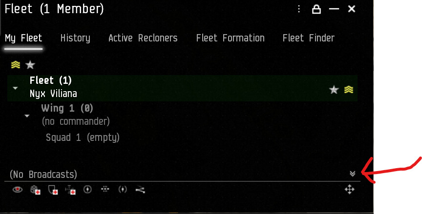
Fleet Broadcast buttons
This one is slightly unrelated, but seeing there is a team working on this part of the UI, please add pointers for the missing broadcasts, currently, there are only pointers for shield and armour, and not for hull, enemy, in position, capacitor or the other two.
One final thought - please give the chat system this mode on TQ ASAP. Chat is a very important component in Eve, and the system has been suffering the most from the padding within the new UI. I’ve already posted feedback so I won’t go into all the issues with it here, but there needs to be more of an emphasis on providing room for channel names, and character names. With that said, a compact mode would still be welcomed, so please get us a mockup system in TQ ASAP so we can provide you with feedback. This is one area where feedback will be far more useful if we get to test it rather than just looking at pictures.
Thank you again for your work on this issue. Keep us informed
i see what you mean, i guess i just don’t notice stuff like that… not saying it isn’t there, and i haven’t played in a while due to RL issues and moving and stuff like that.
I only like using compact member list in local where I need to see as many names and standing icons as possible. In all other channels, I like to see avatars as that helps me identify people I know, especially in busy channels.
Here are two screenshots:
The first has the setting Compact Member List enabled, and as you can see there is still a large area of space on the right of the scrollbar that is not being used. This causes me to choose between losing screen real estate or losing some of each pilot’s name.
It isn’t a game-breaking issue by any means, but it is annoying. If the scrollbar was moved to the far right of the frame, the developers could maintain padding in the form of the scroll track, and we’d get a few extra chat characters.
In this example, I am using non-compact member list mode. As you see once the space on the right is added to the size of portraits and the standings icon, I am lucky if I see the full first name of each pilot.
For me, neither the standings icon, nor the portrait is a waste of space as I actively use both, but that padding on the right is, and it’s a problem.
For a quick comparison here is a picture of what it looks like in the old UI:
The adjustments on D-Scan and Fleet window already go in the right direction.
And I like a lot where “Compact Mode” mode is going.
What I noticed from the last screenshot from the opening post, the distinction between header, content, and footer via line and different background-gradient is much better now.
Looking forward to test out the new stuff as it’s coming in.
It doesnt look like this is going anywhere near far enough from your images and is far from compact, its still not even close to previous UI sizes. The Fleet and D Scan windows are particularly disturbing, the button sizes are ridiculous.
I hope there is a lot more to come as this doesnt cut it.
I have to personally disagree here - the broadcast buttons need to be way bigger than they are in the current UI, as they can be a pain to use in a pinch
I mainly use broadcast hotkeys, so the size of the buttons has never been a useability issue for me.
Typically hotkeys have been a bad solution for pilots as broadcasts don’t go through if you have clicked on another UI element (e.g., chat, overview, etc.). Personally, I got into the habit of clicking into space a lot to make sure my broadcasts work.
I definitely see how the larger buttons here would be useful for people who stay away from the broadcast keys for safety and usability issues, so I would be fine with them being made larger SO LONG AS I can still minimise them as I can now. The pictures shared by the OP suggest that the feature may be removed.


