This is just a smattering of my general feedback for Photon.
All of this feedback is from a 5K iMac playing with 200% UI scale.
Big wins:
- The new “Locations” window is awesome. In fact, the sleekness of the new compact Locations window should be a gold-standard for the rest of this redesign.
- New Career Agent dialog UI is awesome
- Compact mode on the Overview and the Directional Scanner is great.
- The more compact rows on the skill window are a blissfully welcome change.
- In the recent update, thank you for making the groups for things like Drones or Fitting categories slimmer.
Specific problems:
The mail window is just busted, and you can’t see all of the fields.

The icons for the Selected Item window are newer designs, but the actual texture/asset is crunchy and needs to be higher resolution. You use these buttons all the time and they could be given more love like how the station services icons look.
So much vertical space is wasted on the chat window by this row of controls, it needs to be combined into the [...] menu or the right click options for the chat tab.
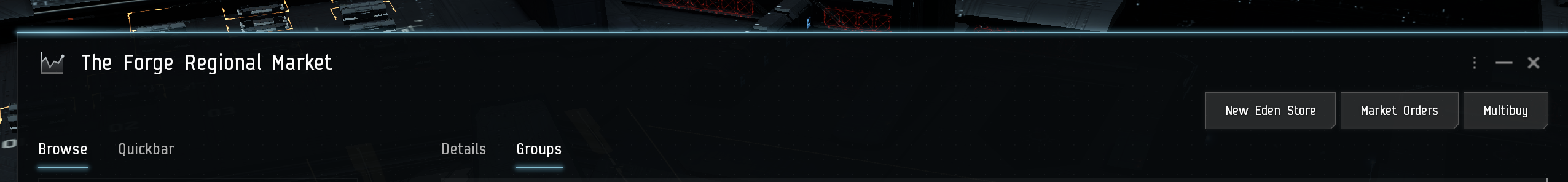
A huge amount of vertical space is wasted on the Market window. These buttons need to be smaller, part of the top row of tabs, or moved into menus or something. Also all of these are available as different Neocom buttons / keyboard shortcuts anyway.
The text inside the big buttons is strangely small, it should match the other UI text. The big buttons have an odd amount of vertical padding. These don’t need to be 32px high all the time.
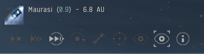
The button to recall your scan probes is really important and currently teeny tiny.

This part of the fitting window is just so ugly and clobbered together. It needs to be re-designed somehow. For example, why do we need a separate tab for Charges when it could be part of the filters instead?

The size of many things in the different small dialog boxes is all crazy over zoomed. This is the Repair window, for example. What is happening here?

The undock button needs to be huge again, or needs to be given some custom design for how important it is. Also: Very little changes when you make the station window compact.

Links to pilot info dragged into chat are often used for "mentioning" people and this is a good opportunity to make them a different color
