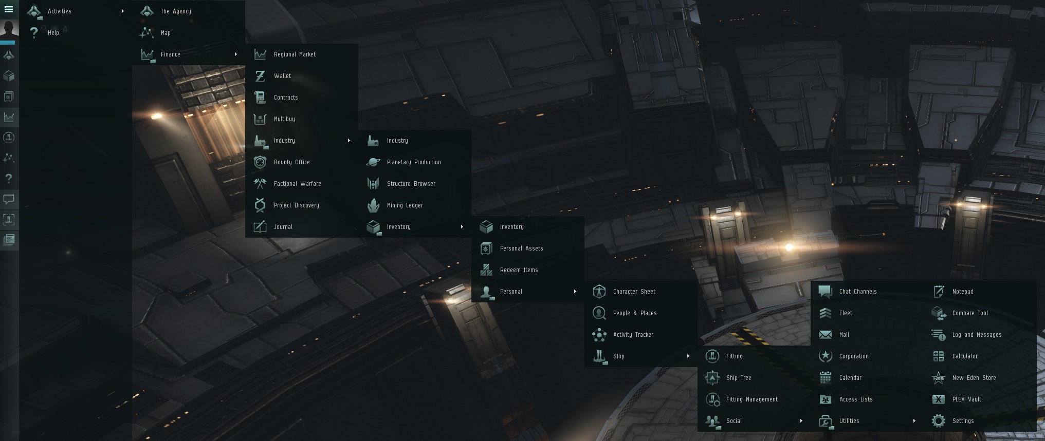
With the next Singularity update, players will be able to see an updated folder structure within the Neocom menu, that we believe will allow players to more easily find the windows and/or features that they are looking for.
We are also stripping down the default Neocom to only show the ‘bare necessities’ that a new player might use, thereby reducing the amount of visual overload.
Existing characters should NOT have their current Neocom sidebar rearranged, so if your Neocom does reset to the new default, please submit a bug report from the in game F12 menu, and name drop CCP Deadlift.
As always, all Neocom menu buttons can be dragged onto the Neocom sidebar to customise it to your preferred state.
Please use this thread to leave us your feedback on this change
Thank you very much in advance!
Here are the current known issues on this Neocom update, that we will add to/remove from as we approach the release:
I like the current “distinct shapes” icon design language, and would only ask that the Journal and Notepad icons be tweaked (pick one or other other) so that its easier to distinguish them at a quick glance. Both are rectangles with a pen over them. One is narrower (portrait orientation,) the other wider (landscape) - its not enough of a difference.
I don’t know if it is my eyes, my brain, or a combination of both, but I do not have much of an ability to distinguish the neocom menu icons by shape.
Certainly I can tell they are different if I examine them, but I have to examine them every time. Particularly the market and industry windows. In real life, I have similar issues identifying people. People look pretty much the same to me by shape, and I will normally choose a predominant color that they wear to identify them without having to examine them too uncomfortably closely. In school, my locker was the yellow one. My house was the white one. My winter coat the blue one, etc.
I respond better to color, and it would make my eve life smoother if I could at least give some variation on hue. I can deal. The icons have been like this a long time, but I am clumsy and misclick a lot more often than I used to.
E menusymbol should above the charpicture (remember the many missclics after moving the undockbutton)
Inventory missing over half of all the entrys: Hulls&Bays, Open Item Hangar, Open Ship Hangar, Open Corp Deliveries
the missing of these entrys also prevent to make a own folder with them
Move “PLEX Vault” to Inventory Group (as before)
“Structurebrowser” in Industry? - but there you can find ALL useful information for stations/structures (including NPC) -> maybe Group Accessories (together with the “Access Lists”)
rightclick menu “remove shortcut” is misleading to the real (key)shortcut, label “remove” or “remove symbol”
Positive is the cleanup for default Neocom. Maybe also remove the “fitting” - its already on every station as stationservice.
Finally its also fixed to (un)blink open windows via rightclick on Neocomicon.
I’d like to add my voice to those requesting a return to color for the neocom icons.
I’ve played off and on over the years, first subbed in 2005 I think, if this is my original account. Last year I resubscribed again, and I took the neocom icon difficulties I was having as one piece of evidence that my eyes were failing me due to age. I’m not even 30 yet! I was surprised by how confusing the neocom icons are, and even now I still click the wrong one frequently. This wasn’t a thing before.
Please do something to make it easier for people to distinguish them. No need to redesign, just hue the icons. I’d love it if you had a default color scheme and the ability to set your own custom color hues on them.
I figured out that it wasn’t age related eye failure, but chronic eye strain due to a bad prescription in one eye. Lasik has made things better, but those neocom icons are still confusing!
PLEASE ensure that the Fleet button remains on the default Neocom menu! We “fought” for several years to get Fleet button on the default Neocom menu, to remove it now is a step in the wrong direction.
Also +1 to adding the option to colorize different Neocom icons. As one of many with some visual difficulties, differentiating between the similarly-shaped and colored icons is irritating. I can’t tell you how many times I’ve confused fitting and corporation buttons, chat and journal, and others.
I would like to add my voice to the re-add colour buttons. Now the old ones might be considered to be a little cluttered, but they are still vastly superior to the current offering.
The current Neocom design offers neither clarity or differentiation. It fails at every level from a users perspective.
It may have been an almost fashionable offering once, but like gigantic flairs and power dressing with door width shoulder pads, that would suit an intergalactic dictator, that fashion was very short lived and now looks frankly pathetic, and more than a little embarrassing to show prospective new players.
+1 for Colored Icons IT CANT BE THAT HARD TO IMPLEMENT
give it checkbox in ESC Menu or something CCPLS
allways missklick on market industry and map also people & places an fitting management
at least give them little bit different shades of color (hey in my wet dreams i see playermade icon mods for eve^^)
i dont care about some clean UI rules from who ever told you that and was probably overpayed or wanted to troll you^^
i want to play eve! and the not clearly to see what is what grey menu is disturbing my game expirience for long enough!
Not only the color, but the shapes as well were more distinct and identifiable. I still mix up the market icon and industry icon when glancing at the neocon and selecting them, never had that issue with the old icons.
btw is this intended to reorder/regroup all (but the last one of each list) Items in the EVEmenue?
And yes the Neocom is locked.
This bring potential to missclick and accidentaly move an item - and then search forever for it.
Just been on the test server and noticed my “Ship Hangar” and “Item Hangar” icons was missing. Just have a “Corporation Hangar” now. Why on heavens earth are you removing this feature ?. Are you really going to send us back to the stone age with ridicoulus downdates ?.