Exactly.
I use two monitors; a large flatscreen Samsung TV and a flat screen hi res art tablet/screen.
The font is perfect and a godsend on the tablet, crystal clear and so so readable for my archaic eyes.
On the TV its a blurtry corrupted mess.
Exactly.
I use two monitors; a large flatscreen Samsung TV and a flat screen hi res art tablet/screen.
The font is perfect and a godsend on the tablet, crystal clear and so so readable for my archaic eyes.
On the TV its a blurtry corrupted mess.
Yeah it depends HEAVILY on the UI scale, text size, screen res AND size… then sharpness, contrast  Basically it’s a WIP that just got dropped on us and now unless it gets rolled back, I guess it’s those of us with issues who need to help correct what we find. The old text was also horrible on certain settings on certain screens for certain people. CCP can’t do enough “case studies” on a thing as subjective as this to know what to fix. It’s not like a game mechanic. I can see it has the potential to be a better font, but right now the old works better for most of us because it had time to get refined up to this point and we’re all used to it and set up for it. There is a fundamental lack of sharpness here though, and then glitches. Just keep reporting. CCP eventually reads stuff and this isn’t like a mechanic they want a certain way, it’s totally subjective and I’d think they want users able to see wtf is going on and be online
I think the main issue is the lack of spacing between the letters to be honest when bolded or linked or yellowed etc.
its not great in non bolded text (the spacing is wrong still!)
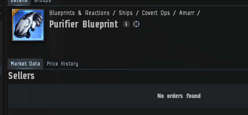
the “Market Data” word is perfectly readable.
the word “No ORDERS FOUND” blurs together (yes its legible, but its not as legible because of the bolding and smaller sizing)
Im actually not worried by the font and shape of the letters per se but the spacing between the rounded curves makes it hard to read, made worse when its bold or linked as it further reduces the spacing between each letter
Obviously I know what the words say in this instance but in a flowing text its a problem when linked, bolded or similar
this is on a 1920 res on a an Asus 27 inch
Yes, overall the font is too thick with too much “bleed” on the edge… and then glitchy spacing and some sub-optimal use of different colour/contrast that fatigues eyes. Good point to point out how the thinner examples are more readable… and that is more in line with the old font  3 main issues seem to be thickness (and the edge bleed of this type), spacing in various applications and the context menu being blatantly mismatched in size
totally agree, and well phrased re the bleed over
For a game labeled sandbox lol pretty bad they force font changes. Why any one would sit down and go yep I know lets force font change it will be a good thing. Thats like me sneaking into the samd pile and painting it all sky blue and purple, vs leaving the paint out for the people to chose what to do with the paint. Now if they put it in as a option and you could change it then its fine, but force changing a font for no reason is beyond me. Also the problem with the font is apparently the person who made it uses 1440 or 4k, because it looks fine at those resoultions, but if you put it to 1080 atleast for me with a cx oled it is blurry and hard to read.
Yeah cos Gary’s Mod and Disney Infinity and Lego Worlds let you change the font when you like… OH WAIT
Someone saw too many memes and thought Impact was the typeface to use in the game.
Eek yeah if this wasn’t tested thoroughly across all resolutions on a few screens and all UI scales and text sizes and not found to be better than the old text, then why release said “improvement”?
@CCP_Convict so ccp_Dopamine refuse to give any awnser to anyone how come we cant get a rollback to the new font change size or anything dosent help your change are hurting your players thought you whanted us to keep playing but it seams more like you dont care about us at all
No idea i never played any of those games. I can say star wars galaxies, eq, and ulitma online always allowed me to change the font.
Yeah sorry, I might have been a bit harsh there.
It should have at least a couple options, youre probably right
I’ll preface my comments with this, I really don’t like this font and neither did I like the one it replaced. Both are difficult to read, the new one being worse than the old. I am 60+.
In saying the above, I notice the new font readability is highly dependent on distance from the eye to the screen. Moving my 3 screen setup a few inches closer makes a significant difference (1440 screen resolution). That makes the font sharper but it doesn’t do anything for other issues. For me, it looks like the font has a shadow blur, resulting in eye strain. If I’m looking at non-text and switch to text, it is difficult getting the text in focus. The focal range is 3 to 6 inches, depending on angle.
In closing, not a fan of either font. But, of the two I’d prefer the older one.
Hyperbole much? This thread has only 112 replies as of now, tiny compared to real rage threads, and many of those replies are even positive on the font. There aren’t going to be more than maybe a handful of unsubs over this lol.
The new font is for blind boomers
Glad I’m not alone. Even set to small it’s gross.
So far sounds worse for those of us without perfect eyesight
Exactly
I have very bad eyesight - short-sighted in one eye, long-sighted in the other. I have cataracts in one eye. I’m also diabetic, which means the actual shape of my eyeballs varies with the amount of sugar in my system - and I still find the new font easier to read than the old one…
Yes on certain settings I am seeing it is better. The fact remains though, that the new one is unsharp across all settings as far as I can test vs the old. I take it you’ve tried all settings? All very subjective isn’t it