So it is now four years later and the standard advice in “English Help” is turn off the new map.

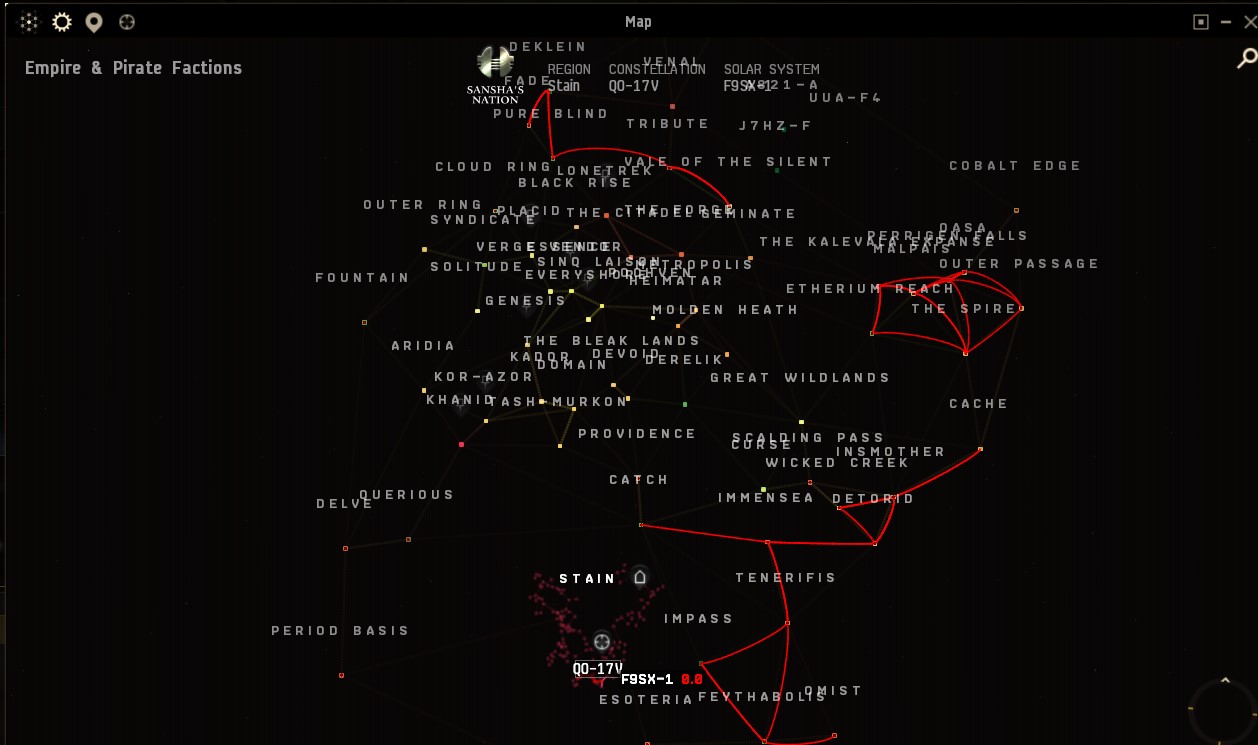
Here is a picture of my “new” map of Stain. As shown in the menu, “All lines” is selected but unlike the picture here, I can’t see them in game. I just see this red trail of my route and that is it. I can barely see the dim red stars on the black background. In the jpeg which has been blown up a bit the lines are more evident, but they need to be evident in game.
I like having the map in a window instead of taking up the entire screen, especially with widescreen, the extra space is a waste.
Please do some QOL adjustments to the windowed map.
- Brighter or bigger “smallest” size stars. I’ve got an HDR monitor and the stars are still dim. This isn’t limited to just the particular color of red But this is the entire map. If I zoom out it doesn’t look like a star map or even a regional line map. The only lines that are apparent are the jump bridges and a bunch of words floating in space.
Screenshot_7|690x408 - Thicker and brighter connecting lines.
Really, if it is too hard to make the “new” windowed map work like the old map, just make it so the old map will work in a window.
Thank you.