Photon UI - Compact Mode on TQ Feedback thread

Hello everyone,

Thank you so much to everyone on the feedback so far on Photon UI and the now released Compact mode which has made it’s way onto TQ.

You can currently find Compact Mode for the following windows:

  • Fleet Window
  • Directional Scanner
  • Probe Scanner
  • Overview
  • Selected Items
  • Locations
  • Watchlist
  • Drones

We would very much like to continue getting your feedback on this so please use this thread to give us your thoughts and experiences with the Compact Mode. If you have any general feedback or ideas you have on Photon UI in general then please consider making a new thread in here so we can give it a thorough read over.

To use Photon UI you need to enable the Feature Preview System. The Feature Preview system can be accessed via the Settings Menu (by pressing ‘Esc’), under the ‘Feature Previews’ tab.

Keep it coming o7

7 Likes

Opened the Photon UI for the first time in some updates and I am already dismayed.

You said that you want more UI clarity and easier to use UI elements. Well:
grafik

This is not easier to use. The button icons are smaller and much harder to recognize than in the existing UI

grafik

So, this is a first fail already.

Compact Mode for Hangar Windows:
grafik

Normal mode:
grafik

Every window manipulation feature is gone. I can’t search, I can’t use the inventory menu, and it’s still not more compact than the existing UI’s hangar windows – which, mind you, even in their compact mode keep UI data display features intact.

That bodes well for the rest of the compacted windows.

Selected Items:
Compact:
grafik

Not Compact:
grafik
Not only is it more compact and compactable than the compact window, it also shows the information in a more compact manner by having it in 1 line instead of 2.

grafik

And it’s both less compact than the old UI, which does not have this unnecessary large empty space between the object icon and the buttons. Plus, if I expand the window in Photon UI, the buttons move further and further away from the icon instead of staying at the icon.

Oh dear.

Drones:

Oh my god is this awful.

Non-compact:
grafik

Compact:
grafik

I see exactly 0.3 more information. WOW!

All the while the existing UI’s drone window in the same window height displays all 5 launched drones.

Watch List:

What the actual hell are you smoking to call this compact mode? Which of the following two pictures is compact mode? Can someone tell me? :slight_smile:
grafik
grafik

Dscan:

Non-compact


Compact

This is the first window where you could arguably say that something got compacted. Although 2 more data rows … Oh well. The huge button with the tiny text remains as issue since day one.

Same goes for Overview. There is some sensible compaction happening there although it’s minuscule.

Plus, why have you made the active tab indicator line so tiny and not adhere to the color pattern when I am not in the window? Sure, you want to make it more obvious which window is active. However, you are forgetting something very important in your UI rework zeal: The overview should not need to be active and focused to tell me easily and precisely which tab I am in. The tiny gray bar under the tab is infinitely less clear and easy to recognize than the lit up tab in the existing UI.

Back to the drawing board.

Locations:

WOW! Just wow. I gain 1 (ONE!) crappy location folder line from enabling compact mode.

Non-compact:

Compact:

Not to mention: Why are the buttons so narrow in this window? Why can we have nice and narrow buttons in this window but LITERALLY NOWHERE ELSE where narrower buttons would make sense, too? Another thing: why are buttons not adhering to the selected color theme in compact mode? Gray tiny buttons squished in the corner of the window are not better, easier to use or an improvement over the existing UI. They make thing worse.

To make matters worse: You moved the Search into its own tab, made it impossible to see where the search field is AND hid all the filters in a context menu button despite having all the space in the world to have them in the front page. Search belongs to the Locations/Contacts tab so that you can quickly see what you are looking for and what the results are. Separating these 2 features creates more clicking and less information clarity. What is wrong with you?

Fleet Window

The window is a trainwreck altogether. Both in compact and in non-compact important information is hidden (fleet name, wing/squad position). The compact mode literally gives 1 or maybe 2 more rows of fleet mates and broadcasts. It could be at least 3 or 4 more if you removed more of the annoying padding.

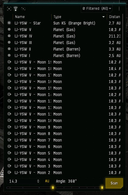
Some more observations with cut of text:

grafik
grafik
grafik

WTF?

Conclusion after this hour of wasted time to prove something I knew beforehand: Don’T you dare to make this trainwreck mandatory any time soon. This is unusable, it makes almost everything worse compared to the existing UI, it requires more work and effort to get the same results and it is much less clear and easy to read than the existing UI. And the compact mode? That is a sad joke. It’s not more compact, it just hides all kinds of information and buttons behind more clicks.

REDNES

30 Likes

Even after a client reset the photon UI doesn’t display mission agents any different than it has in the past. Perhaps I’m doing something wrong but I don’t think so. Any help would be appreciated. Thank you.

The password input box is still mangled, repo join a passworded text chat.
Applying to a corp, input box is still mangled.
Compact inventory is unfit for purpose.

When adding a corp standing the slider moves but has to be moved a second time to select the standing for real.

1080p, 100% UI scaling for the record.

Please return the minimize window where it was and make it so that when returning from some other screen all the chat windows not return on screen back again.

1 Like

I find some of the glow effects to be way too strong and it is uncomfortable to look at. The most glaring examples are the standings icons in chat and the sliders on the d-scan window.

3 Likes

The compact mode is great, and improves usability a lot.
Can we please have it for all windows (especially the chat windows) and can we have a possibility to enable it everywhere by default, please?

1 Like

Ahoy!
Trying for the first time today and while in general things look good two things jump right out at me:
The “selected item” window feels unresponsive due to lack of feedback - i.e. when I push the button the icon doesn’t react/push in at all
Having the D-scan angle and distance selections next to each other rather than stacked on top feels really unintuitive and is playing merry hell with mine and my comrades muscle memory !

1 Like

I used it for awhile when it was a preview and i had no issues with it, however right now i have the problems that the entire array of icons get mixed up using alt tabbing and abyssal space , faction icons instead of station icons for example very anoying and turned it off now that its fully released.

Chat channels are still to big for beeing usable, with the photon UI I only can see 4 chats instead of the 18 I am used to and that I do need.

1 Like

Yeah this is where my first “Oh no” moment happened. The buttons are TOO SMALL! I use that window a lot and I do not to misclick more often than I already do CCP.

Whoever is in charge of Photon needs to make it a number one priority to not be reducing the interactable portions of the UI…because thats the most important part of UI, it’s a user interface and if I have worse interfacing than before then how pretty or modern it appears to look is pointless.

2 Likes

Can we please have constant borders around the windows, When I have 5 windows open and overlapping and only the current one is bordered the rest mix together and I cant tell where one ends and another begins.

Would be even nicer if we could color code the borders for each window.

Maybe we can do this already and I’m just not sure how?

Also can you please flash the whole tab for chat windows when a new message appears. with 10 windows open the little bar under the tab that flashes is not big/noticeable enough IMO.

1 Like

Holy moly that selected item window can really get tiny I like it thanks.

Quite a lot of good work, but a few issues…

A bug mostly, but not entirely, deactivating the purchase button in loyalty point stores as the information tooltip displays quickly (Windows 10 desktop), has no timeout, and then blocks the button in the loyalty point store from becoming active. With considerable effort, it is still possible, however, to use the workaround to beat the timings and click the purchase button before the information tooltip displays.

Duplicate of the Bug Report

Overall, it is easier to read than before, but some suggestions for improvement are listed.

1.Can we please have constant borders around the window and item and list.
Any boundaries are very confusing.

2.The outer frame is very large. I would like to see a minimise indicator on the chat window as well as on some parts of it.

3.Reverse the list of scan signatures and the map of the solar map. Similar to the previous changes made but very inoperative.

Transparency-- I Disable my window blur and make sure I slide the transparency bar to have it turned off only to find out when i am in game it is not how i set it.

In order to have this not be transparent i need to click on a pile of windows, and my overviews to turn off this light background that i have disabled in my settings…

I need to do this on every character and account i have, this is the most irritating thing i have found in this game in years.

Pls fix this. thx

Compact inventory windows R E A L L Y need a way to switch between the main inventory and any containers within said inventory space:

“Active Ship”, including an ammo container holding my pristine crystals

activeship

Ammo container within “Active Ship”

ammo

The non-compact inventory is borderline unusable for small windows, so that isn’t an option either.

I also feel that stuff like wrecks or containers in space should be compact by default.

Edit: Also an ability to close the window.

3 Likes

I tried to and turned it right back its nice but to clunky no enough time spent on the details like boxes and tabs are way to big text is ok but gaps are an issue and double spaces and larger setence gaps are very in your face. E.G. names in locals list right side all I see now is a few letters but the big blue yellow grey icons are massive the station menu apon docking is hard to look at its massive and there is no defind buttons. Seems like they where going for modernizing the look and came up with a way to white wash everything. Its very tacky. Colors love them design needs work.

Still not as good as the current UI yet, but it’s a lot better than it was with the introduction of compact modes for certain windows.

For windows using the newer style like the AIR Career Program window have them open as floating by default and not as full screen.

UI colors is another thing that needs to be brought up to the current UIs available choices. Photon is currently dark windows with only colored highlights. Compared to the current UI where the entire UI can be something other than black. Personally I like set my combat pilots UIs to different colors so I know which one I’m looking at with a quick glance, it really helps when you’re running a lot of game clients and especially when you’re running multiple clients flying the same ship.

The compact mode for the fleet window is buggy and appears to revert back to non-compact mode after leaving a fleet, until you click on it.

The hanger window is clunky, if your items are in icon form you can not click and drag from the left or top of the hanger window to select multiple items. There’s plenty of space that could be used to slightly expand the hanger window to fix that, without making the windows any bigger.

When adjusting market prices you can’t just hit enter to update the price and have to click okay.

There are actually quite a few areas where the current UI has a very clear distinction between areas of a window whereas Photon doesn’t. For instance the market window could use a better outline around the sells and buys areas similar to the current UI. The sell portion could be improved, currently there’s enough wasted space between it and the buy area that could easily hold one or two more lines of sell orders.

The character window is still trash, has been trash since it was introduced, and will be trash until I can hide the 3D character model without docking it into another window, which is over a third of the total window width. The arrow on the 3D character model should hide the 3D character model, not the actually useful part of the window. Literally, just reverse which part of the window clicking the arrow hides and the window is mostly fixed, although it still looks pretty bad on the current UI.

I don’t need to see my 3D character model basically ever and the information on that portion of the window ranges from redundant (DOB, home station, SP) to entirely useless (net worth), with the exception of security status which is only shown there I think.

2 Likes