The Photon UI team is excited to introduce a long-awaited feature: Multiple Overviews.
This is currently on the Singularity test server, and can be enabled by hitting escape, navigating to Feature Previews, and then enabling “Multiple Overviews”.
As with Photon UI, we would appreciate any feedback you have on this feature. If you have any general feedback or ideas you have on Photon UI in general then please consider making a new thread in the appropriate section so we can better see it.
Looks like my old custom overview filters have survived the transition but they are being arranged seemingly at random in the selection list, they were alphabetized before.
As a person who’s been running their own overview for 10 years, and someone who’s colorblind, this update was made for me.
These are very clear which is null, which is high, and which is low now. Thank you.
FD-MLJ to Jita for instance, very easy to see when i start to get out of low into 0.8 space.
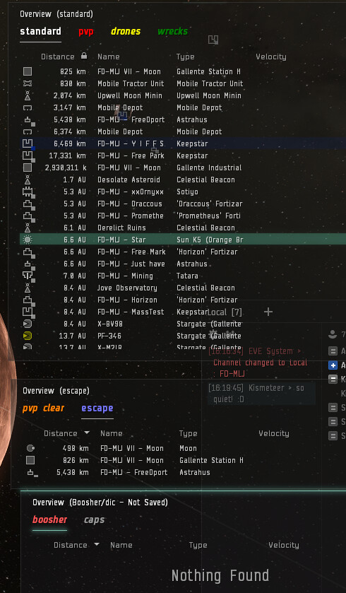
Multi overview just allows you to move tabs into their own window, and I suspect this is how i’ll run my overview going forward. This way, I can easily see the escape point, see what important ships are on grid, or switch to caps or a nearly empty overview to catch things on gates. Bravo, really happy with this implementation. Wish we had +1 more overview tab but i think that will never be enough as well.
The renaming of the tabs is a great addition. ‘overview tabs’ to 'tabs, and ‘tab presets’ to ‘filters’. I see columns editing has gone away though, did they get moved somewhere else, I can’t right click on columns to add them, which would be the sensible change.
Had not noticed the ‘has kill right’ has an icon, really nice
For vets, these things are all positive other than the column editing disappearing.
Can I request we get a button the ‘history’ tab to revert back to the new default instead of the awkward way you have it now? Maybe at the bottom ‘reset to Z-S default (NOW GOOD)’ or something.
edit: found ‘reset all settings’ in ‘misc’. All three of those buttons should be in ‘history’, I think, rather than ‘misc’.
With multiple windows and tabs it “feels” like the overview settings window defaults to selecting the wrong filter (sometimes). Here is a scenario:
Window A, Tab N, Filter X
Window B, Tab O, Filter Y
Window C, Tab P, Filter Z
Click Tab N, Click Window B “Open Overview Settings”. Selected Filter is from Window A/Tab N. Expected Selected Tab/Filter from from Window B
Click Tab N, Click Window B but not Tab O, Click Window B “Open Overview Settings”. Selected Filter is from Window A/Tab N. Expected Tab/Filter from Window B
As someone who will quickly deselect all visible states, and then selects the one or two things I’m looking for I don’t want to accidentally clear an overview, especially in a fight or key moment. A history could mitigate that if clicking _Revert _ didn’t also revert all unsaved changes from past edits.
Now that I figured out dscan isn’t totally broken, and it’s just a render issue that requires a resize, I would add the same feedback above applies to dscan as well. You (shouldn’t) need to click the actual tab for the setting to take effect. Thanks!
I suppose an alternative would be to only underline the ‘tab’ that is applying the active filter to the dscan. This way at least you can glance to make sure the correct filter is applied to dscan without needing to click. Or it can have an icon, or something. Edit: this option of only underlining one tab makes less sense when I add more tabs to other overview windows.
Are you seriously trying to claim you can easily see the difference between lowsec and nullsec in the picture above? Unlike you, I am not colorblind, I am a graphic designer working on expensive and perfectly color calibrated panel and the difference is miniscule.
Colors #721F1F (0.0 nullsec) and #901A1C (0.1 lowsec) might look different in their hex representation, but they actually differ only 0% in hue (which idiot though this is a good idea?), 12% in saturation and 5% lightness, which is significantly below industry standard accessibility recommendations.
If you cant tell, the blue arrow points to a column with nullsec, lowsec, nullsec, lowsec and highsec systems (from top to bottom). This is not cherrypicked route, unlike yours. It actually has lowsec and nullsec systems next to each other, and mirrors the reality of the map topoly, where absolute majority of nullsec and hisec is separated by lowsec with very small security difference and thus small color difference.
How hard is it to use 3 different color palettes that do not overlap nor closely neighbor each other, like this one?
The nearly indistinguishable colours between 0.1 and Null sec have been an issue for over a year now, ever since CCP screwed up the color rectangle in contracts. Good to see that this has not been fixed in Photon either.
Do comments on the regular Photon UI go here as well? There doesn’t seem to be a better, consolidated place for the version that is on TQ.
In the conversion we’ve lost the ability to search the fleet finder while in a fleet. If you want to go from fleet 1 to fleet 2, you have to drop fleet to see what your options are. That was a great QoL change that was added relatively recently in the old UI; it is a shame to see it disappear.
Losing the search window in compact mode in the inventory its a real drag. Can the search box come back, maybe in the header panel where it says ‘Inventory’ ?
I mean good you fix stuff as player wants but can you share a way that will prevent the rest of the opt out?
Like if I would safe the Char settings data.
Then do the 13th patch which will opt in me again.
Can I then just copy back the old settings file and be happy or does it take me another day to fix my overviews?
Would be nice if there is a way.
Note: it slowly starts to annoy if it resets all stuff for something i don’t know if it works now.
A roll back for the pre opt in settings would be dope to test things.
Would be dope to have an ingame way to feature multiple screens for one account, for those who don’t have an ultra wide it’d be dope to have a lot of windows open, but also being able to actually see into space
(Cuz probe scan dscan overview drone windows fleet chat corp chat 2 intel chat alliance chat inventory targets watch list … on a small screen… its just a pain, and you can’t just close the windows…)
Right-clicking and selecting Overview visibility for ‘X’ → Remove from ‘N’ tab will remove from all tabs that happen to share the overview filter.
I don’t imagine I’d use the same overview on multiple tabs, but I often select a default ‘known filter’ as the starting point to create new views. From Tab 1 (PVP Filter) switch to Tab 2, apply PVP Filter, and remove frigs and stations (because Amamake). This will remove stations and frigs from Tab 1 also when I only want to edit Tab 2.
What Toxic Isogen said is 100% spot on. Also, In 2019 I stood in London with my better half and talked to Hilmar about how poor the UI is for those who have visual impairments. The ability to make use of colour to help people with things like meares irlen syndrome or those that suffer from certain light sensitivities would help massively.
Please consider allowing users to change the background colour of text boxes properly or adjust other colour elements to help make the game more accessible for everyone.
Please, for the love of God and all that is holy, DO NOT DO THIS.
It took me DAYS to re-set my classic UI again after the last time you forced this on people because when you force the change, it breaks the stored layout for the classic UI.
If you could make the UI a per-character setting, I think more people would test it. Give control to the players, and they’ll be more helpful. Force them into changes they dislike (and have already made clear they dislike it), and you’ll only annoy them further.
It’s this sort of thing that means you should NOT be forcing the new UI on people. It was the same with drones when the new UI was first forced into opt-out.
If you need more people to test the UI, then find ways to make it more compelling. Shoving it down out throats when it’s clearly not finished is just not right.
Another actual expert who has looked at what CCP have done and is thinking “wtaf?”. It’s a worrying trend…
If I could get past the glaringly obvious issue of wasted space that every man and his dog has been barking about, I might be inclined to give it a try. It’s hard to get in depth feedback if people are turning away at the gate and not even exploring the new interface. I don’t think repeatedly forcing it on a wider audience is the answer. Fix the obvious so people can see past it. Thanks for the heads up this time, so I can backup my settings.
A full re-skin… settings for window margin size… Compact Mode…
Ok, maybe I was quick to judge. I’ll give it a go. I sure hope Compact means compact, not show less and remove functions…
First impressions, seems less wasteful. Margins don’t offer a lot of options but it seems tolerable on a laptop screen now. Compact mode is still useless in that it removes info and functionality, but normal is looking better anyway. One thing I notice, locations in system has a single column and header row which takes up a lot of space (for a small window), and no Compact Mode. Ok, this is worth spending a bit more time exploring…
If I stack multiple overview windows together and minimize that window, it disappears.
It would be nice to have some kind of visual indicator for currently active tab in case of deselected multiple overview windows. For dscan active tab filtering.
Selecting an overview window containing a preset and selecting a preset itself is a different thing. Good but can be confusing?
Toggle option to choose which overview window will dictate bracket filtering.
Great qol would be drag and drop tabs from/to different overview windows.
Updated Scrollbar - The scrollbar in Photon UI is now static and no longer expands and collapses when hovering over it.
This is one of the best parts, by far. UI developers who make scroll bars that only expand when you’re hovering over them are seriously confused about what the user wants.