I am not a fan of the Photon UI. The neon flashing colors of where the curser is for text is very distracting. The brighter colors on buttons and tabs are not really helpful. Overall, this feels very distracting. Also does not seem scale one bit with any UI settings. It seems it was designed for a user using a tablet. Overall, I hate this Photon UI and I find it very ugly and not very aesthetic pleasing. The script seems too harsh to me. I prefer something softer like Ariel script.
4 Likes
■■■■■■ up your interface became impossible to play
3 Likes
Hit escape in the client, go to the “Feature Previews” tab, turn it off, restart client.
3 Likes
It’s a terrible UI - it now actually hurts my eyes to use. I’ve “opted out” - this better be available after the beta or I’ll be gone as my eyes are more valuable to me.
9 Likes
Thank you - just need to restart and hope I can still see
2 Likes
I will try to explain in simple terms!
Eve online is a game where you handle a lot of information and often you are doing multiple things at the same time. Which means we use a lot of screen “real estate” and with these transparent borders it’s simply waste of space. People in game have been perfecting overview settings for years, and you guys never even tried to include them in a game.
I don’t wanna be rude but sometimes I feel like people who are working on this game doesn’t even play it. Eve players have never been people who where here for shiny new Apple looking UI, That’s Overwatch and Fortnight.
Summary:
- Screen Real-estate is bad in Photon UI
- Contrast of the colors are to weird for “unavailable” icons and “available” ones
- Wasted time and money on something no one asked for. While you could have made something we all need and ask for. Like website with maps like there was old “Eve-maps” of at least market kind website with included “appraisal” system.
Plus esthetically it’s downgrade, but I guess that is personal taste.
16 Likes
We were notified about a year ago, and again blatantly at Fanfest, and again in updates since then. We are now in the final stages before it becomes the norm. If you cared, you waited a long time to speak up since this is your first time posting.
A general recommendation to all, instead of naysaying the inevitable (and from a design point of view a general move forward), this is a great opportunity to give input and help shape the future of your EVE.
If you just want to sit by and whine while contribute nothing, make a different Post for it and stop cluttering this one.
I personally made an effort to try out Photon over the last many months, I had a lot of conflict with the original design (and still do), but after input many positive changes have been made, and it is at least a lot more do-able. I am sure that after more constructive feedback the team will fine-tune Photon to be the gem it has potential to be.
I opted out because I could not stand the huge drone status bars glaring at me from the corner of my screen. I certainly don’t need those to be the brightest things in the hud.
7 Likes
- Alright, what y’all here are callin’ “Compact Mode” needs to be the default, and you need to make a real compact mode that is actually compact. At the very least could we get a “Compact EVERYTHING!” option? Why so much empty, wasted space?
- One of my mantras for new players is “When in doubt, right-click.” I’ve noticed that a lot of the right-click drop down menus have been removed and now we have to hunt down the little buttons for stuff. Not good.
- The Agency and AIR Career Program windows aren’t taking as long to load at least, but they and the new skill window were their own prime examples of the problems plaguing Photon UI as a whole.
- Recover Active Probes button has been shrunk dramatically (and moved to the opposite corner of the probe window, took me a bit to find it). That’s going to be a pain when trying to pull my combat probes before a target sees them. Meanwhile the buttons I don’t need to use on a moment’s notice have been made enormous to the point of displacing the range slider.
- Seriously, just scrap this Photon thing and give us non-photon versions of Agency, AIR Career Program, and Skills windows.
13 Likes
It costs CCP nothing to leave the current UI as an option. All the resources and coding are already there. Just give us an opt-out like they did with being able to go back to the old-style galaxy map…
13 Likes
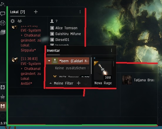
One thing, wats maby posible to make:
Tu pin a window to anotherone. Like chat, overview, or cargo.
I have the problem at swiching between Full size client windo and “normal” window mod.
Here i pin my Cargo to 2 Chatwindows:

so it looks like this:
But afte size Chanche of the client window, the UI windows stay
pined to the Neocom sidebare or the client sideline, but not to another UI window.
I’ve opted out already. I’m new, and I just started learning the normal UI, and the new UI is slower to load and as far as I can tell from conversations with other users and my limited experience using it, only removes utility instead of adding anything of value in exchange for being less responsive.
Of particular note, as a point many people have mentioned in rookie help channels while discussing gameplay and how to work with the new UI, the “people and places” menu from the old UI is just “people” in photon, and can’t be used to easily access saved locations. This removes useful functionality from a frequently-used shortcut many players are not just familiar with, but are learning the value of very early from helpful experienced players. There’s no good reason to be removing utility from an interface element like this.
If this isn’t going to be changed, I sincerely hope that the ability to opt out of the new UI remains permanent. And what I’m mentioning here is far less problematic than the consistently-repeated “why are you putting a mobile game interface into a PC game?” feedback you’re getting. This is a mess, and it’s not improving things - it’s an active DOWNGRADE of the experience.
I’d honestly rather you EITHER scrap the photon UI completely, OR add it as a secondary permanent “opt-in” setting which users can optionally choose to replace the DEFAULT setting of keeping the current UI. I’m fully expecting that not to happen, because everyone is jumping on the “make it look like it’s designed for cellphones” thing these days, in spite of feedback that it’s utterly stupid to be doing that for PC. I’ve literally changed to another bank over this kind of screw-up in the past. Don’t think I won’t quit something that’s just a piece of entertainment over the same kind of stupid.
I was gearing up to buy a starter pack (tossing up between gold and silver) when the update hit. Now, I’m waiting to see what happens with the photon UI before I make ANY decision that involves paying for EVE. Thanks for saving me some money, I guess? But seriously, fix this mess before rolling it out any further. Maybe even do an off-schedule update and roll it back TOMORROW instead of waiting the full week?
6 Likes
After being surprised by this “”““feature””“” on thunderdome a week ago, I immediately opted out. I value the small amount of real-estate I do have on my screen.
The partial statement in the patch notes "You can still opt out for now" is quite worrisome for me.
I left EVE for 8 1/2 years back in late 2013 due to CCP Fozzie’s decision to change the ship model of my favorite ship. Think what I may do if ya’ll phuq with how I actually interact with the game…
Do NOT remove the opt-out option, period!
5 Likes
I’ve been using Photon UI for a while now and I think it’s a big improvement on the old UI….but it does waste space in some areas - I still find the Drone Window has to be larger than with the old UI.
1 Like
i dislike the new ui as a whole please leave an option to use the old UI like the old map
7 Likes
The fonts are massive at random and it’s horrible
6 Likes
Thankfully, opting out on one account opted out for all of them. I really wasn’t looking forward to opting out and restarting on 75 toons…
2 Likes
comparing the photon ui with old ui:
- dscan shows 10 instead of 12 items
- probe scanner shows 5 instead of 7 items
- locations shows 3 instead of 4 items
- watchlist shows 13 instead of 15 items
All with compact mode. I will not switch until it is as compact as old one.
3 Likes
Takes up to much space …
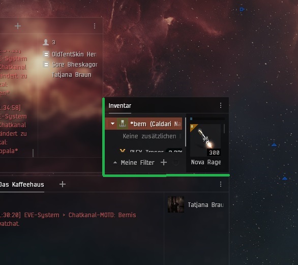
I have lost column space in my over view. And chat channels take up to much space, I see less ppl in local in busy systems.
It looks cheep makes the game look like its made for a Nintendo Switch… Please keep the opt out for us that don’t like it…
8 Likes
HI, the NEW UI is far too bulky in its appearance, the spacing in the overview is terrible too, the previous UI we had gave you everything spaced vertically as it should be the new UI throws spaces underneath everything, the window borders are clunky and unnecessary too, this might be ok in eve echoes but when you become used to eve and the way it was, the UI was far more superior.
The other problem is, when you receive the update its set to ‘auto on’ without giving the player the option to turn it on, this should be made as an option when you log in rather throwing players directly into the new UI, there are going to be alot of players like myself that just don’t like it.
my 2 cents
7 Likes