The “information” could be extracted via the ESI API and tooled up for lists and tables that way.
I think the general design is quite nice.
The font is readable really well.
My critique points are: The sice of îcons on the top part of open tabs are too big for my liking, and dont seem to scale. Also the old modules disappear when the mouse is not over them, wich I like a lot.
Also compared to the classic theme the disign makes it harder to find things. As the old one has underlying color markings and parting lines between important parts of the window.
vs.
That makes the contents of the tab a bit confusing.
CCP should make this PhotonUI a desktop theme and people can download it as a theming pack, it would then be hard to tell the difference between game and desktop.
Looking back at my post on the SiSi thread I’m happy to say that a lot of the things I noticed then have since been fixed! Similar to last time I’m using maximum graphics settings, the Caldari Color Style, and Small Font Size on a 1080p screen Let’s re-evaluate:
The Good
-
Padding - Now much more under control which has made everything feel a lot more usable.
-
Title Bars - These look to be gone or improved depending on the window.
-
Overview - Still looks great! And now we look to have the overview settings button back.
-
Right-Click Menus - Still good, could maybe still use a bit less padding.
-
Style Mismatch Fix - Whatever was going on with those accordion-style dropdowns seems to have been fixed, the style now looks more uniform where these elements are present.
-
The Wallet - Goodbye Sidebar, hello top menu bar. Love it!
-
Assets Window - Still looks awesome and feels less buggy than it did before.
The Neutral
- Window Backgrounds - As before the film-grain and dot-matrix pattern on windows are going to depend on personal preference, I still personally like them.
The Bad
-
Skills Page - I definitely noticed a few slight improvements, but more still needs to be done. Reduce the height of the buttons next to each skill to further condense things. The elements within the Skill Plans section need to be much, much smaller.
-
Neocom Minimum Size - Would definitely still like for this to be able to go a bit smaller.
-
Button Heights - Significant improvements have been made since the SiSi version (especially within the most used windows), but there’s still many places where these don’t need to be as big as they are.
- Show-Info Menus
- The Market Window
- Member Details Window
- The Multi-Buy Window
- PI Extractor Control Windows
- Mining Ledger Window
- Fitting Window
- Fitting Management Window
- Chat Channels Window
- Calendar
- Notepad
- Settings Window
Bugs
-
Window Transparency - This no longer seems to function without Window Blur enabled. When it is enabled, still looks great!
-
Project Discovery - There’s still some overlap problems between the border and the main window contents; the contents seem to have a fixed style while the border follows the new UI style.
-
Possible Performance Bottleneck - I’m experiencing momentary hangs every once in awhile in space. The client will freeze up for maybe 1/4 to 1/2 second (registers as an FPS Drop to 1-2) before returning to normal. Possibly when a pod explodes or self-destructs? This doesn’t seem to correspond with any hardware limitation on my end, as during the events my CPU Utilization, GPU Utilization, RAM Usage, and VRAM Usage never look to exceed about 60%.
-
Element Intersections - Places where elements intersect with eachother:
- Fitting Window - A lot is getting overlapped by the circular fitting interface.
- The Agency - Planetary Industry Window (Bottom right two buttons)
- People & Places Window - Contacts Tab
- Mail Window - The Mail Counter is cut off by the Next button.
- Corporation Window - NPC Standings, Corporate Contacts, and Alliance Contacts Tabs
- Calendar - Upcoming / Latest Events list.
2 Likes
Pretty minor, but toggling any of the options in Wallet, Settings has no effect. Upon closing the Wallet and opening it again the settings revert back to the original values. The “Suppress if balance change under:” option is the only one that actually does remember the change state after closing and opening the Wallet.
Otherwise, pretty happy with the UI changes overall (using a 1440p monitor though so I haven’t really paid attention to whitespace and margins and whatnot.)
Visually, this interface looks good. But there are too many graphic bugs at the moment to use it properly :
- Many buttons are covering important information of their window.
- The visual don’t allow to show as many information as before, because of the font size, for example.
- To try fitting as many windows as before in the same space, I tried to reduce the interface scale to 90 %, but the graphic issues are too problematic.
- I understand that it can be interesting, for a compagny, to uniformize the interface of a game and, doing so, to ensure a visual signature for the game. But I’m absolutely not impress by the limitations of this UI. The fact that many windows aren’t resizable is really annoying for me. It would be great to be able to adjust font size, and not only in the chat windows, but for each windows title, the overview, etc.
I’m going back to the regular IU.
1 Like
Don’t worry, it’s coming to RL as soon as people figure out a reasonably stylish set of AR glasses/sunglasses.
1 Like
We kinda do. Good UI/UX design isn’t just about presenting the maximum information in the most efficient way, but presenting it in the way that best balances efficiency and intuitive accessibility. You can efficiently present a ton of information, but if the user has to spend a lot of time and effort just trying to find it, or understand it, efficient presentation becomes inefficient utilization. After all, the most efficient way to present a lot of information would be to overlay a 3-D spatial map of the area with full-screen spreadsheets of data on everything being seen… but despite being presented efficiently, it’d be a nightmare to use without a lot of time spent training the user’s brain to understand that presentation.
Instead, it’s usually better to present a bit less information in somewhat more stylized, less-efficient ways, if you can make it so that the user can more intuitively grasp and make use of the information they get—including ways to quickly access more information.
2 Likes
hate the padding I feel like I am losing loads of screen space to needless padding, could you possibly make the padding variable controlled in the main options, then we can set it down to zero and never have to worry about it again, or those with super gen pc’s and super huge monitors can increase it to suit.
1 Like
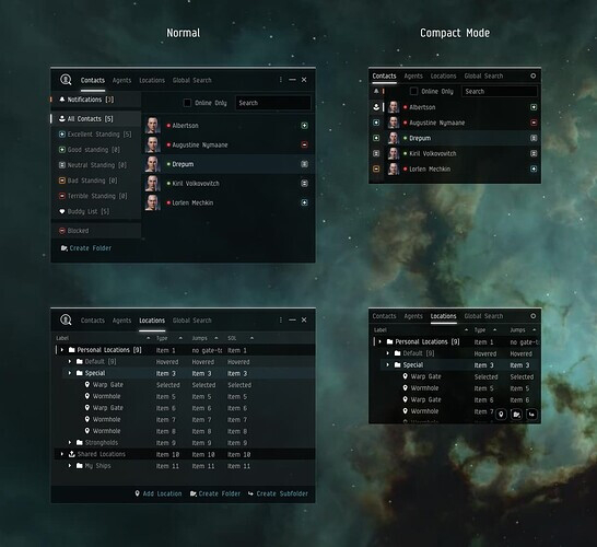
Coming from the Compact Mode topic: Why do you turn the standing tags into these extremely hard to recognize and distinguishable empty icons with washed out borders? In this picture it is really hard to differentiate between Excellent, Good and Neutral standing. It makes no sense at all to turn these tags into empty border style icons when everything else in the UI is solid, filled (buttons, other icons, tabs, rows, you name it).

Can we have UI layout “profiles” so we can switch between window placements from profile setting slots? Also with export/import options.
Also can we have a show all / hide all windows like a desktop or “cinema” mode perhaps?
2 Likes
Oh my god, if I could fully overhaul my UI depending on which ship/job I’m jumping into…
1 Like
Oh and hey, @CCP_Paragon : please please please more watchlist slots.
1 Like
I like everything! It has become more beautiful, cozier and more comfortable too!
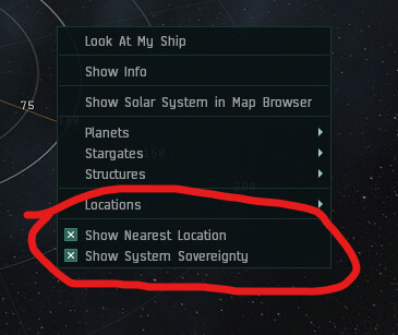
Do i really need to see this everytime i rightclick in space?
2 Likes
They need to remove right click and have more buttons.
You don’t see right clicking on Star Trek, you see flashy lights and knobs.

- The blue “active window” thing is too bright compared to the rest. way too bright.
- missing delimiters are not design, they are just stupid. Same in the settings menu. it looks like ■■■■ when you have things that are grouped, without any visual grouping. DONT DO THAT. It’s bad design. and just because google does it, does not make it good. If they change their mind again in the next android version, or whatever, your UI will just look stupid and dated.
- This takes more space than before, but you can make it smaller than before. not great.
same here btw. grouped ui elements without being visually grouped. bad.
Top bar, search bar and volume display, actual content, bottom sum bar, everything becomes one soup without visual seperation in some way. DO NOT DO THAT. See above.
2 Likes
Nice game killing…in only 2 years…just take an eye on the falling number of players…last 3 months are so great ! Bye bye Eve that was a nice experience, specially from 2010 to 2014.