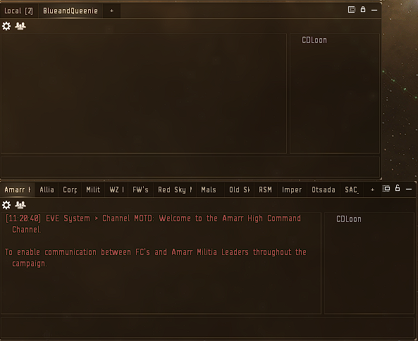
1: the font size on some title bars don’t follow the chosen font size selected, as can be seen in the screenshot
2: Some title bars take up way to much space
3: The borders of the windows should be slightly more prominent with an really light alternate color from the rest of the windows, so it’s more visible where a border ends
3 Likes
Hello ![]()
After all that Feedbacks: When will be the implementation/update according to them? ![]()
Or will there be an information about upcoming changes? ![]()
1 Like
there is too much wrong with photon ui.
EVE is a game about windows, a game about many windows, and the less space the windows take up, the more comfortable it is to play. In the new interface, window headers and buttons take up too much space, the part of the window with useful information is too small. The second disadvantage is that the colors are too bright, after 15 minutes of using the new interface hurts my eyes.
4 Likes

I tried out the Photon UI. I found it disappointing. The symbols next to the player names in chat are too large. Everything was too large. Except for the undock button which was fine before. I’ve reverted to the current UI.
Pick an existing UI in game and make all of it the same. Give us the option to keep the current UI.
2 Likes
I think it looks really nice. However in dscan window the range is hidden inside the box, it doesnt fit fully in.
Then for example the market window, the title area with the “Citadel Marketplace” was really large. That could be thinner.
In short, there’s lots of things that take a bit too much space than they should, from buttons to titlebars. But you’re on the right track I think.
Please reduce the padded borders of windows by like 90%.
Edit: or a 100%
1 Like
As requested.
Thanks.
CD
4 Likes
Would’ve been nice if they’d fix the blinking too ![]()
1 Like
No, it does not. EVE definitely does not need more UI bogus like the ESS grid UI. This crap is so obtrusive and frustrating to use, and it’s only one single UI element. Imagine hundreds or thousands of these floating elements instead of a neat, clean, tidy list of things.

1 Like
As shown in the screenshot, iam using minimized and anchored windows at the top
these windows open up, as soon as I undock, and also when I close a UI element in fullscreen, such as the map.
I dont know if thats specific to the photon UI, but i wanted to drop that annoyance here nonetheless.

1 Like
Why can we jump back into the SAME clone we are currently in? Why can we destroy the same clone we are currently in?
Something wrong with the button states? Shouldn’t the active clone be disabled jump/destroy buttons?
1 Like
I have tried the new UI and I find the style a little jarring.
It seems harder to customise in stations and the large buttons for closing, resizing etc very much get in the way, visually.
Larger icons for cargo would be appreciated but larger resizing buttons contribute nothing. On the whole the older one seems a lot more user-friendly.
2 Likes
I agree the Board my Corvette button is way too large
1 Like
also we need some borders and different colors around stuff in windows, currently its not very readable
2 Likes
Was Eve ever readable?
- Transparency slider has no effect anymore.
- Chat blink isn’t working
Hell no. All those fancy 3D approaches have information density of modern mobile phone (i.e. approaching zero).
Eve is game about information, presenting it in the most efficient way, processing it in the most efficient way, making decisions on it and so on. We don’t need any “modern” BS UI!
1 Like
It is not. I get the same with the current UI. Annoying as hell when doing PI.