No transparency on the new UI without motion blur enabled and no UI/HUD icons behind motion blurred windows. Fix either and I’m happy.
The PVP Button (labeled as “Undock”) should be bigger than the “Board my Corvette” Button - throws me off every time I want to undock.
3 Likes
Hi, my feedback:
- Please make control buttons for windows smaller (close window, minimize, more options and all that), ideally let me have only the more options thingy (three dots button). It really is annoying when you are trying to make your UI as compact as possible and you have this giant unresizable buttons on all windows.
- A bit less padding to make things more compact.
- Let us CLOSE alliance and corp chat finally, pretty please?
Overall not too bad, but please remember that we are playing space Excel and most of us have 16 clients open on one screen (or just using small laptop screen). Try to make things as compact as possible when you can.
King regards,
Billy Bob Bobby
Activated. Realized that window controls, tab header text and more simply does not fit / is overproportional large. Rated as crappy ■■■■ not tested, nor revised by a UX expert. Dont let the intern do stuff. Revert to old layout. Peace.
5 Likes
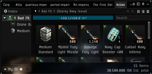
I like the look of the photon ui but some of the padding on windows seems just too much and obstructs what used to be useful area. Take my active ship window for example; which I use to see what is in my cargo, take drugs while in space, move ammo/cap boosters around in combat.
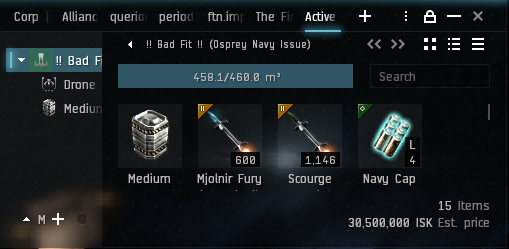
As you can see in the screenshots below, as it is now I can see up to 10 items at once. With the new ui this is reduced to basically 4. Firstly it only allows for 4 items to be shown on a line instead of 5, and secondly I can only see one line of items at a time. The padding is so much that even scrolling so that you are between two lines of items, shows so little of each line it’s hard to interact with all 8 items shown.
On normal ui:
On photon ui:
5 Likes
Initially it feels… ok. Some of the buttons are definitely the wrong size though. New Folder and New Note in the notepad feel way too big, Board my Corvette is far too big compared to View Outside/Take Control/Undock. Some of the lines inside chat windows feel a little faint and should be more defined imo. And while it might just be me, I’m seeing a lot of grain or noise in the UI but the UI only. The padding/sizing of items inside the UI is a little large too. As well as the aforementioned, some things overlap or just don’t fit. My filters for my inventory for example.
This please. I do rely on the old UI heavily.
100% agree w/Guy’s statements. For example:

Undock was specifically made larger in the old UI to make it easier to find. For people who are used to that UI, ‘Board my Corvette’ now sits exactly where ‘Undock’ used to, real-estate-wise, and is the largest button there.
Next: the Fleet Window.

The window and the window frame overwrite one another, especially where buttons and the ‘only show…’ checkbox frame are concerned.
Finally, issues of… well, girth. Starting in the fleet window, but also the chat windows…

A) Does the dropdown need to be on a separate line from the word ‘Filters’, given that there’s literally nothing that will ever appear between ‘Filters’ and the ‘Clear History’ button? And does it need to have such a buffer around the drop-down itself?
On a related note: does the ‘Clear History’ button need to be so large? It’s bright. It’s easy to see. I totally get the idea of having big buttons on things like ‘Undock’ etc while you’re docked up. ‘Clear History’, though, is something that will be on-screen during fights—which is often when screen real estate is at a premium.
Why is there a border twice as thick as the expanded/mouseover’d scrollbar on the outside of it? Removing 75% of that border would let the scrollbar be expanded all the time and still give you more room inside the window.
Every pixel you take up with borders or padding is space the UI could be using to deliver information in a clear way. Dropdowns exist so you can filter what information you present. Padding the size of the dropdown border doesn’t present the information more clearly, it just means the information itself has less space in which to be presented. Making the button to clear history bigger doesn’t help you present the information, it just means the history items themselves have less space. Making window borders thicker doesn’t help offset them from the background, it only takes up space that the information in the windows could have used.
I really want to like the new UI. The presentation’s a lot cleaner in the broad strokes. But the Interface needs to get out of the way of the things the interface is trying to present to the player.
1 Like
The most prominent issue for me in the new UI is an outrageous amount of vertical screen space wasted. Seriously, what is this (mission journal as a prominent example)?
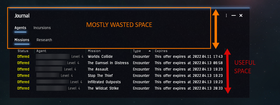
2 Likes
Bringing together both the issue with the ‘Filters’ dropdown in the fleet window, and the ‘Wasted vertical space’…

Nothing ever fills between the ‘[Region] Regional Market’ title and the ‘more / minimize / close’ buttons. Can we maybe move the ‘New Eden Store’ ‘Market Orders’ and ‘Multibuy’ buttons up into that space?
Heck…

Do we really need to be told there are ‘Repair Facilities’ in the ‘Repairshop’ window? With a totally separate header item? Can’t we just get the header, you know, once?
5 Likes
Please check the jump clone buttons states (jump, rename, destroy), see anything odd?
Same as everybody else - pretty but taking way too much screen space and therefore not efficient. Given how much stuff we need to display on screen… this is a big no no for PVP. But if that is fixed, then I would give it another try.
Also, people are already undocking less and less, please don’t make the Undock button smaller… unless you want to make this game “Station Online”.
3 Likes
really unnecessary
It’s ugly as sin, much like all the other new windows. Everything is too fat and opaque. I hate it.
Running it on one account to compare with classic UI.
Generally like the changes.
I really like the yellow highlight marker on the tabs–very much appreciated for these tired aging eyes (color tab overview with yellow marker is nice!).
Like the standardization between all the boxes.
Things I think could use improvement.
Rather than minimum width for a box with tabs, it just makes tabs disappear altogether-- I’d actually prefer a proportional reduction to total width but with all tabs still showing–even if very narrow (a couple of letters).
The undock icons are a bit odd, the most often used is probably the Undock one, but it’s the smallest and surrounded by unnecessary black space.
Generally would like less black space–screen space is at a premium for most users)
might be just my setup, but transparency isn’t working at all.
1 Like
Yea new UI takes too much space
3 Likes
Another case: look at this Regional Market screenshot:

Due to the missing border around the table of “sellers” (sell orders), you might come to the conclusion that there is no further order that is higher than 70,99 ISK each. The space to the “Buyers” section below is a little too large for the brain. Either reduce the padding or introduce borders to prevent that.
3 Likes
Labels of Icons get truncated:

Obviously, the space available before enforced wrapping is calculated wrongly.
2 Likes
I like that the scrolling with mouse wheel has been set to be faster. I am doing a lot of market stuff and there it’s convenient.
I don’t know whether this is also desirable at PvP, though.
I actually like it, it helps a lot for easier locating objects and having a more clear sense of object boundaries such as windows, buttons, tabs etc. it is a bit more bulkier but not a big deal the way i see it. I think this effort is towards a more intuitive direction indeed.