I spent several hours tinkering with Photon. Overall, I like it a lot, there’s lots of really subtle, smart things that are being done that I appreciate, I missed parts of photon the instant I went back to TQ. There’s still a lot of room for improvement though and I’d like to focus mostly on those areas for this post. I’m not the greatest at posts like this, but I really wanted to offer some feedback. So, let’s dive in:
On a 27” 1080p monitor the first launch looked pretty rough at default settings. Messing with UI scale and font size got things into a really comfortable feeling place. The UI felt much happier with things at a smaller size. Once I got that stuff sorted out in a way that I liked, I kept those settings constant and started investigating.
Window size flexibility
The way that some of the windows can be rescaled is incredible, and really should be brought into more of the windows of the game (more on that later). The best part is that it’s all just click & drag-able.
Here’s some different arrangements of chat windows I was able to do:


How great is that?
And then I found the scaling limits for the “Show Info” window. Wonderful. As someone who sucks at remembering resist profiles, I could see myself keeping this up on my UI permanently in this form factor. The more stuff that can be squished down like this, the better. I hope Photon takes every opportunity to incorporate this much flexibility wherever possible.

- Also, I love how tabs that are getting cut off fade and darken into the background instead of having a hard break. Looks clean and much less jarring. And is a good segue into the next big improvement Photon is offering;
Visual Softening
I really like how much softer the interface feels. Without all these boxy frames, tabs, buttons, etc… everything looks much much cleaner. I think in some places it goes a little too far.
I think in places like the above image, the sellers and buyers feels too floaty. I think they need some framing designed in like this mockup image below:


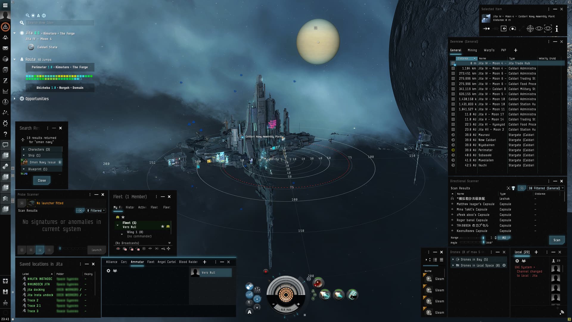
Other places where I feel like this treatment would be beneficial: Dscan list, wallet transactions, solar system info. For the Dscan list in particular, I was repeatedly reading the column labels as though they were the first row of scan results.
Right Click
The right click menu was also noticeably different. I’m not a huge fan of the icons that have been added. They push the left margin really far out and makes type readability feel a little weird for a second. When I right click, the first thing I see is that icon and my brain starts looking for more icons before it starts reading the text. I think you could kick the icons and use the illuminated markers similar to how they’re used in other places, or alternatively, add more icons so there’s more visual identifiers to use to find what you want quickly and that margin space doesn’t feel wasted. Here’s some mockups of alternatives that I think might be worth considering.


Not so great stuff:
I think there’s a small handful of stuff that needs to be revisited or completely cut.
-
The blooming glow effect on tabs and stuff is great, but a little too big. In some places, or when there’s a lot of active tab indicators, things start looking very hazy.
-
The scale of display headers for windows is a bit large. Make them adjustable to that size for accessibility purposes, but the default scale is just too big. A lot of windows in general really don’t even need a display header, because the primary tab inside the window is also of the same name.
Speaking of scale, I think the size of the text field feels a bit tall, all that space below the baseline feels weird:

Next is the bookmarks window. It’s a super important window that almost every eve player has dedicated screenspace for. It should be just as flexible to resizing as the chat and show info windows. Right now, those big buttons make it completely unusable at its smallest possible size:
I think those buttons could easily be represented by icons. Maybe create a compact mode that does that, and scales down the (enormous) magnifying glass icon in the top left?

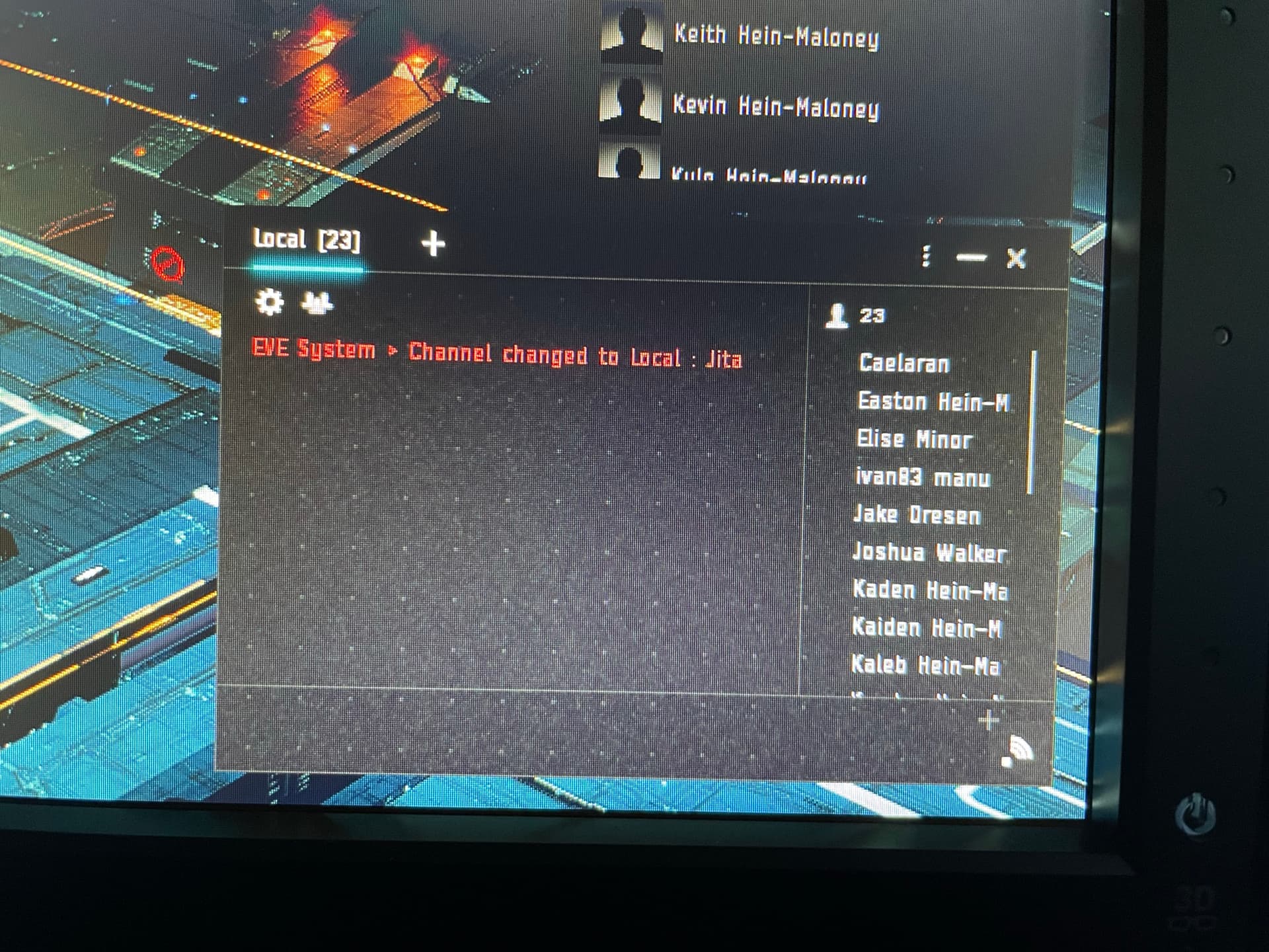
The thing I need to talk about most is the dot matrix and background static in active windows. The dot matrix, background noise/static/snow effect looks REALLY bad on my monitors. Maybe it’s my color balance or something, but it actually caused eye strain for me and I have a hard time keeping my eyes from losing focus because of it. It makes things look blurry like I’m watching a low quality livestream. Just cut that entirely, or make it optional or something. The dots look cool, maybe pepper that in around in very small parts of the UI to add a little character to something, but really, it’s not necessary and really detracts from things imo. I’m personally begging, please address this, it’ll affect my ability to play the game. Here’s a photo of what it looks like on my monitor:
In some windows, the outside margins feel really big:

- Lastly, there’s a lot of places where type and elements are overlapping or something like that. I know those things will be cleaned up, so I’m not going to point out every little place that this happens because that doesn’t feel constructive at this point of the design.
Ok, so that’s all I’ve got for now. I’ll probably do a bunch of edits after I submit this post, but I didn’t want to wait any longer to put things together and was hoping to get it done before the weekend (I delayed posting this and you guys already fixed all the stuff in the wallet that I mocked up proposed solutions for). Happy to expand on any other points further. Apologies for any unclear language. I’ll wrap things up with a picture of my UI by the time I was done tinkering, which I was really pretty happy with. Thanks for reading, keep up the good work, folks.