PhotonUI continues to waste not just space, but complexity, in the most pointless of ways. I’m going to illustrate this with what is, really, the stupidest of these missteps, but also the one that causes the least actual problems, just so you can clearly see what the hell is going wrong with your whole UI design.

This is the top of the member list of Jita local. As you can see, the first bit is with the scrollbar ‘expanded’ and then below that, the scrollbar ‘collapsed’. Except it’s not collapsed. Only the slider is ‘collapsed’, the scrollbar behind the slider remains full-width, so ‘collapsing’ the slider gives you exactly 0 pixels of useful space.
Your UI is there to convey information in a clear and useful manner, taking up the minimum amount of real estate needed to do its job, while simultaneously being aesthetically pleasing. Every single piece of it should keep that in mind. Every single element should use exactly as much space as it needs to use, and otherwise get out of the way.
And that’s clearly the intent here: to get out of the way and provide information. Because the slider, you know, tries to get out of the way so more actual information in on-screen. But you get no additional information on the screen. Not one pixel more of useful data. Because the scrollbar track behind it doesn’t collapse. So you’re still wasting space.
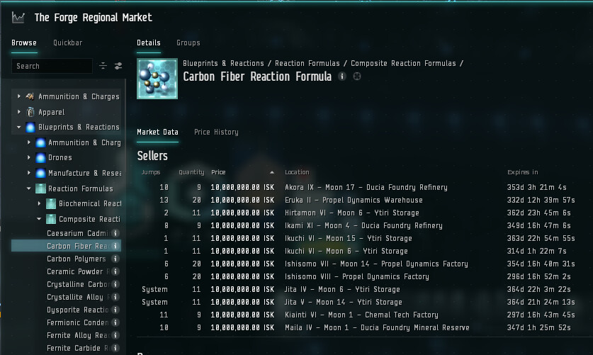
In the top of the main market window, we see, above the name of the item we’re looking at, the tree we used to get there. If we click on that, it takes us to the full list of Composite Reaction Formulas. Which, you know, seems useful, right? Click on Composite Reaction Formulas, go to Composite Reaction Formulas!
Click on ‘Reaction Formulas’, the middle part of the directory tree up in the main window, and you go to… Composite Reaction Formulas? Click on ‘Blueprints & Reactions’ and… Composite Reaction Formulas.
Which makes that more wasted space, in a market UI that’s already so cramped, if I go to the minimum window size…

You can’t even get the buy orders to show up in the window. Meanwhile…
And that’s with the ticker turned off. If we turn on that piece of clutter, you can only get 1 sell order visible (and still no buy orders).
Now, again, the examples I’m using are specifically chosen because they don’t cause horrible gameplay issues. But that design philosophy of ‘we’re going to waste your limited real estate’ carries through on everything.
This is already the ‘compact mode’ of the overview. You know, the thing you’re relying on when you’re fighting in space, and every single bit of screen space is either actively useful, or actively a problem. See the white bar to the left of the useful data? I put that in to highlight the gap between the border of that window, and the beginning of the useful pixels. You’ll notice I left it at half the height so that you can see, on the IHUB and TCU entries, that no, that’s not part of the first column of data, it’s just empty window-frame. That is more wasted space.
As I said, this runs rife through your entire UI. Things that don’t need to be ginormous take up space other parts of the window could be using. Frames that could be 1 freaking pixel wide consume valuable space—and in 1 frame, it’s not a big deal, but it adds up. A little here, a little there, and pretty quickly your UI is only getting in the way.
It’s gotten better since the initial release of Photon, but for the love of god, go back through every element in the Photon UI and ask yourselves ‘am I wasting my customers’ space?’ One more example…

See that? See the compass band around the capacitor where all the bookmarks are? THAT IS GOOD. That is not wasted space. Yes, it can get cluttered, but you can filter the clutter to drill down on things. Otherwise, it’s inobtrusive and gets out of the way, is reasonably compact, and can fit a whole lot of information because color use is built into the presentation.
Whoever came up with that, all those years ago when it went in? Get them thinking about how to present information in the rest of the UI, please. And stop wasting our screen space.