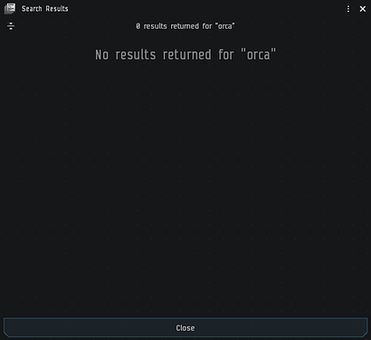
If that was true, why does the screenshot say ‘111 filtered’ ?
These weird orange flashes on ship and object surfaces that have no discernible source are still a thing, ever since release 19.12 or something like that when CCP tinkered with the graphics the last time.
Logged in a few days ago and noticed half of my chat tabs were missing. Upon closer look, I noticed the icons in the window headers to close, minimize, etc were super large as opposed to being super small like before.
Those icons now take up way too much room in the header, thus clipping out tabs that normally appeared.
Gotta say CCP is consistent, it’s either one extreme or the other…
There is a known issue where the sound plays from the wrong side of the speakers.
compact mode of watchlist is not compact at all
You use the Carbon UI theme, right? I use Caldari, Amarr and ORE and the in-system bookmarks are highlighted in light blue, pale yellow and toxic yellow. The in system highlight color for Carbon is a slightly brighter white.
This makes Carbon just another totally failed theme for Photon that perfectly highlights what a terrible mess Photon really is. CCP really thought it would be good to have slightly brighter white as highlight color for the Carbon. These people are beyond salvation. ![]()

Whoever thinks this highlight color makes Photon “easier to use, easier to learn and reduces cognitive overload” is out of their mind. ![]()
Yes, i use carbon theme. But all themes are the same. Whith old ui ,bookmarks that are in your current system are highlighted with green, now no dont matter what theme employ.
Yes, they were. Now the highlight color depends on the theme you use. It is quite telling that CCP implements a number of faulty themes as only choices to “customize” your UI. ![]()
Oh i know… cognitive overload reduction… ![]()
Fantastic. Accepting a private convo or opening a new chat in an existing stack turns Light Background on AGAIN.
CCP’s super amazing outsourced AWS chat system is acting up again. It randomly kicks people from player channels, although these chars are in a corp that is allowed to be in the channel. And it leaves other chars of the same corp in the channel.
is there a mod or theme we can use to make the new UI look and more importantly work like the old UI?
The cloud chat/local system continues to keep on giving since that March years ago (I’ve stopped keeping track… feels like 5 years now? ish).
You know, I fondly remember a time about 2 or 3 years into the new cloud era where local would show different amounts of people (and different names) to each of my 3 logged in toons. But no matter what, if I docked up at a citadel or station, the guest list would be accurate and would be the same for all 3 of my toons.
Now I dock up in a station and toon A will see toon B’s name twice in the guestlist. Toon B will see their own name twice and toon C’s name twice. Toon C just sees A+B+C once each as it should be.
Absolutely incredible.
I wouldn’t blame CCP if they just kept a list of all the issues you’ve pointed out labeled “Dyver Phycad Bugs, Do Not Fix”, just to spite you for having such a bad attitude.
I could totally see that being the case if weak-ego’d people like you were work at CCP. Fortunately, that’s not the case because I regularly see bug fixes for things I pointed out. ![]()


