
That would just make it bigger probably. What do you propose that doesn’t make it more difficult or elaborate to use, while not taking up more screen real estate.
I don’t know… I’m not a UI designer. But the drone UI is severely outdated.
Because drones are stupid. If you want fighters and their interface, fly a carrier. You don’t need anything more than a spreadsheet to handle what drones are capable of.
Enough UI changes… not eveything needs to be new…
From what I’ve seen every UI update by UI designers has made the UI elements look bigger and take up more screen real estate.
Skills window? Bigger and I still cannot find the skills I need since I changed it.
Compare tool? Bigger and less usable than before.
While I agree the drone UI doesn’t look great I love that it is compact and functional. And those are two aspects UI designers seem to give low priority.
Explains a lot when you tell us you don’t know how to use a search function. ![]()
I stated it somewhere before on this forum. When I play the original Guild Wars, I can make up my own UI. You can read more about that here.
Players worked with the developers to allow the GUI to be modified, by individuals themselves, at the Direct X level. Which means the 3rd party software wasn’t hacking the game, but using the Direct X to modify the individual player’s experience. In some cases, the developers pulled player made content into the game making it a better visual experience for all.
The end note on this project was made by a company official who stated this;
To all modders: It’s important to note that the parameters concerning the use of third-party programs do still apply. We cannot condone the use of such programs, and we cannot support the accounts of those who may be negatively impacted in using such programs. That’s called the “If it eats your hard drive and blows up your refrigerator, don’t call us” policy.
No one ever got banned for using the GUI 3rd party tools on that game. They did, and still do, monitor people using the 3rd party tools to cheat PvP. That will get you banned from any online game. CCP could simply allow the programming community to create some player designed UI tools and they could reduce the size and need of their art department.
Have fun!
To use a search function you need to recall how the skills or their effects are called.
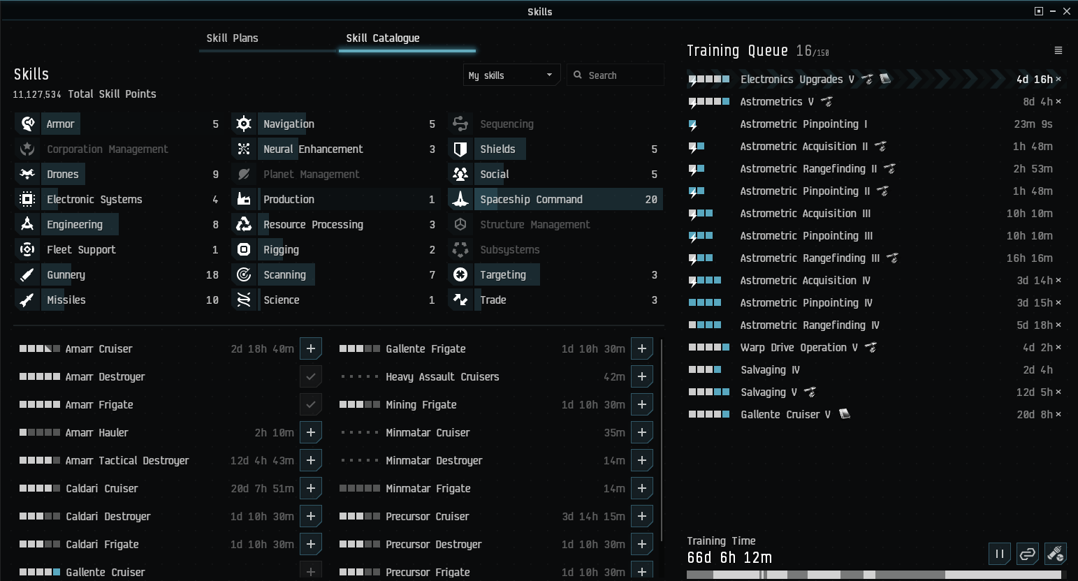
The previous skill window was ordered by category, by purpose. Largely it was non-combat skills like social skills, industry, mining and PI on the right, ship skills on the left, then engineering, shield and armor, guns, etc.
The new skill list instead of logical is alphabetical. So whenever I look for industry skills I need to recall to look under the ‘P’ of ‘Production’, or when I look for the Command Burst skills I need to rember to look under the ‘F’ of ‘Fleet Command’.
It uses less intuitive logic and requires more active knowledge of skill category names to navigate the new skill window as easily as the old.
I call that a downgrade.
Every time there is a UI “upgrade” we lose capability, legibility and logic. It’s as if the devs working on this never played EVE and don’t CARE about EVE, and IF they played they were miners or something like that, because everything takes more effort and more time to use and get information from. That works fine if you’re not doing anything consequential but if you do more active stuff it’s crap.
“looks nice, doesn’t work” is pretty much their motto.
Dafug are you talking about? I open my skill window, and all the categories are upper left, the skills themselves are below that, and the skill queue is on the right.
How dafuq do you need to look under “P” or “F” for anything?
You’re making zero sense here.
You don’t seem to understand it, but that’s OK.
Right there. And he’s right, it used to make sense and was intuitive. Now you have to search.
Then what is that entire 1/3 of the screenshot I posted where they have the categories listed for you to click on? When you click on Production, you get the Production Skills shown to you; when you click on Gunnery, you get the Gunnery skills shown to you.
The issue is between your ears, not with the interface.
What I don’t understand is how you think nothing is categorized for easy look up when a full 1/3 of the skill page is a list of categories for you to look up?
What I don’t understand is how you can’t grasp an Alphabetical listing of skills, or what kind of idiocy you’re imagining when you say you need to look under particular letters for a category.
You’re not even trying to understand what I said, you’re just being an insulting prick. As usual.
Sorry, I apparently can’t go low enough to meet your common denominator, you simply don’t make any logical sense and you’re refusing to explain anything.
I’ve explained my issue perfectly clear. Aisha understood me and even tried to explain it to you again, yet you still (pretend to) misunderstand it.
You’re both claiming that the skill list isn’t sorted by category, when there’s an entire section of the page devoted to categories.
I’m not understanding it because you’re claiming something isn’t a particular way when it clearly is.
You’re so convinced of your own opinion being correct that you cannot even see we’re talking about different things.