Odd it’s there and works for me no issue
Uhm…why doesn’t the fleet window have the broadcast buttons anymore? Even in non-compact mode, that’s really inconvenient.
And generally speaking, compact mode should also reduce the spacing between the elements, not just the outer frame. Element spacing is needlessly huge compared to the old interface.
Are you trying to cater to an aging user base that has eyesight problems? ![]()
2 Likes
Hi,
I took my first look at Photon UI. Comments in order of importance:
- The icons in the Selected Item window are far too small to make out easily or click on. If you had to find one quickly, you’d be in a lot of trouble.
- Did not care for the flipped vertical order of elements in the Probe Scanner window. Titles and controls should be above related material/results.
- The hot buttons (e.g., the “x” to close the window) are too faint/dull/muted to locate easily.
- The capacitor graphics (e.g., capacitor, high/medium/low racks, and sensor display buttons) were smaller/more compact. Kind of neutral on this, but it does free up more screen space on smaller screens.
- There is still some wasted space in the window construction. For example, allow the window border to more closely approach the icons.
After the experience, I disabled the Photon UI and went back to the old one. I like having more play area in the center of my screen, but I have to be able to find and operate the controls, especially when things are hot and moving fast. If I can’t fly my ship, I’m going to die even if I can see things coming a little bit sooner.
2 Likes
o7 All.
Not sure if this has been covered here but I have a couple of points I’d like to raise about the new UI.
-
When opening “Locations” any Bookmarks that were/are in the system you are in “USED” to be highlighted in Green in the old People and Places making it Super Easy to see stuff that has expired (Talking Wormholes here in particular since we spend a lot of time scanning)
-
The Icon to open the System Map in the Dscan window is different from the Icon to open the System Map in the Probe window - Pretty confusing for Vet’s never mind Noobies
-
When you click “Compact mode” on many windows it doesn’t really compact it too much… Can we improve on this ? E.G. In Locations - do we Really need to see the constellation number and such ? Surely better to just see the Bookmark, system and time and date it was BM’d are the critical ones.
-
I REALLY miss having a Kissy “X” to close a window when Panic sets in - E.G. Your checking BM’s and then see a Sabre on Dscan - Can we please have an “X” top right to insta close the windows - Again, seems to be inconsistency as some of the new windows have it and some do not.
Apart from that - I am slowly getting used to it - For me, personally, I find the text a lot easier to read on my tired old eyes.
Keep up the good work team
1 Like
Some problems with this UI

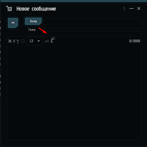
I cant see the title while editing an email

The upper and left sides of the green frame are “hidden” behind the border
3 Likes
You are not really making it big right?

I think it would be better to learn from the old

4 Likes
Hey, dev team. You did a really great job on photon ui.
But it’s really tough to work with, TOO small size of “theme” field in mail composition widget.
A few things I have noticed:
the UNDOCk button in stations is smaller than the corvette in my UI. This is incredibly annoying as I inevitably continuously hit the Board my corvette option.


Chat windows and other window:
The Photon window border is really difficult to see in darker regions of space. When I attempt to drag and drop windows in order to create more space, the windows border gives me no indication that I can.
Select Item Window Compared to older version, it just seems a lot Busier. I prefer the older icons but that’s personal preference.


All around, I would like to like Photon. But right now, I just find it very DARK in regions of space such as Amarr and it’s difficult to tell where windows begin and end because there is no double border delimination in photon like the original.
Photon:

Old UI:

1 Like
Hi Dev team, I’m sure you put a lot of work into the new UI and it has a good look.
But sadly: It’s not usable. I have a normal FHD screen and there’s WAY too much padding EVERYWHERE. So lots of information is missing. I haven’t yet figured out how too change that or if it’s even possible.
I’m also having quite a few of the issues already mentioned here - so for now, I’ll stick with the old UI.
1 Like
I really like it. Compact windows are great for laptop users that still need enough area to use mouse for view and radar.
Please reduce the system map minimum size. It’s way too large.
I’ve been outta the loop for a while and just now checking out the Photon UI. It looks nicer but my main 2 complaints are 1) the “padded” windows that when you try to snug them up to each other, the blank space somehow covers the edge of the window behind it and 2) the lack of a static “close” X on a lot of the windows, requiring a click-select-click action to close some windows. Granted, I have the close window command hot-keyed to Mouse5 but still…
Overall, I find it to be less efficient myself but I guess it could make learning the UI easier for green capsuleers
I love it!
Bit of an issue opening the “active ship” cargo.
I used to have my windows setup so that the “active ship” cargo hold would always be open. When I logged in the other day, the “active ship” cargo window wasn’t open. So I did what I usually do in the station and double click my ship which opens the “specific ship” cargo window, but now, when I switch ship, the cargo window doesn’t change to ship I jumped into and keeps the old one open.
Hello developers!
First of all, thanks for your time trying to make EVE even better secondly, the feedback about the Photon UI:
PI: when you have the extractor ready and you want to check how much raw material will get in the scheduled time, the “Total” amount is covered the a blinking message “Edits pending”. So it’s very hard to read the amount.
Locations: previous Photon UI, locations was together with characters and so but now, when I press the shortcut, I miss the locations. I still can find it through Edecom but the shortcut now have been… Separated? I do not know if it was intended or not so, I decided to post it here too.
Local chat: I think that now the local chat has too much space between the characters.

It appear not to be important but in null for example, it’s very often to have over 14 ppl in the same system. With that amount of ppl. With lot of ppl in local, you have to rais the chat over half the screen to see all the ppl in the system. The extra space (between character and the header of the chat) make it to have to extend it even more. I would sugest to make it as minimalistic as possible.
Oh! and the transparency. It’s a bit annoying that even with the transparency at 0, there are lot of screens that are more transparent than the settings window at 100% >.<

This screen has the configuration of 0% transparency and as you can see, it’s hard to read cause it’s still very transparent.
Tried Photon UI and in some ways impressed with its clarity and ease of readability ended up turning it off as was getting bugs on trade windows with my alts as it kept saying that the trade amounts had changed so no trades could be completed (they hadn’t) and the lack of number of skill points to apply to the next level of each skill was annoying. Overall buggy but still not ready for use
We still have a header-line in Compact mode and thats fine. PLEASE remove the “Close Window-Option” from the “3dotsdown”-menu( Who thought that a good idea? Anyone playing EVE on his Smartphone, or what?) and put that X back into that headline.
Having lets say an inventory-window open in compact mode( I see no reason to have it open in any other mode) and having to do the extra-click & Mousemovement just to close that window might get ppl killed in space.
![]()
Hello kindly be informed that the ‘Holds and Cargos’ Button is not functional after latest patch, kindly find the attached SS, it demonstrate the capacity just fine but not showing any windows anymore, that working fine on normal user interface but not photon,
have a nice day
any chance the locations window can be a toggle please - currently L opens the location window but does not close it