Revised EVE Activities & Careers Chart Project - Work in Progress

Haven’t looked at the original version of this chart in years but here are my

Initial impressions:

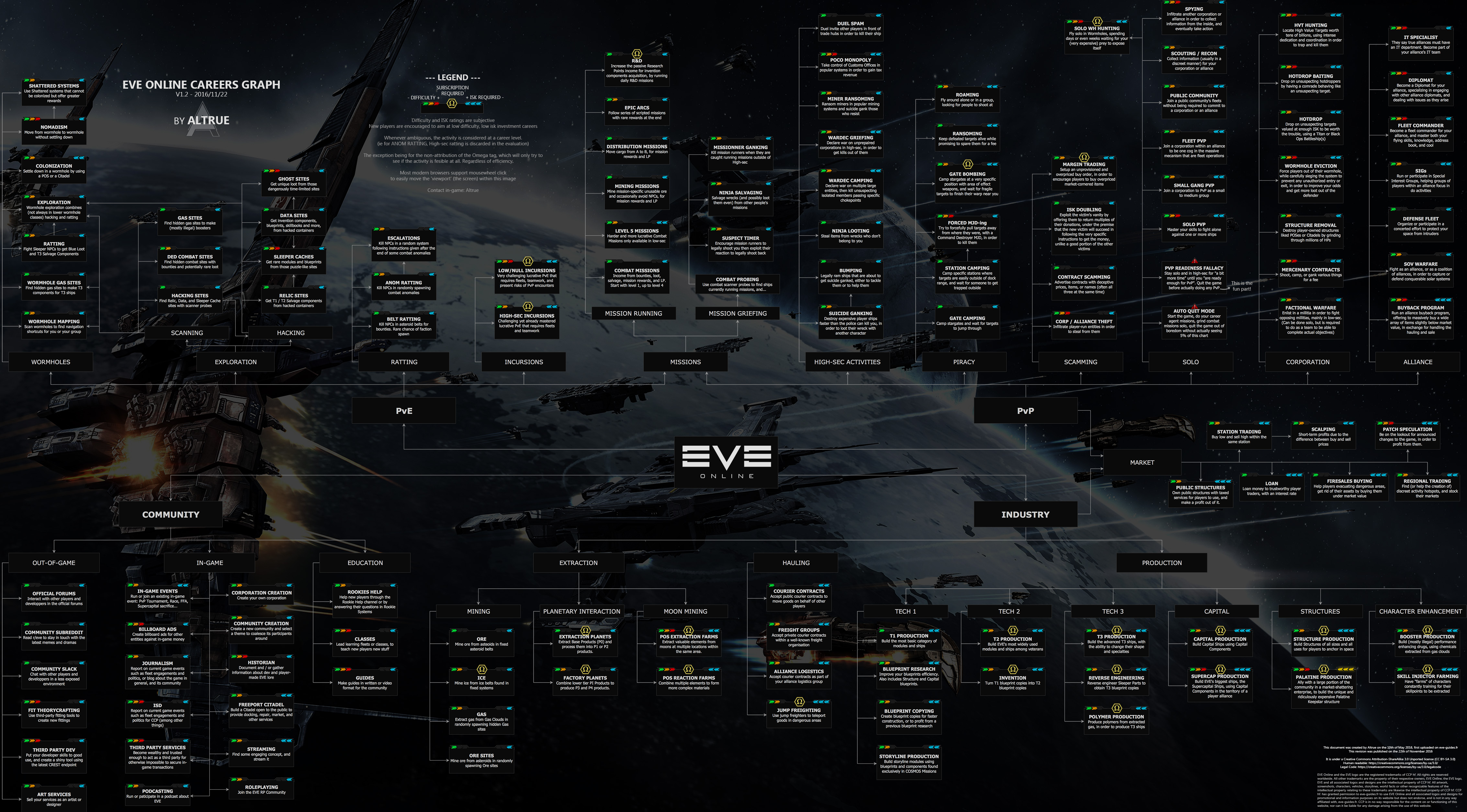
  • It’s pretty well done and laid out, coming from the print design sector i can see that this was a lot of work and a lot of care went into it.
  • The overall color seems very grey. I guess that is cause i don’t have an HDR screen but it would be nice if the file works well on SDR screens too. A darker (less grey) background would help already, currently it’s not easy to distinguish the foreground from the background.
  • In the market branch, some boxes have their indicators at the bottom?
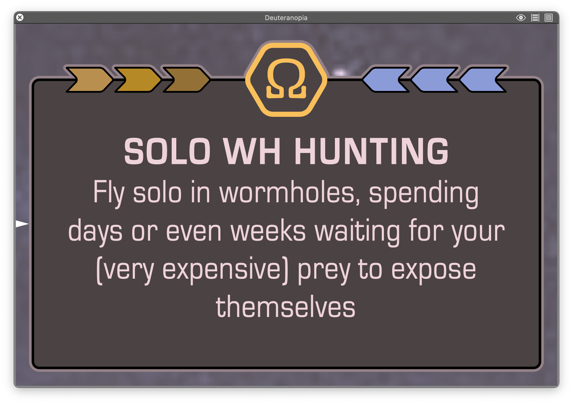
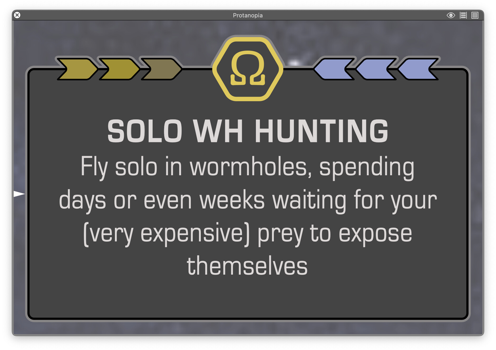
  • Adv. (i guess that is short for “adversarial”?) Broker relations has a different font color and the legend does not mention what a different font color means.
  • It took me until the next they when i looked at this thread again to understand why it’s called “Interactive”. I opened it in google drive and in the preview there, the hyperlinks don’t exist. (Though they work in the readme, i guess cause there they are text based.) After downloading the file and opening in chrome or acrobat, when hovering the boxes only your cursor changes. I guess i kinda get desensitized to cursor changes cause that happens constantly and is different per platform, OS, program and browser. It would be nice to have some indicatior like in a browser where in the lower left you see where a link leads. In chrome it directly opens the link target and replaces your current tab, in acrobat when clicking on one of the boxes it opens a popup window that shows you only the main domain name (e.g. wiki.eveuniversity.org) instead of where exactly it leads.

I guess the accessibility generally could be improved by moving to a website instead of using the interactivity of the PDF format. (Having worked with it for years and having a bit of technical insight of how it works - I’m regularly surprised that the PDF format in general hasn’t collapsed into a singularity yet.)
It seems PDFs can be converted to HTML via acrobat but the file is password protected so i can’t test it myself. While that could be a quick and easy (and knowing the PDF format, probably dirty) solution, in the long term moving to a website has whole host of potential other benefits. Sadly that would require a lot of work and i can totally see why that would be out of scope for now. At least it’s already in Illustrator and could easily be exported to SVG and embedded into a canvas element.

Good work o7

1 Like

My guy, telling you that your chart could be condensed, or made more legible, or made more accessible to new players is not griefing you - nor is it griefing you to call you out on an obvious bias, in which your chart refers to activities which CCP has repeatedly stated are not “griefing” as if they were.

I’m sorry you can’t accept constructive criticism, but that’s on you.

3 Likes

Interestingly, broadly speaking I work in that sector too so it’s nice to have a fellow professional pick up on the effort that has gone into this. It’s been a case of long hours and graft put simply, although it has been massively satisfying to work on (and a bit of a privilege too) because I love the game and the fact that others are going to and are already finding it helpful is very fulfilling.

Colour is really complex as I’m sure you’re aware as someone who is ‘in the trade’. My starting point was that I did want a refreshed look and feel to the chart and my particular design aesthetic preferences led me to choose a flatter and cleaner look and feel. I am reasonably happy with it - I was able to maintain good contrast for readability - although I’m aware that it looks very different to the earlier chart.

As I mentioned previously I’ve used an app called called SimDaltonism to check on the chart’s legibility for people with colour vision issues, but the app also gives a good indication of visual contrast.

If you’re curious, here are some samples showing one of the chart’s cards rendered in the main colour blindness variants.


Yeah, that’s deliberate. The structure of the chart in that section is a tiny bit tight and the (slightly quirky positioning was a good way to deal with it.

My apologies for this. Because the chart is still in Beta (I’m using this term to indicate that the chart is feature-complete, more or less, but likely to contain several known or unknown parts that will need further work before it goes live) there are some elements that need some attention. This activity card is one of them, hence the pink colour.

I think you make a good point but at the same time I did want to create a chart that was multifunctional, insofar as you can view it online as a PDF with clickable activity cards, or you can get a print produced by your local short run print shop to put on the wall of the room where you play EVE. I’m conscious here of the fact that as a complex piece of infographics it might best work as a poster, rather than online only. I hope that makes sense.

Having said all this, this is not to say that I wouldn’t consider linking up with a web designer in the future to explore doing this, but at this stage it’s probably more than I can take on right now.

Yeah I did do that. Having spent a couple of years on the chart and put a lot of hours into it, while I really do see myself as the custodian of something that in truth belongs to our community, I didn’t want someone ripping off the work and then taking the credit for something that belongs to @Altrue and me. I won’t be budging win this either, I hope you understand.

:rocket:

2 Likes

Here’s a shareable and linkable PNG version, which I believe is within the terms of the license: https://i.imgur.com/xRPx4RO.png

1 Like

Also, the information about Abyssal Running is incorrect. This is not omega locked, and one can get started with very little investment. Besides, it does not go from level 1 to 4, but from tier 0 to 6.

1 Like

The problem is that it’s not very readable. There’s something inherently “weird” about the original that makes it difficult to zoom in properly.

2 Likes

And mission running is PvE, not PvP. And ninja salvaging is PvE, and should be separate from loot stealing, which is PvP.

Also, market activities being presented on the horizontal axis, while everything else is vertical, is weird.

1 Like

That’s interesting. I hadn’t uploaded that but someone has and in my mind that’d be exactly the kind of thing that I’d be looking to do with the final version, in terms of providing people with multiple ways to view and access the chart.

As I’ve said already, for me the big disadvantage to JPG files is that fact that, unlike PDFs, there’s limited interactivity and definitely not the kind of card-by-card linking that I can set up within a PDF file. As I’ve also already said, that’s not to say I wouldn’t and won’t seriously consider making a JPG version available.

That’s really useful feedback and I’ll add this to the list of corrections and amendments that I need to do. Thanks.

I’m struggling to understand where this issue is coming from. Don’t misunderstand me, I do believe you when you say that you’re struggling to view it, I just can’t seem to replicate the problem at my end.

Below are four screenshots of the PDF chart being viewed in Adobe Acrobat that I’ve just taken on my computer.

The first image is opened and then fitted to the screen size of my laptop, effectively 12.5%. The second is 100% of size. The third is zoomed in to 800% and the last is zoomed in as far as I can possibly go, 6400%. As you can see all the images are absolutely pin sharp.

This is because I’ve created the chart in Adobe Illustrator which is a vector program and as such, in theory, if you printed the chart out at the size of a football field it would still be pin-sharp because that’s just how vectors work - precisely the reason I chose PDF as a format.

Thanks for this. You are absolutely right about the Mission Running side being PvE, not PvP. I don’t quite know how that slipped through (doh!) but I will definitely get that sorted before we go final.

In terms of the Ninja Salvaging thing: Ninja Looting is also on the chart in the PvP section (High-Sec Space spine, three cards up). Based on this, and given that Ninja Salvaging has similarities (you’re stealing stuff that belongs to actual people rather than nonplayer characters) I think it should still be PvP rather than PvE. Having said this, if there is a chorus of disapproval to this I’ll try to take this on board.

This does mean that Mission sits between the PVE and PVP genres. The solution that I suggest to this might be that the indicator line from both these genres leads into the Missions box to indicate the fact that it straddles the divide.

I hope that makes sense!

The reason for this, aside from the fact that this is how it was presented on the original chart, is simply the available space. If I strictly stuck to vertical only the chart would quickly become much wider, a bit unwieldy and less user friendly. This is also, for example, the reason for placing project discovery where it is (bottom left-hand corner).

:rocket:

2 Likes

No. Salvaging is not stealing. I momentarily forget the exact terminology, but you can salvage wrecks belonging to someone else without getting marked as attackable, unlike looting.

This does mean that Mission sits between the PVE and PVP genres. The solution that I suggest to this might be that the indicator line from both these genres leads into the Missions box to indicate the fact that it straddles the divide.

That’s the way it was in Altrue’s original. Tho I would say it belongs naturally in PvE, way more than PvP. Missions do not send you into PvP. PvP players breaking into missions is just a side-effect of Eve being in essence a PvP game.

The reason for this, aside from the fact that this is how it was presented on the original chart, is simply the available space. If I strictly stuck to vertical only the chart would quickly become much wider, a bit unwieldy and less user friendly. This is also, for example, the reason for placing project discovery where it is (bottom left-hand corner).

I would suggest to put Project Discovery under Community > In-Game. And put tech 1, 2, and 3 production under each other, and that way make room for Market on the right.

1 Like

It all feeds into the overarching belief that everything in this game is PvP, whether it’s mining, or PI, or hacking sites, because it’s all “competition between players.”

The only thing that’s not PvP, of course, is attacking other players, because that’s only done to “grief” when the other players “have no chance to fight back.”

2 Likes

Ninja salvaging comes in different forms. One of those is “roam around and grab what you can get”, another is “sit at the (Jita) undock and grab what you can get”, yet another is “enter someone’s mission and grab what you can get”. One of those is pretty much just a PVE thing, two of those have a player competitive component in them where is a sort of cat and mouse game which could/will escalate into a fight.

Just like the saying of “the fight didn’t start when the first short was fired, is started way before that”, this is part of that. Thus the majority of ninja salvaging is a form of PVP (light).

1 Like

Wow, great work much appreciated :slight_smile: But I would not know about it if not for recent Community Beat piece mention :wink:

Will EVE Vanguard have own separate chart or will be integrated into main chart? Or is it too early since it is in pre-alpha stage and the functionality may change at any moment?

3 Likes

This is the issue though, nobody’s got time for Acrobat or similar. It needs to be fully visible and readable as a png uploaded somewhere and then opened. It needs to be able to be an ingame link that can be clicked on which then is visible and then with one extra zoom from the web browser is readable.

It works for the old one: https://eve-guides.fr/images/wtd.jpg

It doesn’t work for the new one: Imgur: The magic of the Internet

You can then save that picture, open it on your PC with some sort of viewer and THEN you can zoom in and all the detail will be there. But that is way too many steps to be useful for most situations, it needs to be (at least) readable just from the basic browser.

2 Likes

Do you think an additional indicator of “meta game level” or “zero trust level” for each activity would be helpful?

Basically that new indicator would help determine how much (relatively) trust to other players is required to perform the activity successfully :slight_smile:

I will try to explain what I mean by “meta game level” or “zero trust level” on below examples:

High level would be any element that is arranged by players with the help of tools outside of main game mechanics and not fully supported by it as an implemented UI options.
Example would be “Mercenary Contracts”. There is no such thing supported by game mechanics (yet) players simply communicate their intent and interact based solely on trust to each other in regards of payment and collateral and job done.

Low level would be any element that is specifically integrated into game mechanics and fully supported by UI options. Example would be “Courier Contracts”. Fully supported by game mechanics and players simply use specific UI options to setup contract and secure payment and collateral. Little trust is required from both parties, although it is not scam-proof obviously.

More on this element of EVE in my forum post.

This is the hardest part to grasp in any mmo game imho but very interesting to study and helpful to enjoy the game …without regrets :wink:

3 Likes

Firstly, awesome job mate.

I find I share the original image often because it is a ready to view link online.
It would be much more handy if it wasn’t necessary to download your amazing file. Is there a version of this interactive PDF hosted online (ready to view without downloading)?

2 Likes

Fair point. In my mind, possibly because I’m a purist, it is kind of stealing, at least if the other pilot is present and on the scene but I’d wholly accept that this is within the game mechanics so at best, it’s stealing light. Either way, I’d now agree with you that it ought to be part of PvE.

I think the market section is clean and understandable at the moment, even though it is horizontal rather than vertical and I’m not wholly convinced that moving a whole bunch of stuff around would yield a 'better chart to be honest so I’m not going to go with this suggested change at the moment. Sorry.

:rocket:

1 Like

I tend to agree with you here I think, at least if I understand correctly the point that you’re making.

My aim with the chart revision from the very start was to objectively and truthfully reflect the wide diversity of activities and career paths that are available to pilots in the game, irrespective of my personal likes or dislikes.

I think it is a truism that at its core EVE is a game that involves PvP. However, it would also be true to say that other activities within New Eden are also core, like mining for example, especially since everything in the game, more or less, including the ships used by gankers to blow up mining ships has been created from ore that has been mined by a player (oh, the irony, LOL).

I feel quite strongly therefore that the chart ought to not have a polarised or judgemental view on any activity in the game but more just act as a pointer towards stuff that you can do if you want to.

If you want to do PvP that’s fine; if you want to mine, that’s fine too; if you want to do PvE, PI, market trading, or indeed a weird mix of all or some of these, or something else, well that’s fine too.

There is no ‘right’ way to play EVE (and here I turn to the words of one of my in-game heroes, @Chribba and his essay The Art of Selling Trust which I’ve mentioned before).

… players have told me that I’m not playing the game correctly, and I’ve always asked them what the correct way is. It’s amusing how many different ‘right ways’ there are in EVE Online; opinions vary from person to person

This brings me back to what playing EVE really comes down to: it is a player’s choice to do the things she [or he] does … CCP has given us tools to shape [New Eden], but it is up to us to use these tools: the right way or the wrong way, there’s no such way - there’s only your way.

I love these words and I hope that the final chart reflects them and the diversity of what people do.

:rocket:

5 Likes

Well, the solution is pretty simple, then: describe the activity, not the morality.

Let’s use an example. One that I understand personally, so I feel that I’m qualified to talk about it to at least some degree:

image

WARDEC GRIEFING
Declare war on unprepared
corporations in High-sec,
in order to get kills out them

This is objectively false in both the title and the description.

A much more accurate way to represent this activity would be to say “Sanctioned Corporate Warfare” and describe it along the lines of “declare war on rival organizations to interdict their commerce and traffic, and/or attack their high-sec structures for profit and/or political motives.”

“Griefing” has no part in this.
“Unprepared” has no part in this.
Even “High-sec” doesn’t really have a part in this aside from being a descriptor of where the activity generally takes place, because the vast majority of war declaration targets these days are major null-sec power blocs.

Yet you describe some activities as “griefing”…

Thanks for taking the time to offer positive feedback, I genuinely appreciate it.

I have a contact at CCP who offered me a plug on the Community Beat which was both very generous and slightly unexpected. It has been a fantastically positive experience both in terms of the number of players downloading the chart (the uploads have increased, genuinely, by around 5000% since the article came out which makes my head spin) and in terms of the level of engagement with this thread on the forum.

If the community team are reading this and I suspect they’ll lurk to see what feedback I get, I literally cannot thank you guys enough, you’re completely awesome.

Good question - :slight_smile:

To be completely honest, at this stage, I’m not sure. I’m a Mac user so as yet I’ve not played the tester, but from what I’ve been told by my PC user EVE friends it’s a pretty complex game. Based on this, my initial feeling is that what might happen is that there is a clear reference to it on this chart but maybe the available activities are captured on a separate chart.

I think importantly, what I wouldn’t want to do is degrade the quality of information on this chart to facilitate creating enough space to include Vanguard activities, or for that matter vice versa.

I do emphasise the use of the word ‘might’ here because Vanguard isn’t even properly released as yet, and I’ve yet to finalise this chart.

:rocket:

2 Likes