Revised EVE Activities & Careers Chart Project - Work in Progress

Original Post

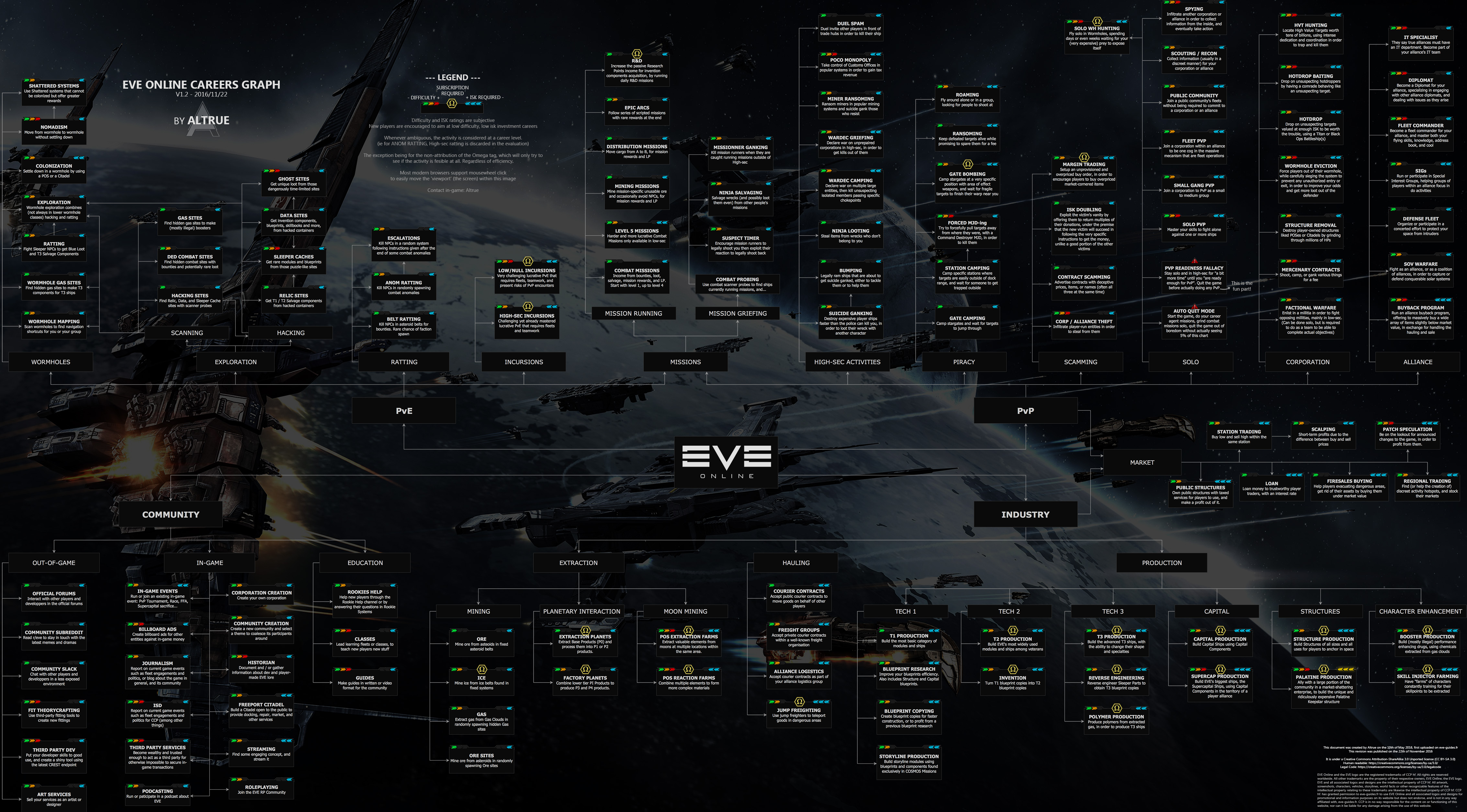
You can find a very useful EVE career chart online here: https://eve-guides.fr/images/wtd.jpg.

From a visual and infographic point of view, as a chart, it works pretty well, IMHO, but it’s not vectorised artwork so if you wanted to get it printed out as a poster (so that you could put it on your wall for example) the resolution probably be high enough.

In real life I’m a graphic designer so I thought I’d have a play around with it and create a revised *(and updated)*version in Adobe Illustrator that’ll enlarge up to any size.

I was going to do this as a fun project, mostly to give to my corporation colleagues, but I though it might be cool to share it here too, if it’s likely that it’s something that people might like to get their hands on. (Would people find a revised version of this chart useful? Desirable?)

At the moment, I’m working on the look and feel and below is a mock up of how a box on the chart might look on the final version.

The coloured indicator chevrons work and communicate well, and I like the box colours overall, however I wanted to go for a slightly flatter, softer and more rounded look and this is reflected in the radius corners, chevron shapes, Omega icon and text choice

I’d be interested in any constructive feedback that people might have.

If I’m re-creating the chart, then I probably need to look at updating the career path options at the same time because the chart linked to above was done in November 2016 and I think a fair bit has changed in the game since then.

I’m not an expert in all things EVE so if there’s any obvious corrections that you think need to be on the chart, please feel free to suggest them here.

Thanks for your help.

:rocket:

Information

Following a lot of time consuming and detailed work, the project has now reached the Beta release stage (basically not quite finished yet, but at a point where it’s good enough for some mass feedback and testing by rank-and-file players.).

So based on this, here are the download links that you need:

Download site one (Google Drive): https://bit.ly/EOCAC-GDD
Download site two (Dropbox): https://bit.ly/EOCAC-DBD

In the main download folder is a PDF file:

READ ME FIRST! - EVE Careers Chart - Version 2.0 Open Beta - Release Notes.pdf

At the risk of stating the bloody obvious please do read this PDF first because there are a bunch of notes that pertain to what variants of the chart are available as well as some feedback notes and so on which I really would like people to look at, first, please.

In addition to this file, there are three folders in the main download folder:

  1. Printable Chart
  2. Interactive Chart Folder
  3. Chart Extracts

Although it might be pretty obvious to many, for the sake of clarity, here’s what’s in each folder:

1. Printable Chart
EVE Activities & Careers Chart - V2.0, Beta Release - March 2023 - Print.pdf

The printable version of the chart - 600mm H X 917mm W - completely with trim marks, registration targets and colour calibration strips. Designed for those who might want to print the chart out themselves and/or get it printed out at a poster size by the local print shop

2. Interactive Chart Folder
EVE Activities & Careers Chart - V2.0, Beta Release - March 2023 - Interactive.pdf
EVE Activities & Careers Chart - Hyperlink List.pdf

The interactive version of the chart. Designed for those who just want a version that exists on their computer, but one that offers embedded hyperlinks, allowing end users to pull up additional web-based information on activity genres, activity spines or specific activity cards.

The Hyperlink List file is a stripped down to basics version of the link information presented as a PDF (created from an RTF document to keep the file size down)

3. Chart Extracts
EVE Activities & Careers Chart - V2.0, Beta Release - March 2023 - Community Extract.pdf
EVE Activities & Careers Chart - V2.0, Beta Release - March 2023 - Corporations & Alliances Extract.pdf
EVE Activities & Careers Chart - V2.0, Beta Release - March 2023 - Industry Extract.pdf
EVE Activities & Careers Chart - V2.0, Beta Release - March 2023 - PvE Extract.pdf
EVE Activities & Careers Chart - V2.0, Beta Release - March 2023 - PvP Extract.pdf

Given the physical size of the chart I can easily envisage a scenario whereby you might want to have the benefits of the interactive chart but in a more compact form, and where you might be concentrating on one area of gameplay. The aim of the extracts is precisely this.

.


.

When I wrote this update to my original project post (18 November 2023 - following some really useful feedback from Isaque Muutaras) I realised that it’s taken a long while to get to this point - two years, eight months - much more time than I’d actually envisaged investing in the project at the outset, but, having taken it on, I felt a big responsibility to make sure that the final product was really good.

The chart is very complex as a piece of graphic design - 5,273 different chart elements, 189 hyperlinks at the moment - but I do feel really lucky to be its current custodian (getting the blessing of the chart’s original creator, @Altrue was a real honour for me).

I am hoping that lots of players will download it, and use it and that it will be helpful to them as New Eden Pilots.

I am really interested in any feedback that you have on the chart, but please read the release notes first, and ideally use the email address that is given there to give this.

At the moment I’m working on incorporating the feedback that I’ve had so far and reflecting the big changes that came in with the Havoc expansion. I’m tentatively looking to get this variant of the chart, (possibly to be called the ‘version 2.0 release’) out sometime in 2024.

The final release info will, most probably, go into a new forum post. This (long’ish) thread has been (mostly) about the development of the project, so it makes sense to me to create a new post for the finished project and therefore, going forward, more about tweaks than overall development.

Either way, another massive thank you to all the people who have supported and encouraged me up to this point, I really couldn’t have done this without you guys, hopefully, you all know who you are.

:rocket:

32 Likes

It looks really nice.
I don’t understand why you reversed the order of the colors for the difficulty level ( from red to green ) while the other chart has it from green to red which makes more sense since we write from left to right so maybe you have a logical explanation for it.

If that was your aim then mission accomplished. It certainly looks more spartan than the original.

I like the background but I would have had it less obvious, less stark and maybe more faint to emphasize the main focus which is the rectangle for the career. Maybe in a much lighter blue or even a little out of focus.
But it’s the way you wanted it and you have your reasons. Art is more to be enjoyed than criticized since it reflects the person’s general disposition so take my suggestions with a grain of salt.
Did you finish the whole thing? I’d certainly would like to see the whole thing completed.
Well done!

2 Likes

you may actually wanna contact the creator of the template and they can help you out with it. @Altrue

@Han_Zealot , while i’m not sure of where the OP is from, Japan reads from R to L. So they could be basing it that way.

1 Like

True. Then the wording should be in Japanese.

2 Likes

Meh, while you are right, OP is from UK (looking at his profile)

Anyway OP, since the name of the creator of the document is on there, contact them in game, they may be willing to give you an editable copy of it. I would hope you weren’t planning on recreating it, without giving credit to the creator of the of the image.

1 Like

Credit for the idea, maybe, but it’s not a copy since he’s redoing a bunch of things, updating it and whatnot…

2 Likes

I like the look of what you have done, good work. I have used the original sheet in the past and still sometimes go back to it if i feel like i want to try something different but not sure what.

1 Like

Please add “ESS Cat Burglar” as a new profession :laughing:

And gl with the rework, will be interesting at the very least.

3 Likes

Looks really nice. I too feel that the difficulty should be the other way round, more blue ones means more isk so more coloured ones should mean more difficult. Meaning that at a quick glance play styles that don’t have many “highlighted boxes” are ideal for starting players both in difficulty as cost.

In the end it doesn’t really matter though, it works both ways.

2 Likes

I’ve added a project update into the original post at the top so please go there for that, but here’s some specific replies to some of the (very useful) feedback given above…

Thanks!

“…I wanted to go for a slightly flatter, softer and more rounded look…”

Thanks, I think … I’m hoping the use of the word ‘spartan’ isn’t necessarily negative here?

I’ll probably get some feedback on a good background image (maybe a choice of several and a poll …) to have behind the chart before it’s finished. Blurring it sounds like a good idea though. Thanks.

Not yet! LOL I think it’ll take me a few weeks to get everything in place and work everything out to the point where I’m happy to publish and share it (I am, I suspect like most graphic designers, a bit of a perfectionist).

For what it’s worth, I did try to contact them but I couldn’t elicit a response.

I’m from the UK as well, just for info.

I will definitely be crediting @Altrue as the creator of the original chart on this one (unless they ask me not to).

To be honest, a hell of a lot of the work that I might have had to do to get this project off the ground was already in place because of @Altrue so it would be deeply dishonest and churlish of me (and I sincerely hope I’m neither of these things …) not to credit this work on this chart.

For what it’s worth, I really love the chart that @Altrue created. It’s basically brilliant.

There are things that I think could be improved, enhanced, and it’s possibly a little glossier than I’d have done it, but the logicality of it and the central out schematic is a really well thought through bit of infographic design.

Interesting idea! LOL

Joking apart, I was thinking that the chart is a little lopsided at the moment and this is something that I’d be looking to possibly improve if I can to even out the representation of career paths available.

At the moment there are, in descending order of quantity

51 PvP career signposts
29 PvE career signposts
27 Industry career signposts
21 community career signposts

I wouldn’t necessarily want to take anything away from PvP at all (I think it’s scope is very wide and thorough, and well written) but I do think that the other three areas probably need to be expanded with more signposts if possible.

:rocket:

4 Likes

While I didn’t realize one was updated in 2016 with the difference between Alpha/Omegas… When I was taking newbs under my wings, I would reference the chart quite a bit helping them to figure out where their place was in New Eden.

1 Like

Damn EVE’s really been pruned. You can’t even mine anymore!

1 Like

Perhaps you could add a “doable pretty much right from the start” sign highlighting entry playstyles for new players to look in to. Like a “starter career button” for different play styles.

4 Likes

Peeps may be confused until they get to that point.
The thread title is misleading. Its not chart, its WIP and concepting at this phase.

3 Likes

Same here really. I think it’s a brilliant and essential bit of player created collateral which is why, aside of the look and feel, I’m trying to tread very gently in regards to any changes I make to the schematic - screwing it up is not an option!

Feel free to make any suggestions however that you think might make it better.

From my perspective, what’s important is to get it right so that it’ll stand the test of time rather than rushing it, so they’ll be more opportunities for player input before the project is over.

Well I still mine on a regular basis for what it’s worth @Xuixien and really enjoy it. (I use the mental head space that it gives me to simultaneously chat on thing like help, rookie chat and B4R and to also work on projects like this)

I did consider that @Xanthellus but I think one of the real infographic strengths of the original is the way the there is division and separation with also degrees of overlap where appropriate.

Hence why I thought of using the Alpha icon instead.

Thanks @Nana_Skalski, that’s a good point. I’ll amend it now.

:rocket:

It isn’t. Compared to the other one, that flatter softer and more rounded look makes it your own.

Perfection… Never to be achieved but worth striving for. Can’t wait to see it when it’s all nice and done.
Not sure that blurr idea is great for the background. You’ll have to see.

1 Like

wooooooooooooooooooooooooooooooooooosh

I literally have no idea what this is supposed to indicate. Ho hum. It’s all good though. LOL

:rocket:

I think it’s supposed to indicate that Mining should be on it. Not sure if in-progess was understood or something completely different.

PS: put Mining right smack in the middle with lines connecting to all the others :face_with_hand_over_mouth:

1 Like

The ESS is new, and ccp does try to promote it a bit, so why not add it :slightly_smiling_face:
What I found missing from the old wtd pic is NPSI fleets, which I think do deserve a spot, for casual pvp (bombers bar, spectre fleet, etc…)

Good luck with the chart, will look great !!

1 Like