Complexity vs Accessibility; Specialisation, risk, and Sacrifice
My starting assumptions:
About Eve’s Players:
There are new players and veteran players.
There are players that enjoy complexity and players that prefer simplicity.
Those that wish to preserve past play experiences and those that wish to create new and improved ones.
Players for whom the current UI technology is sufficiently functional and players for whom it is not.
Each group wishes to preserve what is fun, unique, engaging, familiar, and functional, about their preferred game play style.
About Eve’s complexity:
Eve has a steep and complex learning curve up to and including the end game content that in terms of its politics alone is complex.
Eve’s complexity contributes to its difficulty.
Eve’s specialisation opportunities contribute to its complexity.
Eve’s propensity for punishing poor risk managment contributes to its complexity and its difficulty.
The difficulty and complexity are part of the fun and richness of Eve and should be preserved.
The element of specialisation and the complexity that it brings to the game is the same element that accounts for and what makes Eve such an immersive, rich, and engaging sci-fi fantasy experience.
Eve’s complexity is what generates its explorative, challenging, exciting, and risky, gameplay.
Eve’s propensity for specialisation requires that you take risks and sacrifice opportunities.
About Eves redesign of the Ui:
CCP needs to improve the new player experience.
CCP needs to improve the veteran player experience.
CCP needs to differentiate between what constitutes an appropriate beginner challenge and what needs to remain as a necessary veteran challenge.
The level of complexity should not be reduced for beginners. If anything the level of specialisation (i.e. complexity) should be increased for everybody across the board as the game grows in order to retain veteran players.
The game of specialisation should be complex, meaningful, and sacrificial in nature, but the game itself, those risk, those sacrifices, that complexity should be accessible.
In simple terms you should be fighting the environment not the interface.
You should be punished for a failure to plan effectively.
You should be punished for a lack of experience.
You should not be punished because of the obscurity or illogical design of the interface.
Eve’s interface should be easy to understand, but the game itself should remain complex, risky, academically taxing, and difficult to master.
My final thoughts.
Although I’ve personally come to enjoy some of the more obscure design compartmentalisation that the interface employs, in most cases it is simply convoluted for no sound logical reason apart from the difficulty of coding. Therefor information that ought to be grouped together is often times annoyingly and arbitarily grouped apart or hidden deep within menu systems. While there is a lot to take in when you first begin playing this is a problem that might better be solved with clear and consistent organisation of data rather than a decrease in complexity. Yes that means that some of the annoying idiosyncrasies that you’ve come to enjoy will need to change. The fact remains that if CCP can successfully unify the UI it can potentially build in even more specialisation and complexity in the future.
Case in point, some very important information is positioned in sub-menus and or in sub sub-menus or accessed through icons such as the hamburger icon at the bottom of the HUD, or the icon to manage the overview settings, or to display combat information in the log etc. that you can fail to recognise, overlook, or discover by mistake. When you consider the importance of the information contained within these menus its astounding to consider how obscure they are.
It remains important not to confuses an increase in accessibility and information management with a decrease in risk, autonomy, and the naturally occurring emergent state of complexity these values bring about.
It’s possible to preserve the complexity and richness of the game while increasing accessibility.
MANAGE AUTOPILOT ROUTE WINDOW
I’m presenting this upgrade to the Manage Autopilot Route window (MAR) as an example case. But the principles herein apply to all aspects of the Eve UI experience.
Currently access to the MAR window is through the HUD Route menu which I believe is an Icon shaped like a spaceship but which appears by all accounts to be a capital ‘A’. You left click the ‘A’ icon and you get a complex menu that covers multiple elements of route setting. Right at the bottom of this list is a check box to activate the MAR window.
The MAR window is very handy, for both new players and I expect veteran players since it presents a list of all the systems that you will pass through along your intended route and allows you to add and subtract and even avoid systems. Great I expect for players who specialise in hauling. The set destination feature also presents a series of coloured cubes in the HUD menu which are colour coded to the security status of the systems on route. You can see how many systems you’ll pass through on route and you can even hover over the cubes to view the names of the systems. Clicking a cube allows you to open a menu and jump the gate etc. These cubes are tiny and difficult to click on when you have the UI set to a high resolution.
By opening the MAR window you can better manage and organise your route. You can see the names of all the systems and scan for places to avoid. I would have expected this list to be colour coded according to the security status of the systems on route and to perhaps also include additional information such as the region. It does not. Interestingly the Solar System information dialogue window does show this information and even has a dedicated routes tab.
This reinforces the points I made in my introductory assumption about arbitrarily grouped and compartmentalised information.
Here’s how:
The information exists, it exists else where, it exists in another iteration of the same menu within the same feature as well as in menus that share a relationship with this menu and its relevant information.
The information is useful to both beginners and veterans.
Having access to that information in the MAR window increases accessibility but does not decrease risk or the complexity of the game.
As a beginner I did not need a larger window or bigger borders, I needed access to this information and I needed it in MAR window not in the Solar System dialogue window.
Below are some example images of the current UI state as well as two alternative iterations of the MAR window.
A shortcut key to this window would be useful.
The ability to increase the size of the coloured cubes would be useful.

The existing MAR window.

Colour coded cubes in the HUD display.
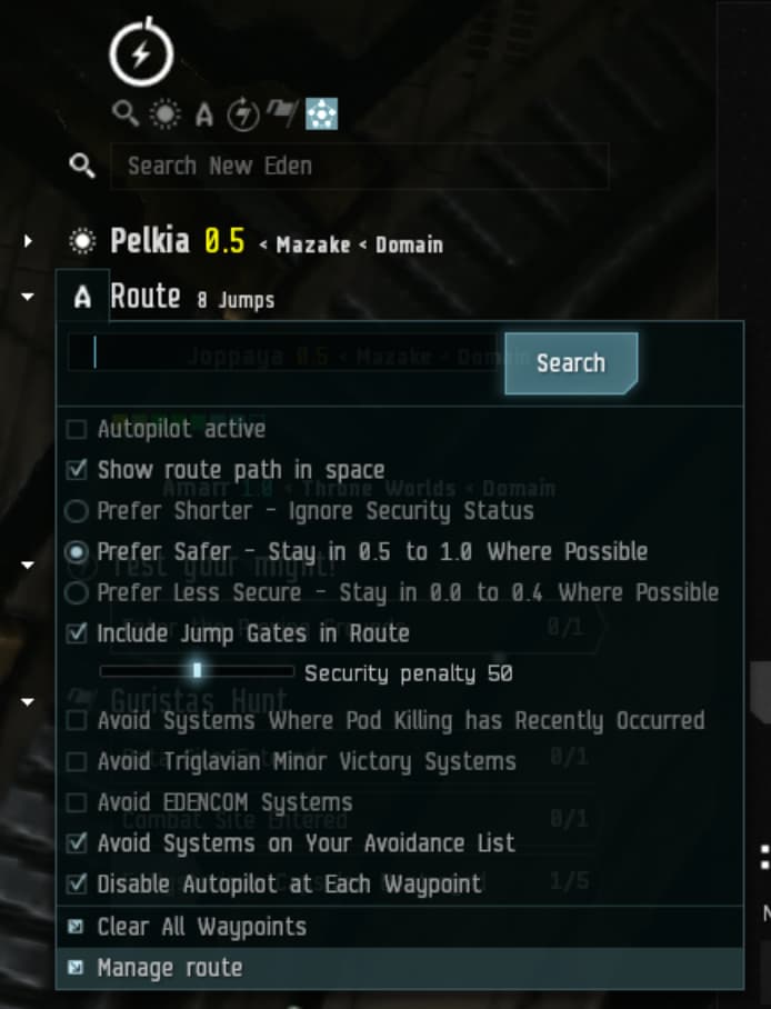
Current location of the Manage Autopilot Route menu link.
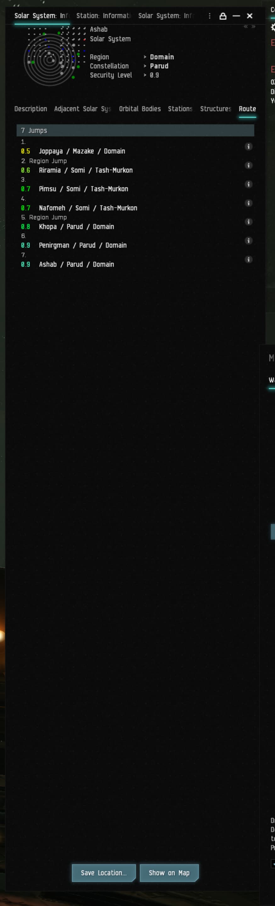
The Solar System Information dialogue window with the Route tab active displaying an information rich output
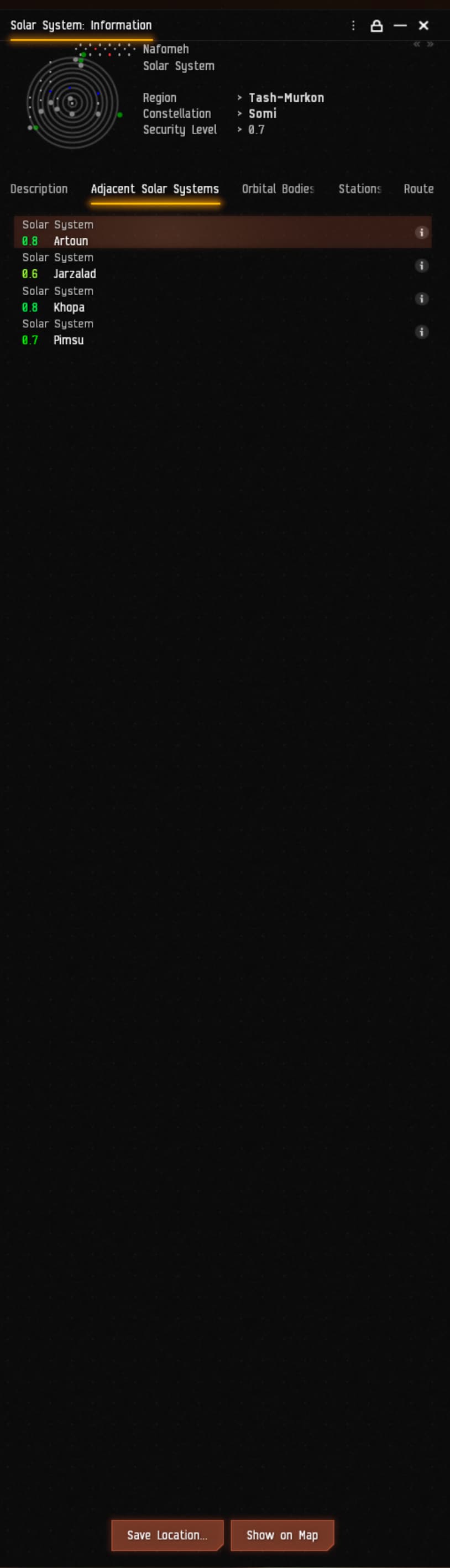
The Solar System Information dialogue window with the adjacent systems tab active showing a compact version of the colour coded system status display.

My information rich improved menu design

A compact version of the design improved MAR menu