I don’t like the idea of a mining ship between the Endurance and the mining barges. Even worse you let alphas use it? I don’t mind alphas using the basic ships or expensive ones (like navy ships) but if you’re going to let alphas use this new mining ship, make it more expensive to make.
A Venture costs 350,000 ISK in materials to build. A Pioneer costs 5,400,000 ISK in materials to build. That is 15 times more expensive to manufacture than a Venture….
unless they do the arc then its free
The overall feedback I can summarize is mostly positive, but for some of the newly implemented features I still have to ask: “Why?” and “What’s the purpose?”
The most important update is the new 2D map, which is one of the key UI tools in this game. I have both necessities and suggestions regarding it.
Necessities
- There should be dashed paths between constellations, colored according to the selected map style
- There should be dotted paths between regions, colored in gray by default.
- Numbers should be displayed correctly: natural numbers (N) as integers, and real numbers (R) as decimals/double rounded to one digit after point. Showing “3.0 pilots” in a system looks messy.
- When zooming into a region, we should first see all constellations, and as we zoom further, all systems, while constellation names fade out. The current situation - where zooming in/out sometimes shows only red and yellow dots across an entire region - is unacceptable.
- Fixation and Point of Interest behavior: When clicking a region, it should be centered in the UI based on its size and aspect ratio, and all system names in the overview should be visible by default and not hidden by mouseover radius effect. The current mouseover effect feels like walking in a dark room with a flashlight.
Suggestions
-
On mouseover of a region, show additional info instead of system names - for example: constellation names, availability of NPC stations, presence of citadels, mining belts. These could be indicated with small dots or icons around the system circle, depending on filter settings.
-
Border systems should have larger arrows for easier clicking. On mouseover a region, it would be useful to display the destination region and system names near those arrows based on the effect radius.
1 Like
Gates should not be dotted or dashed, they should be color coded like in the old map. Dots and Dashes are hard to differentiate, especially if they were changed like you suggested. This color flow from system to system is useless and adds nothing but confusing noise to the map. The old map is much easier to read when it comes to data and easier to navigate when it comes to gate connections.
1 Like
Let me be frank.
1). Remove mining hold progress circle next to my ship altogether, take a chem pen and draw it on your mom’s forehead instead;
2). Add quick radial menu to Mining Survey Results or even better - integrate this menu with Overview (that becomes literally obsolete for miners anyway);
3). Remove II and III, brind back normal ore names; we’re not golden fish, we can memorize and remember things; dont dumb it down, pay some respect to us - your CUSTOMERS - you have food on your table ONLY because we paid subscription. Remember this.
5 Likes
So when we use the new surveyor it displays the isk/m3 of the asteroids, which is nice, but when you look for ore types in the map it only displays the isk/unit. It would be nice if the map showed the isk/m3 instead, or at least in addition to the unit price.
2 Likes
The Outrider’s ore storage capacity is 20,000 m³, while the Hulk’s is 11,500 m³. Please increase the ore storage capacity of the Hulk and Covetor.
1 Like
I disagree with it. I really tried to use the old map - honestly, I tried hard. Maybe that map can be configured in some way to look a bit better, but by default it looks insane. The color scheme of the connections between the respective systems looks clunky and overloaded, especially between regions like Sinq Laison and Everyshore or Domain and Kador.

Here is the same location on the new map.
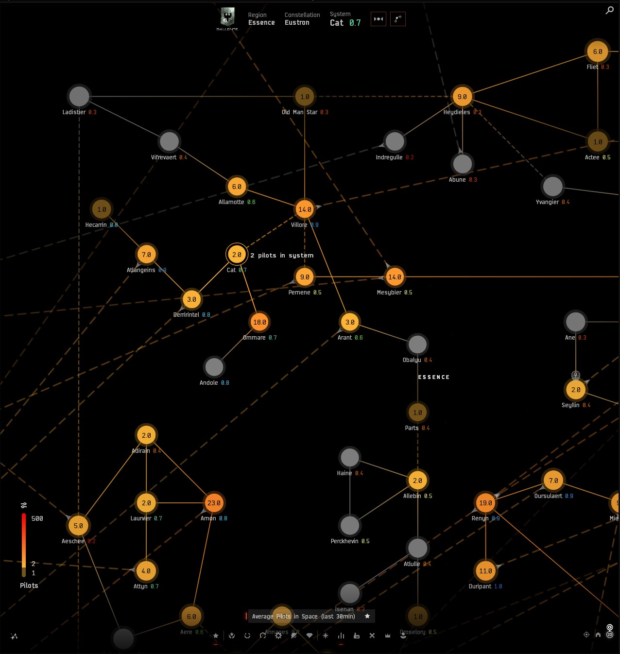
Pay attention to the distance between the inter-constellation connection between the Ladistier and Aeschee systems, and how the Vifrevaert (top left) system has two solid and two dashed lines behind it. Only the line color gives a hint that those dashed connections do not belong to that system, as they are inter-constellation connections. Frequently, that system has the same color as the dashed line behind it.
The Sunset style colors the inter-region connections based on the filtered values of the linked systems. Therefore, sometimes they are yellow and sometimes they are gray. It becomes very easy to differentiate dashed and dotted lines (based on both color and structure) if the last remains gray. Moreover, the inter-region dotted lines can be gradient-colored to blend with the background midway. The map view becomes much cleaner, and the respective connections no longer mimic constellation connections.
The green circles over yellow dots below marks two systems that are not linked by a constellation connection. Those are the Olbra and Eiluvodi systems, and the vertical dashed line between them is inter-regional. And with the current map tuning, there is a zoom range in which neither constellations nor system names are displayed, leaving you with no clue what you’re looking at.

Patch Notes for 2025-11-24.1
- Odysseus receives a cosmetic uplift with SKIN extensions for the many historic SOE ships SKIN lines.
Thank you.
Can you uplift Navy Faction Destroyers with SKIN extensions too ?
SKIN Lines like ;
- Biosecurity Responders
- Exoplanets Hunter
- Cold Iron
- Nefantar
- Serpentis
- Steel Cardinal
- etc…
People should be able to make their own custom ships that is a mixture of the same class (Example: a merlin mixed with an incursis or a damavik mixed with a skybreaker) with some restrictions like spending PLEX and being Omega to use them.
Balance could be an issue there.
Your screenshot highlights extremely nicely why the old map is better when it comes to gate connections in my opinion. The different colors make it much easier to see which gate is which type. Or in other words: Just like Dotlan does it:

This is a superior way to show data in systems and gate connection type in every way imaginable.
You are comparing the flattened view of the old map with the 2D map, that’s the wrong comparison. Compare it with the flattened view of the new 3D map. And even then, your suggestion to “fix” issues would not fix anything as gray would still interfere with the Vifrevaert system. With systems colored in purple for region and red for constellation gates and no useless color gradients between systems (that adds no helpful information at all), this wouldn’t be an issue.
Better manual placement of the systems on the 2D map would be even better so that these gates don’t intersect with unrelated systems in a confusing way.
Yup. I will never use the 2D map, no matter how good they make it. I’m one of those guys who never had any problems with the 3D map. But some guys can’t read 3-dimensional information. I was trained as a pilot and an architect, so maybe I have some inherent facility for it, and I will happily keep using the 3D version. Hopefully that won’t get scrapped during this dumbing down era of the game.
3 Likes

My suggestion was to color inter-system (solid) and inter-constellation (dashed) lines according to the selected color style (Sunset), which uses yellow regardless of the system circle’s color - just like the previous map did. Inter-regional connections should always remain gray (dotted). If you don’t care about strict style concepts, you could make them purple, cyan, or anything else.
The main issue with the previous maps is that Everyshore overlaps Sinq Laison, Essence overlaps Everyshore, and now Pochven is stacked on top of that. This creates an insane amount of visual noise. A dotted line that blends slightly with the background midway would greatly reduce that noise under the web of inter-regional connections compared to solid lines, no matter their color- especially on the new 2D map. As I mentioned in the last two map samples, a solid purple line will not solve the problem; it will simply create the same illusion that Vifrevaert or Eiluvodi have two inter-regional connections, which they do not. A proper solution would be repositioning all systems that suffer from this issue. Do you see what I mean?
Let me explain the 3D and new 2D map problems another way. Think of a London bus map (left) and a metro map (right). If we are at Piccadilly Circus underground, we only want to see the metro map - this follows the fixation and point-of-interest principle. We don’t want a bus map layered on top of it. If we later leave the underground at the same station, then we might be interested in the bus or taxi map. In that case, we need a simple marker (low visible) line that links the two locations across the different maps to show the exit point. In reality, when you look at a map on a wall, your position is marked with “You are here.” We don’t need to connect every underground station to every bus stop with highly visible purple lines. That would just create visual noise.

On Dotlan, all regional maps are separated. You don’t see all the inter-regional connections overlapping each other like you do on the in-game map.
That’s why I posted the dotlan universe map and not the region maps. There, regions are overlapping like in the game map but due to the good coloring of the gate lines and no stupid color gradient (that again does not add any utility and usefulness to the map) from data, the gate routes are easy to recognize and follow.
It does solve the issue of difficult readability of the gates. Your suggestion does not solve the underlying issue of gates going through systems they are not connected to. Even if you change the gradient handling, it would not change a thing because Vifre is way too close to the upper end of the gate line. It would still be in the colored range and it would create new confusion because the colors don’t match the expected style of a gate connection. Dots and dashes are not easy to differentiate, especially in this new map that seems to have perspective compression towards the map edges (at least in the 3D map), which makes dashes and dots appear very similar.
Removing the color gradient on the gate lines and adjusting the system positions on the map so that systems are not placed on top of unconnected gates is the only way to make the map easier to read, less confusing and less noisy.
Not true. Gradient dotted lines will blend into the background while crossing a region, so they’ll be barely visible when they intersect a system. I don’t have a good example to show.

This can be controlled through dot size or mid-point transparency. Elements can be made effectively invisible when their color matches the background.


This adds so much distracting noise and clutter to the map compared to a simple removal of the gradient from the lines and a clear, easy to read line color (and needed repositioning of systems). It would turn this already unusable map into even more of an art piece than an information presentation surface.
Looking at your green dot 3D map image above, these long region connections (eg. from the top green dot to the bottom edge, or from the top right to the top left of the map) would suddenly start fading and intensifying several times as they cross several systems or come close to several systems. The same unsteadiness would appear on several connection lines in the 2D map.
It is absolutely beyond me how people can advocate for more complexity that adds no tangible benefits and improvements to a system instead of going for a time-proven simplification of the UI.
It’s a convenient way to decloak people at gates.