Suggestion: Improve visibility of Planetary Command Centers on low graphics settings
Keywords: PI, UI, graphics, command center, new player experience Note: Helps players locate their command center when graphics are optimized for performance
When running EVE under “Optimize Settings for Memory”, the Planetary Command Center (PCC) can become nearly invisible on several planet types—especially Lava and Plasma. This is particularly problematic during the initial PI setup phase, when locating and building around the PCC is essential.
While there is a small “View Planetary Command Center” button next to “Exit Planetary Industry”, it’s easy to overlook—especially for new players who instinctively press ESC to leave the interface. If they can’t find their PCC, it can feel like it’s missing or bugged.
Possible QoL improvements:
Ensure the PCC remains visible regardless of graphic settings (e.g., through an outline, glow, or 2D icon overlay).
Highlight or reposition the “View Planetary Command Center” button to make it easier to discover.
Add a subtle hint or message when the PCC is off-screen.
This small change would greatly improve the accessibility of PI for players on lower-end machines and make the onboarding experience smoother for new or returning players.
Loot and inventory management are a large part of the game. When I loot a grid, after running a mission or after a fight, I take my haul to my den and then begin sorting… Why not when I repair and repackage everything, the game auto stacks for me. If a player wants to not autostack, then offer a check box in the escape menu or in the inventory winbdow for “do not auto stack”. This addition will cut down on unnecessary clicks from stacking loot, which most of us do all day long when we play.
Suggestion: Allow skinning sequencers to be “activated” like SKIN licenses and materials, so paragon jobs can be started from any location, not just where you have the stockpile.
Not only are these modules utterly obsolete immediately following their respective missions in the exploration career agents, but that fact is not explicitly covered by dialogue. I see no reason the exploration agent can shouldn’t just give the real ones and help squash a common and unnecessary problem newbros run into and have to ask about in RHC.
Suggestion: Move the “Compress” right-click menu option under “Show Info” so it’s closer to the top of the context menu, combining ease of use for both solo players and multiboxers.
Keywords: ui, context menu, compression, multiboxing, accessibility, solo play
Note: Reduces repetitive pointer movement for all players, whether managing one account or several.
For both solo players and multiboxers, accessing the “Compress” option with a right-click currently requires significant mouse movement, as it’s positioned far down the menu. By relocating “Compress” directly beneath “Show Info,” the process becomes faster and more ergonomic for everyone:
Solo players benefit from smoother workflows and less repetitive strain when handling large inventories or frequent compression.
Multiboxers experience improved efficiency, as they manage multiple clients and inventories simultaneously, magnifying the impact of any UI friction.
This adjustment supports all playstyles by minimizing pointer travel and action repetition, making compression more accessible and reducing player fatigue. The improvement would be especially valuable if a compression hotkey is not planned, ensuring both solo pilots and multiboxing industrialists can work quickly and comfortably.
Suggestion: Add ‘Jump Clone Installation’ to wallet Automatic Pay
Keywords: wallet, jump clone, structure, isk, ui
Installing jump clones in an Upwell Structure where the station owner has added a clone bay fee is almost universally disliked by the playerbase, as it results in a pop-up box warning you of the cost to install. This also happens when jumping out of a station where a jump clone fee is set. If you’re the kind of person who has jump clones all over the place, or has a lot of implant sets, this gets old fast.
Adding an option to auto-pay installation costs below a certain value without confirmation - the exact same way that auto-pay for jump bridge tolls works - would alleviate the issue that 99% of people who I have talked to have with jump clone fees.
Suggestion: Add a “Remove Valuable Items” button to the reprocessing window.
Keywords: Reprocessing
When reprocessing items looted while running missions, potentially valuable items are marked in the reprocessing window with an exclamation mark. Currently, removing these items from reprocessing involves right clicking on each one individually and selecting Remove Item. I’d like a button added to the reprocessing window that removes all of the potentially valuable items marked with an exclamation mark with a single click.
Suggestion: Rename Rorquals Ship Maintenance Bay to Industrial Ship Maintenance Bay
Keywords: smb, verbose naming, rorqual
Note: The restrictions are written down in the description of the ship but it is very well hidden (last sentence + behind a dropdown click)
Suggestion: Add “clear all extractor heads” button to PI extractor menu
Keywords: ui, planetary interaction, pi
Note: will massively decrease click fatigue when removing and placing extractor heads with ctrl+click
Also, please fix it so that you can hit “start extractors” when all heads have been added by the ctrl+click shortcut. Right now at least one head has to be added by the standard button in order for the start button to light up.
Keywords: citadels, market
Note: Keeping track of who sells what, and at what price
Suggesting a feature similar to the Mining Ledger, a Market Ledger, tool for Citadel owners to keep track of items being sold, most importantly who lists them for sale, and at what price - to track down pilots who post and maintain ridiculously high priced scam orders.
Suggestion: add more filters to scan window.
Keywords: scan, UI
Note: Recently, there has been a lot of new content in the game in scan window. I would really like to be able to filter this content. For example, Home Front’s get in the way when you’re dealing with high-sec combat anomalies.
Suggestion: Add an Add Customs Office button in the Planetary Industry window for easier access without rightclicking or radial menu.
Keywords: UI, planetary industry, customs office, access,
Note: Remove the need for right-clicking from an already massive click-fest activity.
Suggestion: More values in UI Scaling (Display & Graphics) setting
Keywords: ui, settings
Note: Great for different displays, resolutions, and eye sight problems
Using a 4k 27” screen the 150% UI scale is too big, the next value is 125% which is too small. Having increments of 5% or a slider would help a lot. I think around 135% would be great. I can’t be the only one with this problem.
Keywords: UI, settings, enshittification
Note: Request to stop making UI elements worse
Opportunities nuked the Journal and is drastically worse UI, Ship Info was redone and is drastically worse than the old Ship Info, now the compare tool (even in Horizontal Alignment) is drastically worse than the old compare tool. Please stop making the UI worse, or let us toggle a setting for ‘Classic’ UI.
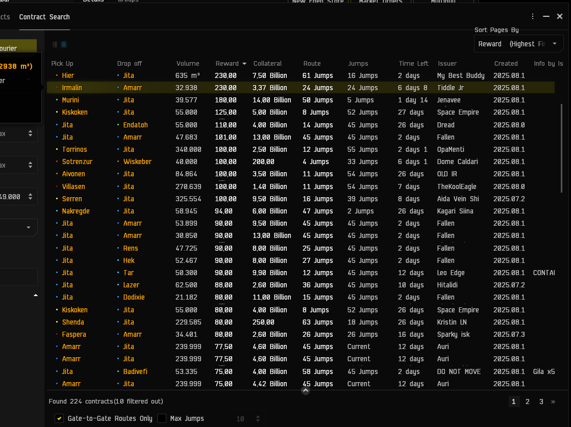
Suggestion: Make the View toggle in the Contract window WAYYYYYYY more visible and move it into the settings (the bottom edge settings because they are filter settings, probably).
Keywords: UI, contracts, view, toggle,
Note: I just now discovered these tiny, dark icons. Can you spot them?
I’ve noticed that if you hold down the hotkeys for say “align” or “warp” (or the others) while clicking on a bookmark in the “locations” menu, it will not actually do the action. You must use the radial or right-click menus rather than the hotkeys.
I think it would be a huge QoL improvement to be able to use hotkeys for this.