As someone who plays with two accounts on a single 1080 monitor, my skin preview window is only big enough to list just 4 skins at time. Where as the old UI would list loads of skins in the preview window. A compact mode for the preview window that uses a layout similar to the old UI would be awesome.
Yes please for off switch, new “docking” message is huge and obnoxious.
3 Likes
- When windows are set to be “locked for size and position”, please have you algorithms stop moving them around and about. A pinned window should never, ever, be moved by anyone but me. For any reason. Nor should they be resized. For any reason. Ever. Except by me.
Locked windows sometimes get adjusted, moved slightly to the right, when they’re opened on top of another existing opened window. And worse, that then becomes their new “locked” position. Some windows, like Fitting Management and/or Inventory, seems to change size now and then, despite being locked.
-
I miss the days, now years back, when the client color schemes were distinct and you could actually use them to differentiate your accounts and characters at a glance, as the borders around the client was “colorable”, not just some interior text and labels. Now they’re all just dark/black regardless of scheme.
-
Please reiterate on point 1.
Stop. Moving. Or changing. My. Locked. Windows.
5 Likes
And the worst thing with this is that you lose any and all color differentiation when you tab between different characters. One of the many small and big Photon features that make playing EVE worse than with the existing UI.
2 Likes
The new UI has a many advantages and disadvantages, and there are some changes I think CCP could implement to minimize those disadvantages, even if people disagree on what the disadvantages actually are. The main way I think this should be done is with even more customizeability.
-
Make it easier to find the resize tool for the sidebar, because it took me ages to find.
-
Allow settings for each window type to either a) make each tab the same size or b) shrink/expand to enclose text. This will prevent cutoffs.
-
Allow users to reinstitute the square standing icon in chats. I hate the rounded one.
-
Allow more range for scaling of UI size and of font size.
-
Allow windows to have relations to other windows, so they’ll still be attached in the same way after a resizing or rescaling.
-
Fix the “Selected item” window, which doesn’t show the icon and has a wierd return in the middle, at least in my position, at 90% scale, stretched to make the icons bigger.
-
Allow certain additive cosmetic features to be turned off in something like “Advanced Photon Settings”, like the ‘docking’ message above (though I actually like it).
-
Allow certain space-filling features to be compacted.
-
Allow users to customize their “quick access” menues, like lock/unlock, dock, and other such things that are now lumped into a big dropdown menu.
basically this
Overall, I really like the new UI. It adds a lot of customization when compared to the old model, and makes it a lot easier to read (for me anyway, though I never had a real problem with that). I just wish there was a little bit more customization, and that you could copy the settings to a file like an overview or ship fit and import them onto other characters, Sisi, or whatever else. Keep up the good work, I am excited about many fun years of Faction Warfare ahead of me!
2 Likes
yeah u are the best
1 Like
Oh, oops ![]()
fixed
Hello there!
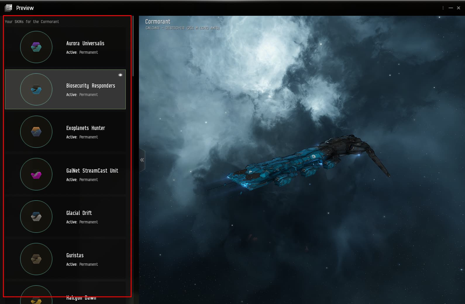
In general, I am very satisfied, but the last update to the SKINS PREVIEW window is absolute garbage (imo).
Please bring back the normal list that does not take so much space to observe.
3 Likes
Greetings. General Feedback and suggestion.
Give option OR remove completely flashy buttons and bars in the new UI. They serve no purpose in this game and also, are not trendy. The trend in desing is minimalism and that serves gamestyle and atmosphere.
I understand that in mobilegame genre the flashy bars serve as part of fast dopamine impact, but the style of this game has been slow burner that build around different hooks.
For medical perspective, flashy bars and buttons in larger screen feed migraine.
Forgive me if I sound a little patronizing, been in same business for… few years.
Here’s image to understand suggestion and feedback better, thank you for your understading.
Have a great podding, and love you.

2 Likes
Welcome, Cherillien.
I just came back from an Eve break, and I really like the new UI. It’s far more pleasing than the old one. Good work CCP o7
there are a lot of good offers for 6, 12, 24 months in the game now, but I care about the question - if the old interface is removed next year and only proton ui is left - it will be a disaster for me.
seeing changes in the game this year, I don’t believe in care, stability, I see stupidity, harm, blurred typeface, uncomfortable character panels and skills, disgusting migration to dx12.
2 Likes
How is it more pleasing?
All that wasted space makes it easier to reach zen and stop playing eve? ![]()
I’ve been trying out Photon again on a ratting alt, there is so much to complain about but not sure it’s worth the effort to write it all up as CCP just ignores it and continues with “the correct” approach of mobile first design because that’s what’s in today…
3 Likes
If I make the Station Services panel as horisontally narrow as possible, the font changes to some large size clown letters.
But anyways, the old interface is better looking and works fine. I’m off the Photon UI again.
It’s a terrible interface. By the way, there is no description of agent missions in it. I hope CCP will not remove the ability to switch to the old one.
2 Likes
Default light background with max transparency is soooo bad. it makes me want to play another game. I cant see whats in the windows and if windows are overlapping then forget anything. That this is default is terrible and that when i change the transparecy setting i then have to additionally go to a number of windows and deactivate light mode is terrible design.
To make things wrose, the neocom menu has no setting ive found to remove the transparency.
As someone who does industry its very common for me to have many windows open at the same time and the transparency being default means i have to change it for each account to be playable. Which leads me to my final point…
After removing the transparecy from all my windows (both default then all the individual windows disable light mode ) it then seems to reset fairly regularly and then i have to go through this whole useless process again just to make it once more playable. (does it reset every update to the game?)
Please for the love of god, let us set transparency / disable light background in general setting for all windows and menus and save our choice so it doesnt reset anymore.
Default 100% transparecy and light mode enabled is the worst possible default setting. Was it designed by the graphics people so that they could show off their space work? because as a player it is completely unplayable like that.
2 Likes
So, I’ve tried the new multiple Overviews feature on SiSi, that’s really neat and long overdue, but would it be possible to have available also on the old UI? Currently it only works with Photon
Photon wastes to much space with useless linespaces which should be reduced to one third, I find it hard to read as I have to scroll for everything
2 Likes
Search and Filter text inputs are difficult to see most of the time. This applies to market, default hud search, and docked hanger. Thanks!
Also, just want to say I’m a convert. I’m loving Photon now that I’ve had time with it. Coupe of nits, but lots of improvement.
- I often mistake active tab for tab with activity. This can lead to fun memes like, intel in public channels, etc.
- Would love to see just the list of drones, and not the drone icons.
- The fleet ‘overflow’ menu is often hard to parse when I want to do something quickly, like rebroadcast cyno. Maybe it was always that way, but I don’t remember struggling before.