Found a new “Bug” with Photon UI in GER Language client .
This is the PI window when you confirm to start something . Everything left from the Red line you cant interact with the Button , you have to click on the right site .
And another one . when you want to change the UI Brightness , The buttons dont scale with windows lengh
Can someone tell me when did Photon get release on TQ , its still Beta in my opinion .
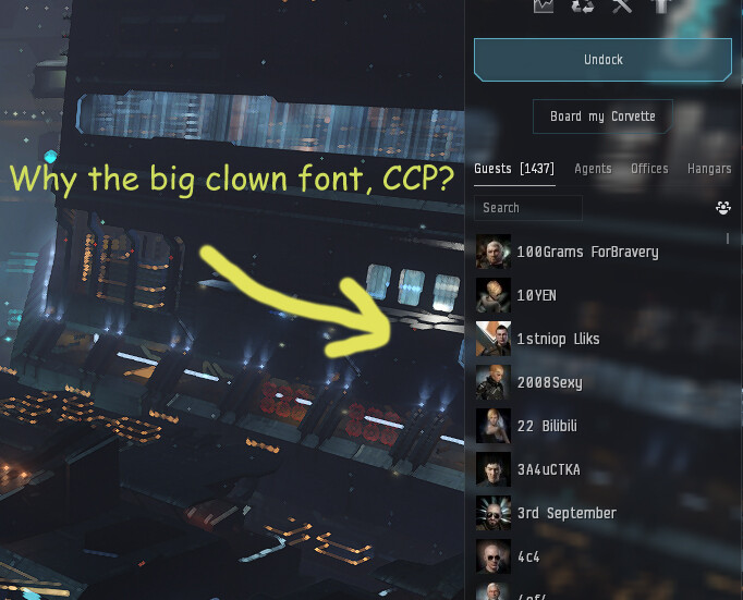
Why on earth is the bar with the (i) icon on the show info so freakin huge? Is that icon in any way, shape or form interactive? No? Then freaking make it smaller.
I am pretty sure you have a theme selected, specifically the Caldari theme. You can change it to gray in the settings menu.
I’d like to say that I really like the new UI. The extra customization, previewed future features, brightness/contrast settings (for that person with the eye pain issues), and Compact Modes make it really nice. I think the compact mode thing is only there to make it so that people with less ability to process dense information can leave the easier-to-read settings in place by default.
I love the new drone window in particular, and the new multiple Overview windows is something I never knew I needed. It is so smooth.
While I still don’t like that weird light cross in the middle of player icons in chat (the neutral one is the most egregious offender), because it just makes it look off. I love the new font, and I like those dog-eared buttons. It’s a nice aesthetic.
Overall a fantastic positive review from me. 4.5 stars.
I also fond that the thumbnails for ships and items in the combined station panel are larger and if you want three rows of items (across), you size it accordingly, but once you have to scroll, the scroll bar invades the icon thumbnails space and forces the rows two. Which in-turn results in you having to resize the entire station panel. The inconsistency of this new 2-D UI in and out of stations is beyond frustrating. After 19 years, it’s the weirdest thing I’ve seen CCP do and it makes my skin crawl.
First of all “Simulate Fitting” is the button I use most, I can’t swear it applies to everyone but I suspect it is generally used more often than “Save”
Secondly, there is more than enough space for all buttons, just reduce the button width and the empty space inside them
Curious how this issue of wasted empty space keeps popping up everywhere, isn’t it?
Before I even saw this, I put it in Small QoL suggestions not even half an hour ago lol
It should go Simulate, Buy All, Fit (idk what that one does), Save.
Instead of slowly iterating on their classic UI via player feedback, CCP decided to throw it out the window and make a new one. The result was sadly predictable - i.e. most of the community seems to vocally hate it, including myself.
Deviously, CCP also decided to make Proton UI opt-out, so the numbers (alegedly) show a “94% adoption rate” - which seems like pure fabrication, given the feedback here. I wouldn’t be surprised if most didn’t know how to turn the bloody thing off initially - it took me a fair bit of digging and I’ve also seen others posts similar experiences.
I absolutely loath the new ‘Proton’ UI and it’s been an active detriment to my enjoyment of the game ever since it was introduced; even more so now that it’s mandatory (how predictable). Thankfully, I upgraded my monitor recently, but god only knows how those with less screen real estate are managing this top-down mandated change.
‘Proton’ UI has contributed quite a bit to me not playing for several weeks now and only logging in for the daily reward. Somewhat annoyingly, I’ve already paid for a year-long sub, but this is exactly the sort of corporate decision-making that makes a resub next year highly unlikely.
BG, CCP.
EvE is a unique gem, but this sort of mandated top-down decision-making isn’t helping, especially given the tough competition you’re facing from other MMOs for my time and money.
You seem to miss the concept of the “silent majority”.
Basically everyone I’ve talked to in Militia and around the warzone really likes it, and people who don’t are more likely to go to the forums to whine.
Apparently you are the one missing the concept of the “silent majority”.
People that just leave silently from the game without talking about it. Quite understandably, as CCP is known for not listening to player feedback anyway.
Could we request a wildcard search function for any search util:
e.g., if i wanted to search for only scan arrays (since other variant strings occur in between) I could type scan*array or scan%array to bring up a more precise search?
How difficult / likely would it be to get this implemented?
You finally cured me of my addiction of Eve. Photon UI is such a stupid, useless and absolutely horrible experience that my desire to play has fallen to zero since it was forced upon me.
Not to mention it is ugly as sin and can not be fixed, because no matter what, the base color is an ugly grey.
And on top of it, I now get headache when trying to play.
(I better not type out what I wish on the Devs and decision makers at this point.)
Oh and everyone who enjoys it, I have a warning for you: It will not last. At some point CCP will throw this out with the same lame excuses and will manage to introduce something even worse.
No, you can not have my stuff.
Major gipes:
The highlighting feature can not be turned off
The lock window button is behind the 3-point menu now
windows take up to much size
No option to customize the color scheme, everything is grey on top of grey in the end, racial color schemes are more or less worthless and lack destinction
the entire UI feels unstable (most likely related to the highlighting feature making windows light up like a christmas tree when clicking somewhere)
Security Status Colors
buttons like the ‘warp to mission location’ button no longer destinc and look liked they are greyed out instead of the clear blue they had
compact mode is lacking the information the old Ui managed to provide in less space and still takes too much space (this is on a 28’'4k Samsung Odyssey G7A - I don’t want to imagine how this looks like on lower resolutions and smaller screens)
worse performance, occasional stuttering, FPS drops (3090 TI here, so I doubt it is a performance issue on my side)
I understand the need to upgrade the backend stuff, but the frontend-stuff should have been preserved. The proper way to do such upgrades is that the end user never realizes it did happen. If you construct a new UI from scratch, the easiest way is to first copy the old one and try to create one that virtually looks and works the same (for the end user) but uses the new better tech, that way you can offer a seemless transition instead of a hard break. Gradual changes over time can follow while new features are implemented and bugs squashed.
Photon UI currently for me feels like a regression (for example regarding customization and color scheme) and is a great step back regarding useability. This is a creature of the ‘dumb everything down liek tablets and mobile phone UIs’ era. Most people will now never discover certain features, because they are well hidden, falsifying even telemetry, because that way certain features that are actually good, never get used and thus might get cut off instead of understanding that the UI itself is hiding the feature or making it inconvienient to use.
You can change the theme in the ESCAPE menu settings.
Fair complaint, I kinda think it’s fine but to each their own I guess…
I really don’t have a problem with this, as I rarely ever unlock or lock my windows. It’s only annoying on startup.
Ah, you did know about the racial themes. I just use the default.
I suggest welping a few frigates in lowsec to get a feel for the UI.
Remember to enable compact mode and set scale to 90%. Hope to see you in space if you ever come back. (About the “no you can’t have my stuff thing…” do people do that? I hear of people with a hundred billion leaving the game, and I’m like… “wow lol that is like literally 140x my net worth and I’ve been playing for 4 years”)
2 our 3 have actually discernible color themes throughout the UI (buttons, window background, window borders, category headers, text boxes, highlights), one 1 of 3 was even adjustable to your custom liking. 1 out of 3 has no way to use discernible colors, and to make matters worse, the tiny amount of color that was left in the UI was reduced even further in the last major update.
2 out of 3 are color themes. 1 out of3 is just grey.
Why on earth is the “LAUNCH DRONE” not on the top? And why the ■■■■, is that button positioned in slightly different places, depending on whether I’m selecting a single drone, or a group [or, I assume, a drone grup that has mixed drones]?
I KNOW THERE’S A BUTTON FOR THAT. But that does not explain half-assed r-click menu.