quoting:
Yes, it’s ■■■■■■■ bad, and ■■■■■■■ slow. And seems to query the server every time I open it up.
quoting:
Yes, it’s ■■■■■■■ bad, and ■■■■■■■ slow. And seems to query the server every time I open it up.
Mobile UI design principles. Your thumb must be able to hit a button accurately, even on a 4,7 inch scree, when on a toilet, at 3AM.
Watchlist window has ridiculous padding issues in terms of nickname displayed:


Why does it need to be so much wider in order to display the nickname fully? What’s the rest of that spece dedicated to? Broadcasts? If so, make this dynamic, instead of wasting 50% of the window width 95% of the time.
One of the latest updates increased the padding at the top of the fitting window, making it inconsistent with every other window. This is triggering my OCD and carefully crafted window layout. Can we have the old version back?
Yep, but this is not a mobile game, and won’t ever be able to be adapted, so much so that they developed an entire new version of the game for that.
I’m afraid that some UI designers got so used to mobile that they started to see those principles as useful everywhere, while they are derimetrial here
Ever since Photon was made mandatory, I noticed a serious degradation in responsiveness of the UI. After I gate jump and start a warp, it takes a noticeable amount of time now before I can reliably F1,F2 my Cloak and prop mod. More often than not, neither activate after I started the warp (even though the server reliably registered the warp because the anomaly notification window appears right away) and I have to press F1, F2 again.
Similarly, the Start button in the industry window is also much less reliable and much slower to recognize clicks. In the past with the old UI, I could reliably start 2 jobs from BPOs within 1 tick. Now it is a lottery to see whether the game recognized 1, 2 or 3 jobs.
Photon was lauded as improvement for the UI performance but so far I have not experienced any better performance. Quite the contrary, the performance has gotten worse in many areas.
CCP UI being helpful again:
Skin list with the setting “Only show Skins I own”:

Skin list with the setting “Show all Skins”:

Skin list with the setting “Show only Skins I don’t have”:

How is that even possible or a rational thing to do? It makes no sense that to tell me that I own 16/16 skins and as soon as I get a new skin of the line, I own 17/17 skins. Or the reverse, first I have 0/32 skins and as soon as I get a new skin, it turns into 0/31 skins. It makes no sense to change the total number of skins available to what I have, which is much less than what is available, or what I don’t have, which is still less than what is available, and the decreasing number only makes it look like skins were removed from the pool and the unchanging 0 makes it look like I got no new skin despite activating one. Surely, this can’t reduce cognitive overload, make the UI easier to use and streamline the UI experience.
Instead of changing the number of skins, these settings should only show or hide the Skin categories where I already have all Skins or where I don’t have any Skins. There should be a new setting “Show partial Skin collections”, which shows Skin categories where I only have a portion of the available Skins.
Annoying Feature, Since I’m stuck on my laptop right now. Small screen little space for windows I have a few doubled up.
I dock up with D-Scan and Overview(New window Target)
But when I undock its switched itself to Probe scanner and Overview (Target Drones)
Not game breaking but bloody annoying.
Obviously I can just switch the windows order but Just thought I’d mention.
NVM It defaults to Probe Scanner and Overview (Drones) WTF???
Old bug. It gets even better when you have a second overview window up. In that case, the UI always not only switches to that secondary overview, but it puts it back on screen from minimized and dscan only observes this overview. It is not enough to click into your first overview to make the dscan observe that overview window, you have to actually click on an overview tab to make it work. With every single undock. But since CCP stopped working on Photon (no new bug fixes for 2 releases), we’ll probably have to live with this glitchy abandonware for the next decade.
Photon Ui is an abomination, the skilltree release absolutely perplexed me, literally facepalmed everytime i opened it up.
Whats going on?
Is there anyway to have the original UI back?
they get this urge to change the UI every few years…
…And everytime we mostly hate it.
We get used to it then they change it again. It’s Bloody annoying.
The Only good thing I like is having ‘New Window for Overview’

Photon UI quality at its finest. ![]()
Every time I log into Eve I can only shake my head seeing that CCP removed the great UI we once had, to replace it with this nuisance of an interface called Photon.
If CCP stops throwing such annoyances on the player base, no “login rewards” will be needed to give people an incentive to play Eve-online.
this i a truly masterpiece!
![]()
+1.
I’ve noticed significant lag / stuttering when undocking or jumping into a new system, or even when new ships warp to me. Never had this problem with the old client.
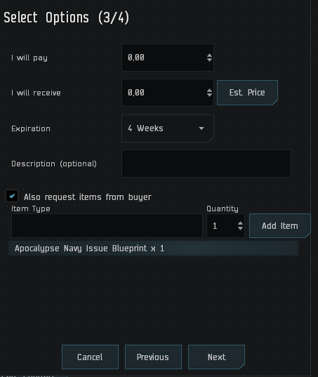
More amazing Photon UI quality. This is not an instance where the window border hides parts of the actual UI content. No, here the actual UI content goes above the window border and sits right smack on the edge of the window because the text box to the left is not dynamic and does not expand/shrink with the window width.
Not to mention the really bad UI element alignment of the checkbox and text next to, below it.
#JustPhotonThings
–
Latest Photon bug:
This is the Warp To alignment indicator, which has lost the text. In warp, while aligning or approaching something also has no text anymore.

Can’t scroll down to see the rest of the text, actually I believe it doesn’t wrap and stays all in a line
You really haven’t tested this UI at minimal windows size, have you?
Make sure you don’t have the Agency window open, even if minimized it reloads like 10 times when you jump gate
I have the Agency never open in the background. ![]()