Please add a Compact UI setting that reduces the size of the window padding and elements like buttons/dropdown/text fields. There is a huge loss of information density with this new UI, and the problems compound on smaller monitors or multiple clients on the same monitor. For the latter case, I’ll have two clients open side-by-side on one large monitor. This makes performing actions on the UI much more cramped than it was previously.
6 Likes
Can no longer see all chat channels at a glance, not a fan of how they go into a drop-down menu.
Overall everything seems like it’s just wasting space more than before. Not a good use of screen real-estate.
3 Likes
It looks fresher but the headers and buttons are too big, they take up a lot of screenspace.
In stations, having the “board my corvette” button so central, it pulls focus, your drawn to it when you want to undock… finding your self in your corvette instead. It should be smaller than “Undock” perhaps the same size as “Take Control” and both those buttons smaller, less primary.
Love the highlight bar at the top of the window you have chosen for focus.
Small icons for status/standings are still quite large compared to old UI, smaller options needed.
For PI interface, the drag bar for time duration either doesn’t want to drag and the time interval doesn’t increase next to it or it lets you drag but time interval doesn’t update, depending on how you click on it.
On the sell item UI, the quanity and price fields overlap.
On the POCO UI, the name of launch pads extends beyond the right edge of the window, even if you make it bigger.
Main point, make text smaller, take up less space with the framing elements.
1 Like
Initial thoughts: I like it! Please just give the “Saved locations in…” window a small header (just like the d-scan window for instance) and I’m happy!
1 Like
Saw a misplaced button in the fitting window. The Inventory button is being blocked, like half of it visible, by the radial menu/background of fitting window
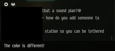
Also, the sound that plays when closing a window is very pitchy, and hurts my ears.
Well, what can I say, we were testing the new interface as a whole corporation.
The design is beautiful, there are many shortcomings that have already been mentioned above, about color schemes, about a large amount of empty space in the windows, elements that are not consistent with each other inside the window.
But it seems that something else should be noted, three pilots had fatigue after 30 minutes of using the new interface, I’m not an expert, but it seems to me that the matter is in the film effect and a large range of brightness on the screen, there are no adjustment elements for this.
P.S. Where is my excel? I want to play excel with 11 pins and zero line spacing! (joke)
6 Likes
Can we please get the “Disable Light Background” for windows/tabs back? ![]()
![]()
![]()
can we please also get a simple way to easily transfer the overview settings and window positions to multiple characters? ![]()
![]()
![]()
3 Likes
I have noticed that there are new UI sounds as well.
I have tested both with my speakers and my headset.
The sound for closing most windows however is extremely high-pitched to the point that it hurts my ears.
I was surprised to hear them at all as i had that turned very low unless there are new options for that.
It was not as terrible on my Headphones but still somewhat painful.
The speakers i use are dated but mid to high quality.
I will probably have to turn off the preview if i play some more the coming days.
Also there is some overlap in this:
1 Like
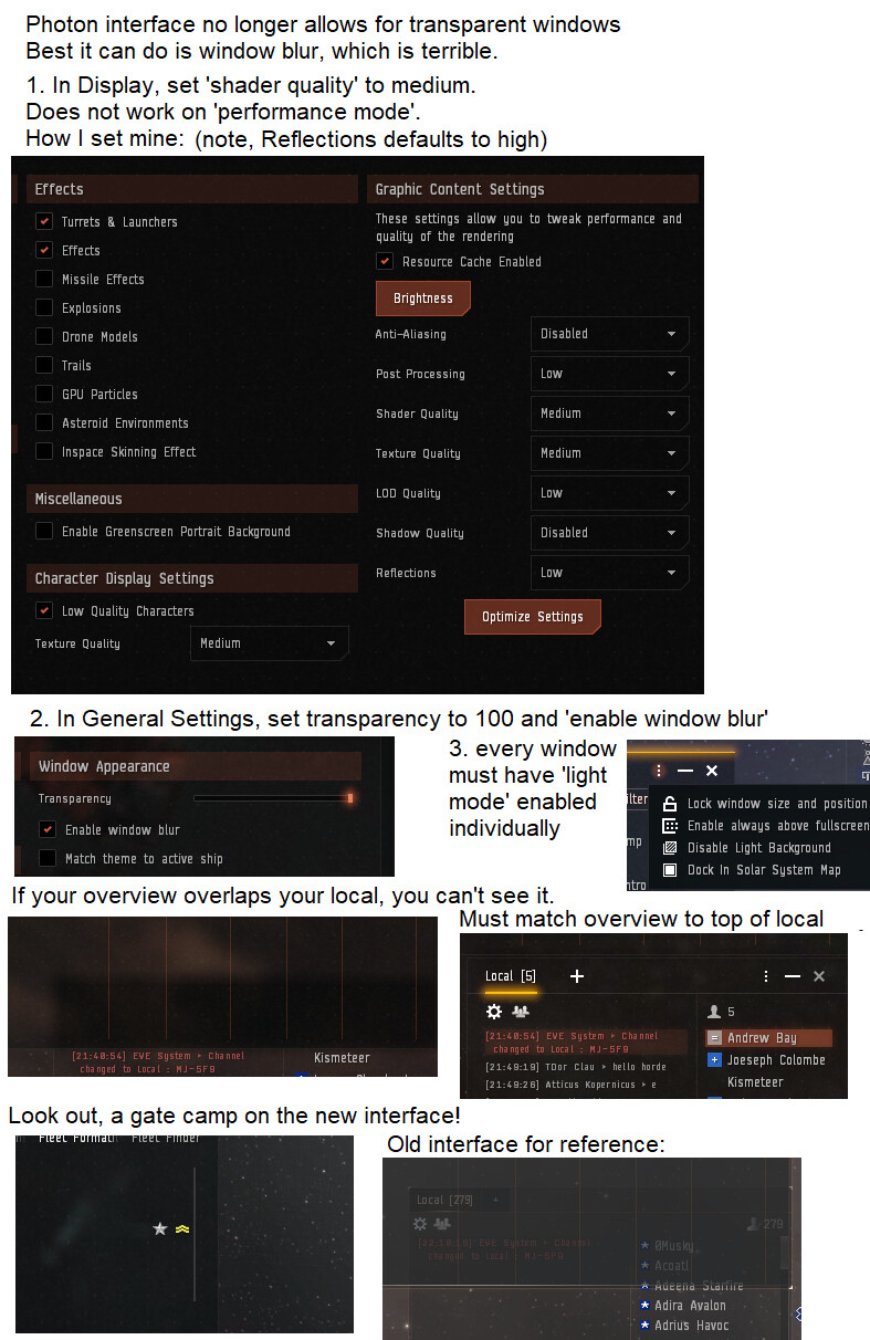
The transparency slider shows no difference.
Transparency is broken on TQ. Window blur works but doesn’t show the same thing. Each window, having to click ‘enable light mode’ is annoying.
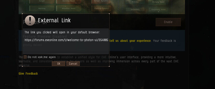
Finally, the ‘give us feedback’ still goes to the sisi feedback thread, which is locked.
3 Likes
I quite liked the style, but when you have 13 chat channels, and you can only show me about 6 because you’ve made them massive now, and to get to the other 7 I have to navigate a drop down, when with the classic client i can fit all 13 in one line.
it needs to be smaller overall - but has potential
CD
2 Likes
Currently it seems the transparency bar only works if you enable Window Blur.
Also has anyone figured out a way to make the neocom sidebar match the other windows?
Edit: Figured I’d add some positive feedback. The mission info screen and other heavy text screens are MUCH easier to read with this UI.
Would there be a way to change the chat text to pop out as much as the mission text? I would love it ( bad eyes)
Adding another image to show what I meant:
Even with a projection monitor I doubt the space-wasting problem would go away.
In the Planetary Interface when determining how long your mines are going to be active, you cannot see the amount of time the slider is set to. Also, the time does not update as you move the slider around, 2 days (initial) remains the data for me, even if I move it to minimum (15 minutes?) or maximum (7 or 14 days?) schedule…
Well … I can say one thing, because I only saw her, because I decided not to look further.
I don’t have a TV instead of a screen, but a budget laptop, and the window borders with information about what kind of window it is take up too much space.
Come on! You also screwed up with the skill window, there is still no button for compressing the names of skill groups to icons. (this function was in the old window, why the hell did you remove it!? Oh well, this is not for this topic)
For the second time you repeat the mistake “Here are huge inscriptions for beginners, and for experienced players too.”
But experienced players do not need the same in this form, they already know what is here and where, and the inscriptions cannot be reduced to get a larger amount of effective space.
I hope you will give players the ability to adjust the size of individual parts of the window (for effective space).
Well, or at least keep the old interface.
Please do not forget that players have different computers with different characteristics. And here you can immediately see that the responsible / responsible are counting on screens larger than average.
1 Like
I mostly like the new UI, but I found a bug and would like to see a few more options for it in some areas.
First, I noticed that the font is bigger and there are more and larger icons, which requires certain windows like chat windows to be larger to see everything, which was a problem before while I was boxing, and is a larger one now. Many windows seem to take up more space than I would like, and I would appreciate it if you made settings to make the icons and borders smaller

I would also like to see more UI themes, or a custom theme designer window. The old UI has more than double the themes the new UI has, and I want more options there.
Also, I noticed a glitch in the sell items window that makes the boxes overlap. These overlaps make it hard to adjust how many items are being sold at once and how much they are listed for. Please fix this.

