Also, WTF is the grey box that appears when I hover the cursor over an obelisk in a contract?
and another bug hovering cursor over any channel name
1 Like
Please leave this as an OPTIONAL UI. I admit it does look pretty, but functionally I hate it. New buttons an headers are too big. Information that was shown before is now hidden. The fitting window blocks some of the buttons partially.
5 Likes
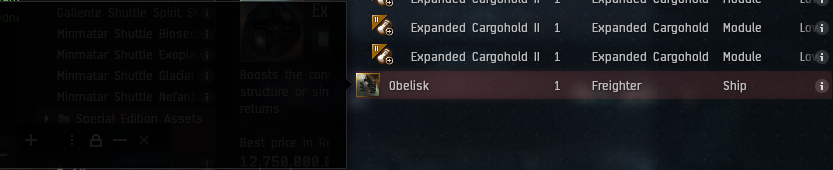
You guys literally broke half of the UI. Contract window is completely busted, including assembled ships.
1 Like
As others have said please fix the “disable light background” feature on TQ ASAP!
I don’t know why every new window opens light by default. They should open like the other windows of the same type so if I prefer it dark I don’t have to manually change it every time someone convo’s me.
Can we fix some known issues before we break anything else? Is this too hard?
Side bar has a bug where you can’t shrink it down. If you accidentally expand it you have to reload core user file. If you didn’t have a back up sucks to be you!
On lower resolution screens the ship fitting window is wider than the screen requiring you to move the window over in order to close it. Can we please make it scalable like it used to be? We don’t need such a gigantic simulation in the middle.
OK maybe not a bug but you know this is a problem.
I count 255, non special addition, subcaps, excluding shuttles and corvettes. We have 250 saved fittings… I get this game is old but not even being able to have one saved fitting for each subcap let alone special addition and caps, is just dumb! Everyone wants it. No one thinks its a bad idea. We shouldn’t need to be importing and exporting fittings from third party apps or having to save and retrieve fittings in notepads and channels just to play the game.
This is spread sheets in space. Yeah cool graphics is a plus but this game wasn’t built on flashy graphics it was built on the depth of information and all the ways to interact with it. At the forefront of any UI design should be a priority on customizing how information is displayed (as adjustable as possible) and minimizing wasted space. Putting big oversized buttons and wasted space around boarders is pissing in the face of your player base.
Just colloquial evidence but in my personal experience the ui does discourage me from investingating more dangerous parts of space more often .
Say i wont tp go hacking in low sec .
I need local , i need d scan , i need system scanner , i need my overview , i need space for ship display and then on top of that i need a massive hacking window sometimes .
Just an example but thats a lot of window space , making these utilities bigger is going to make it harder to moniter the required amount of information and make it harder for players to do what you seem to want them to do , take more risk for more reward , you should be thinking about how to more dynamically provide the information needed rather than trying to make a sytstem developed over several stages prettier you should be thinking how to make information gathering more streamlined and user friendly so its easier to learn and more people are confident to use it . This i think is one of the biggest barriers to people progressing from high sec to more dangerous space . How do you watch local , your d scan , your overveiw , your targets , your console , your ships position , when your ratting in low more effectively not how do you make the mess of windows necessary prettier.
4 Likes
Just switched it on - Initial impression is very clean and bright, big improvement. I was watching streamers playing EvE with the Photon UI and it looked better on stream, too.
The new inventory item highlighting method makes it very hard to tell if you have BPCs in your inventory highlighted, because it just puts a thin white border around the item icon, instead of highlighting the entire icon+text. The old way seemed to make it easier to tell if it is highlighted. Also, when using a blue colored theme it kind of makes highlighted items look like a blueprint.
new:
old:

5 Likes
Is there a way to resize this window? I couldn’t find once. some overlap issues.
1 Like
As i said “live noise” inside the UI is very bad for my eyes, can you remove the noise ?
If you remove the “live noise” i think it is very good looking UI, it’s just the noise that is ultra bad on my eyes.
Not sure if this is an issue with the new UI or just a general bug report, but I noticed it while using the new UI. Item exchange contracts for multiple fitted ships are now broken, it will just create one contract with all of the ships in it. And also if you start typing a name into the private name box, the contract window no longer automatically selects private, but it does still complain that you have a name typed in but have selected Public availalability.
1 Like
Overlap issues are here because text is not small enough at 90% UI scaling and “small fonts” selection.
Oh no, why would they remove item area highlights on select/mouseover? That’s basic reactive UI functionality.
2 Likes
Some text overlapping and the font is too big to where it forces some tabs out of the box that normally all fit together in the old ui.
Another two screens which are broken:
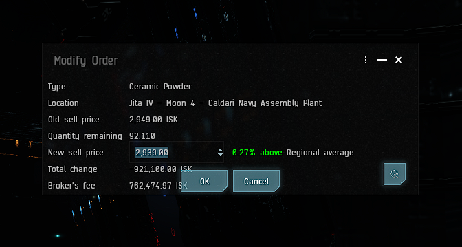
Change Market Order
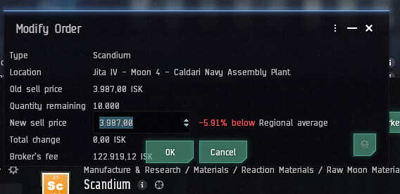
Here it’s bad in particular, as the missing border at the bottom makes it impossible to distinguish which control belongs to which window (under the “modify order” window there the upper part of the “Regional Market” window).
Selection of Buy Order Station when sitting on station:

2 Likes
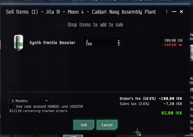
Apparently, the market screens haven’t been tested yet - here’s one when you try to sell something:

Also increasing height of the window does not fix this:
3 Likes
Thanks for having made this a preview only: Given that the market screens are broken to such a large extent, I am opting out for now. Will have a look at this some time later again, hoping that this is fixed by then.
Please get me back my space again!
4 things i want to see
- let me choose the film grain intensity of the windows
- let me adjust the size of bottuns
- let me adjust the size of symbols
- let me adjust the size of the font
and pls make those option with values or slider and not just 3 sizes
2 Likes
Interesting UI changes.
I am not opposed to the UI being reworked, and I really hope that means we can start to see some nagging QoL issues resolved like the size of the mouse cursor on 4K screens (see below).
I do have a few issues I would like to see resolved:
-
Reduce the right padding on the chat channel member list. Take a look at this example from a public chat channel I’m in. There is a large empty region between the scroll bar and the edge of the window.
I would like to see the slider moved to the right edge of the member list frame, and the room for character names expanded.
-
The highlight bars on active windows and tabs are a welcome change, I’m hoping it will reduce issues in fleets where people try to use broadcast keys but they don’t work because their chat windows have focus. Please however reduce the brightness
-
Finally; Please rework the mouse cursor. It is extremely small and hard to see on higher resolution monitors (e.g., 4K), and is not affected by render scaling, so it can be easy to lose sight of the cursor in bright star systems. Please add a slider to the graphics tab on the settings window as part of ProtonUI to allow us to change the size of the cursor.

Edit: After some more time spinning in stations this evening I have found a few more issues I would like to relay: (all of this feedback is using the theme Carbon)
The contrast of the icons just above the system name needs tweaking. Currently the icon foreground and background is too similar when an icon is selected.
The market searchbok could use some tweaking, maybe make the input background slightly lighter


Hi there,
thanks for allowing us feedback on this. Here are my two cents:
- looks good to my eyes
- highlights on active elements are a good idea
- shadows on almost any text is OK but not necessary in my opinion
- some elements are too large or badly placed, this leads to overlap in some windows, e.g. saving bookmarks (strg+b)
- whitespace at window borders costs to much free area if many windows are open
- headers and footers of windows are larger, again costing significantly more space, almost all lists need scrollbars now, not so nice
Personally, I’ve turned back to the old UI after 15 min of testing. If you intent to keep the Photon UI as is, please, also keep the original UI alive as an option.
Best regards.
3 Likes