Revised EVE Activities & Careers Chart Project - Work in Progress

This project is amazing! Glad to see it’s being worked on.

My only suggestion is perhaps think more about visual contrast. In the version available from opening post, there is something off to it which hurts the visibility and makes it uncomfortable to look. Perhaps background is too light (and should be darker) and text info is grey-alike (should be full white) and plates text sits on is not as dark (so text looks not as bright), but not only that…

I can’t give full review of these nuances yet, but I’d say that previous charts didn’t have this problem.
Examples:

1
2

EDIT:

Looks like i’m not only one to notice.

1 Like

Thanks for the feedback. I have had a lot of supportive comments since the Community Post article came out and I genuinely appreciate all pf them.

When I created this chart I spend some time thinking through the look and feel and within this I did think hard about colours and contrast. As a designer I prefer more a flatter, more subtle appearance and I find the contrast okay, and as I mentioned above I have checked with various tools to ensure that it is readable for people with visual disabilities.

Having said all this, given the number of people who have mentioned the contrast, I am thinking that I do need to probably have a look at some colour contrast variations.

I’m don’t think that I’ll be going quite to full black like the other charts, but I will definitely be making it darker than it is currently.

The only catch with this, is that its quite a lot of work so people may have to bear with me a little longer for the first proper release version of the chart.

Thanks for this. @Altrue had mentioned to me that his chart was the second version of the chart but until I saw this link I’d never seen the original version before. I’m sure that you’ve seen the whole post on the TAGN blog but for other’s who it’s here: What to do in EVE Online: A Summary - 15.07.2012.

:rocket:

4 Likes

I’ve just been awarded the ‘Famous Link’ badge which I’m quite chuffed about, mostly because it means that loads of pilots have clicked on the links to download the chart. Yay!
.


:rocket:

7 Likes


Abyss have tiers from 0 to 6. Also abyss havent any salvage and missions

1 Like

would be funny if they did add a salvage version

I’ve been working on the chart a lot recently and thinking through all the changes that need to be made, as well as how I might make a much better interactive version for online web viewing.

From a design perspective, I am still committed to two key things:

  1. There will be a super high-quality, high-resolution version which will be printable on an ISO 216 paper size so that pilots who want it, can easily get a poster version to stick on their wall. (This might be something that I can organise at a really low [non-profit] cost as well, through industry contacts, so I’m looking into this)

  2. The interactive version of the chart will have clickable hyperlinks (which can be updated and revised as necessary) so that it can direct pilots (both rookies and veterans) towards good online resources for most if not all activities.

Based on this I’m currently exploring how I might change the hidden background architecture and structure of the chart, to both significantly reduce file size and make future updates much, much easier.

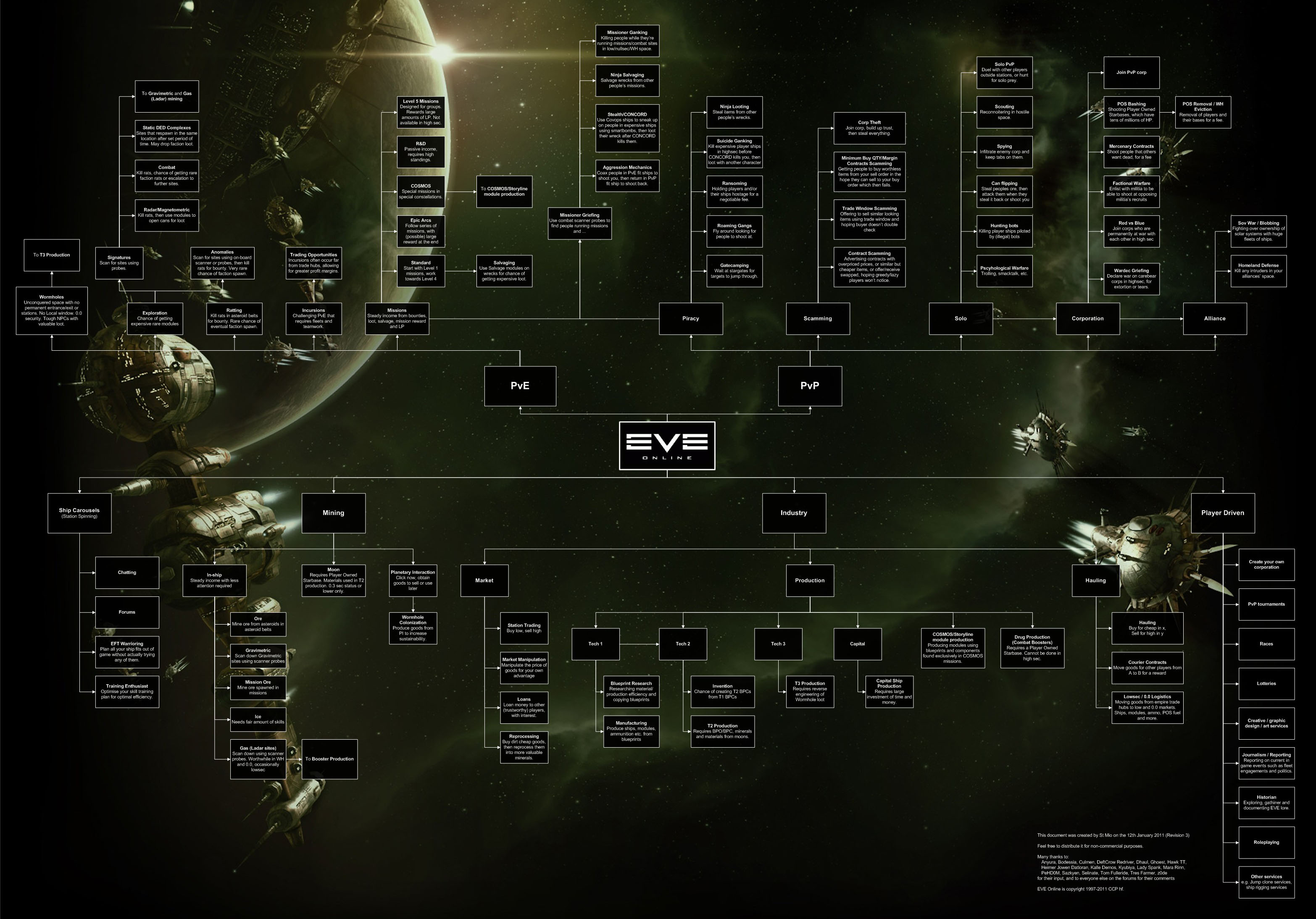
At the moment the process of updating the chart both from a design perspective and in terms of the actual content is quite fiddly.

The chart looks great but there are a lot of layers and complexity and the lack of a straightforward hyperlinking method in Adobe Illustrator means that I have to use both this and Adobe InDesign to get to the final end product, which is very time-consuming.

I think I have found a solution, and it will improve the chart and speed up the production process but it will initially take some time to fully deploy, which I am really sorry about. Having said this, a key part of the reason for the time it’s taken so far is because I just don’t like the idea of releasing anything less than perfect for the final and proper public release version of the chart.

Long story cut short, I’m not now going to have a full-on and final version in the first quarter of the year as I’d been aiming to do. I am gutted about this and I know that some people will be understandably frustrated, but I hope in the end it will be really worth it.

For what it’s worth, so far there have been, as far as I can tell, 2,386 unique downloads of the Beta PDFs of the chart since the plug that I got on the Community Beat in January, so I know there is definitely a demand for a chart of activity prompts. Assuming that just half of those people check the chart once a week for ideas on what to do in the game, then this translates into an effective 62,036 clicks per year.

The point I’m making here is really that given the demand, and the fact that it’s a really important chart, I want to make sure that the EVE audience gets something, really good.

I hope this all makes some sense (I’m a bit knackered as I write this!). Either way, I really do appreciate all the support that I’ve had so far from too many people to name here and I will post an update on progress as soon as I can.

Thanks.

:rocket:

Addendum: The complications of infographic design – one super fiddly thing has been to find a way of creating nested radius corner boxes with an even gap all round. I’ve tracked down the math for this (I have a learning disability that means math is really hard for me and I’m no mathematician, but if you’re interested, the formula is [ outer radius - gap distance = inner radius ] ). To speed things up somewhat I’ve now written a small Applescript to do the calculation quickly. The career card/activity boxes will look clean and elegant on the final chart but I suspect hardly anyone using it will be conscious of the effort that went into this small detail. Ho hum. Onwards and upwards …

4 Likes

You are still working on this?

1 Like

Sounds great, keep up the good work.

Hope you find the time to complete it asap, New Eden is counting on you…

3 Likes

Small Update:

I’ve had some family stuff that I’ve had to deal with recently (tragedy type stuff but I’m okay now) which has meant it was hard to prioritise the chart for a while but I’m now getting seriously back into it.

It was, initially, very fiddly trying to come up with a simple design architecture but I think I may now have cracked it (via playing around with layers and EPSs and all that kind of stuff in Adobe Illustrator and InDesign) and I’m now starting to make reasonable progress.

My apologies for the delay, but hopefully when it comes out it’ll be worth waiting for.

Having said this, It’s pretty gratifying to see that there have been, so far, thousands of downloads of the Beta version (so there’s clearly a demand). However not much additional feedback as yet. If you have downloaded it and you have constructive criticism, do feed this back please.

:rocket:

As a postscript to this message: the Venn diagram about graphic design and the good/fast/cheap paradigm is not lost on me when I work on a complex project like this.

My aim from the start has always been to produce something that is distinctly good, which of course isn’t necessarily cheap or fast. I’m fitting the project around other (paid) design work, and because it’s going to be free for anyone in the EVE community who wants it, sometimes the paid work has to take a priority (not least of all because I need to pay my rent!). I hope this goes someway to clarifying why the project isn’t just being banged out in a matter of days.

4 Likes

I’ve heard you can live rent free in people’s heads, maybe you could do that with one of the naysayers’ heads from this very thread… or maybe you already do that without even you realizing it? :thinking:

:face_with_hand_over_mouth: :smirk: :blush:

1 Like

@Mu_ad_Diib The chart is great. It looks just about finished. You been doing a bang up job.
I hope CCP endorses it and give you a few fully-fitted t3 ships for your efforts.
I know you’re doing it because you’re passionate but you deserve something to show for your efforts.

It makes me proud to see how dedicated and studious Gallente capsuleers can be.
You won’t find any Caldari filth able to do something like that!

Gallente Forever! :fist:

3 Likes

Getting positive feedback from rank and file pilots like you really helps to keep me motivated, so thank you for this. Genuinely appreciated.

I’d never want to say no to a free Tengu or a Proteus because it’s just possible that someone from CCP might be reading this and might suddenly feel very generous, but to be honest, I can’t see this happening anytime soon (LOL) but that really is okay.

I’ve now played EVE Online for over 16 years.

I’ve made friends, gone to meet-ups had some amazing experiences and I can’t imagine my life without the game in it. Community is the thing that keeps me here, and because I know the chart will be useful to a lot of pilots in New Eden (rookies, newbies and even some veterans), I’m going to work it either way.

But yeah, if you do happen to be reading this @CCP_Hellmar, and you want to make my day … well, you know where I iive … LOL

Woah!

Whilst I know that you were probably joking, sometimes it’s good to vocalise things, so …

I know some lovely people in the game who are Caldari, and I know some awful people who are Gallente, and the same does for all of the races. The truth is there’s good and bad all over New Eden and we all ought to remember that the best ship in EVE really is The Friendship.

Fly safe.

:rocket:

3 Likes

:wink:

2 Likes

I have a feeling she is not joking, she really does feel that way about “Caldari filth and Minmatar trash”… but don’t let it alarm you, I’m sure she’s roleplaying :slightly_smiling_face:

And your work is awesome! I really like the tones you chose and the overall design.
Hat’s off to you, sir!

@CCP_Hellmar That man does deserve a little something for his efforts :pray:

2 Likes

Yeah, I kinda did know that (the bit about roleplaying that is …). Having said this EVE can be a really, really intense game at times and sometimes this really does spill over into hateful attitudes (not that I was seriously suggesting that @Harmonia_Blissel was genuinely being hateful …) case in point: Rock Paper Shotgun – ‘You will lose both hands’ - How the biggest theft in EVE Online history ended in death threats. Because of this, I thought it was worth, gently, reiterating the fact that we should try to be friendly at the same times as being fierce.

Thanks for this, I’m really glad you like it. Like I said earlier, getting positive feedback from rank-and-file players is pretty much all I need to keep me motivated.

In terms of the tones used in the chart, for what it’s worth, I think I am going to try to increase the text contrast, slightly, on the next version because there’s been some feedback that for some people it’s slightly hard to read. I want to take this on board because fundamentally I want to make sure that as far as is practical the chart is very accessible.

Thanks for the sideways plug.

To be fair, CCP has been pretty helpful so far with the chart. They gave me a plug in their Community Beat newsletter on the 5th January this year and downloads grew exponentially after this (literally into the several thousands overnight) and so I can’t really complain … having said this, here’s hoping for a Tengu LOL …

:rocket:

1 Like

Bump …

Just to keep the thread live while I’m working the revised chart.

:rocket:
[/quote]

1 Like