- Station Services window layout has been updated.
What was the point of this?
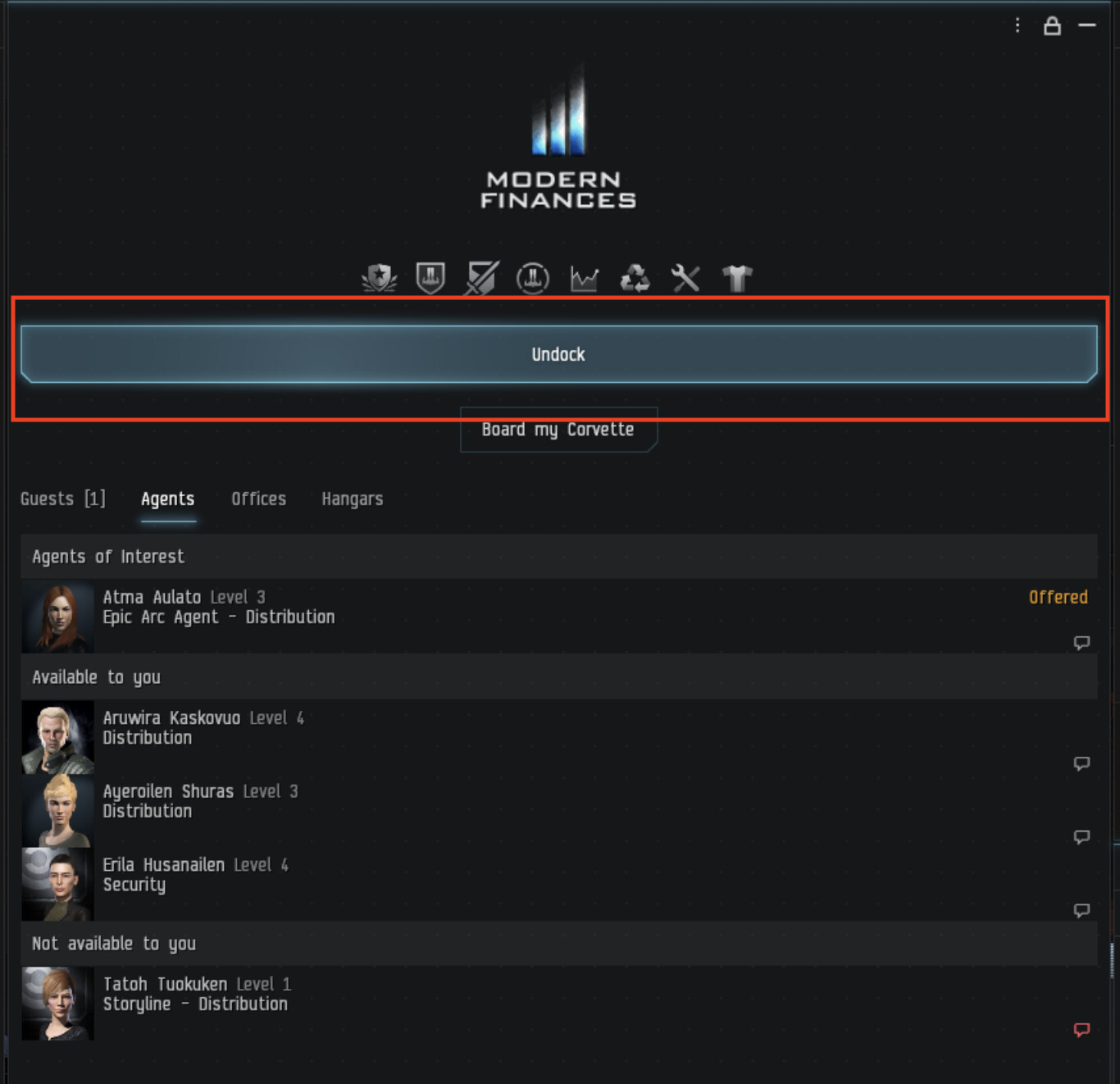
Image shows the result of the Station Services window layout update, a wider Undock button…
Below is a link to my original post concerning the Station Services window layout. It would appear that the result of this change is that the button is wider and therefor technically takes up more space.
Perhaps my comprehension of player feedback regarding wasted space is limited, and why not.
Given this possibility my limited comprehension is thus; that the majority of the player base and a very vocal and resistant minority would prefer that the essential elements within the UI be less wasteful and more efficient in their use of space.
If the values of the player base were listed I believe that economy on space would rank above a wider Undock button in terms of design outcomes.