I did switch to Photon months ago.
Where do i start ?
Why dont you listen ?
Why did you crash a perfectly good UI into a badly made touch screen one ?
We didnt like the Photon UI So you forced it on us
We didnt like the docking banner so you gave us a undocking banner as well
(and both the damn things makes sounds)
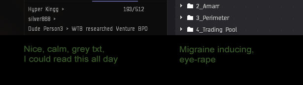
The new colors (green, blue and red) for the market & wallets Makes it harder to see stuff Old one back plz

7 Likes
Do not attack the ISD. It is, as he said, a bad idea.
ISD are volunteers, here to help the community by making sure signal is not drowned out by noise on the forums. They do not make the rules, they do not have any incentive to silence people saying ‘inconvenient’ things to or about CCP, and they generally don’t want criticism silenced.
You are, in effect, standing in court accusing an attorney from the Public Defender’s office of police brutality.
4 Likes
As a CSM, Brisc’s in direct contact with the devs. That means he’s basically a walking support ticket, because whoever gets the support ticket would also need to turn around and then talk to the UI devs. If Brisc can replicate the error, then he can tell them ‘here is how I replicated the error’. And that means he can expedite the error being fixed.
2 Likes
Oh my god, no. JFC, how do we kill this horrible, counterproductive, and frankly dangerous idea that an elected representative needs to be a slave to public opinion and not exercise their own judgment? It’s been 248 years since Burke explained in painfully clear terms why it’s wrong.
2 Likes
Nowhere when I signed up to run for CSM did it say I had to check my own opinions at the door.
No, it doesn’t objectively fail anything. It’s still a work in progress, even if it is live (we know this company launches stuff not done live all the time, they don’t always have the benefit of being able to get good testing outside a live environment). It does everything it needs to do right now, and many, many people have been using it with no issues for a long time now.
They haven’t touched anything with the HUD yet.
The UI does suck, something this poorly built or something this “unfinished” shouldnt be forced upon anyone
Somebody at ccp in a position to should re-evaluate this
2 Likes
Thanks for the fsction warfare update. New bf symbol is more distinguished. Also, I am disappointed to have scrolled through almost 300 posts of people complaining about the new ui.
photon ui? No whith my money.
And introduced a number of new issues at the same time, deliberately and against better knowledge and advice.
The only person here complaining is you that our feedback doesn’t meet your blissful, feel-good ignorance standards. ![]() The rest of us are pointing out issues that have not been fixed for months or even years by now and that CCP keeps introducing new issues with every fix.
The rest of us are pointing out issues that have not been fixed for months or even years by now and that CCP keeps introducing new issues with every fix.
Excuse me, what the hell now? We have been testing this crap show for over a year now. CCP has almost as many Photon bugs to fix as Karkur has Little Things suggestions to work on to make EVE a better place. We have been testing Photon for free in the live environment, a job position that would apparently bankrupt CCP if it was done by paid professionals. On the other hand, better let’s not count on professionals selected by CCP because those have been woefully inadequate in the past…
Photon has been thoroughly tested and CCP has not fixed even 50% of the bug and glitches and issues pointed out in the various feedback topics before they shoved this onto players. They have not even managed to fix the “Histor” in the Char Window or the “Quit Gam” in the Close Client notification… Instead they waste time on stupid new UI elements that no one needs, that serve no rational purpose, that are buggy and distracting.
You are ridiculous when you say that Photon is among those trash features that could not be tested in the live environment. Worse for CCP, even though it was tested in this setting, it’s still worse than the old UI. There has only been one step in this patch that made it inch a tiny bit closer to the old UI’s better usability: The more compact Compact User List in the chats. Everywhere else, Bloatpact costs space, features and functionality.
Same as Arrendis, I switched to Photon months ago. That is how I kept finding ever more issues with it. Just because you are happy with mediocrity doesn’t mean that everyone else is or should be. CCP has shown that they can make the UI more compact than they initially insisted on doing. Now it’s time that they apply this new found enlightenment everywhere quickly and at the same time give back the same functionality that the old UI had. I want a Compact mode ship cargo with hangar view buttons and search bar in a window stack. The old UI had no problem giving me that massive functionality, for Photon it’s apparently impossible.
3 Likes
deleted
4 Likes
No one asked for this UI update, I like the tables.
1 Like
Enjoy
and i’m pretty sure removing the drop shadow on the text would solve 50% of it, jeez drop shadow on body txt … wtf?
2 Likes
The new colors dont have enough contrast, specially in the market windows. Its hard to read stuff.
2 Likes
I wonder if the fact that people refused to test the new interface made you think that the new interface is not needed by most players?
I think it’s time to say goodbye to EVE online.
I hope the next generation will be able to accept it.
And so why is there still no way to express that I don’t like the update.
1 Like
You seem to have been present at this conversation, I am convinced that this is exactly what happened.
The NEW UI sucks so bad that the colour’s is crap. getting so much lag . turn down all the graphics setting to low/ turn off, it only helps a bit. now the undocking crap with docking crap is so lagging aswell not FKing funny at all… even when i undock from a station, lag very hard , waiting take about 30-40 second now before even clicking on the jumping button . before this update, it was 10 seconds . HATE the new FKING UI . no option to turn the FKING crap off… TOO many spaces everywhere… it so FKED up!! … it been fun while it lasted… now im leaving the game can’t play it no longer. Foggy.
1 Like
Hellooo forum😃
Everybody is getting older, Brisc, even if they’re 20yo. I figure a big 42" flatscreen tv is always nice to have for any game but with Photon UI ( even if I hardly have any isues with it ) I would say it’s a must now. That’s a cost that players have to factor in on top of paying for a game.
Or you can tell her that the eyes are getting old along with everything else ![]()
You’re obsessed with Random Dude.
Fifie’s Photon Torpedoes
2 Likes
Photon UI design concept:

Please at least give us a slider to remove all paddings and line spacers
And possibly more UI scaling options below 90%, I’d gladly scale it to 70% or even more
8 Likes
Option 1:
Stop playing. Vote with your contribution to the playercount. Some are doing this already. Also, if you’re not playing, you can stop paying if you were omega, and vote with your wallet as well.
Option 2:
When you open the esc menu, there’s the options to log off and to exit the game in the bottom right. On the left side, also at the bottom, are a thumbs up icon, and a thumbs down. If you click the thumbs down icon, the game asks you for more specific feedback, and you can explain that you don’t like photon, or don’t think it’s ready for the removal of an opt out, and provide reasons why you think that.
Option 3:
Support tickets and/or bug reports. For this, you should have specific constructive criticism, not just “wah don’t like gimme back old UI” but explanations of what you want to do, and why photon isn’t up to the required standard to let you do it yet. But it’s a valid method of providing feedback. You can access that on this website, or in-game you can use F12 to bring up the help page and get a link to the support webpage.
Option 4:
The forums. While you’re here already, explain the problems you have with photon. There’s very definitely a CSM who’s been active in this thread, so you might catch his eye if you give useful and reproducible feedback. It’s possible a dev might show up and read some of these comments too.
I’ve been using a combination of these tools myself for various issues, some photon-related, some not. It’s well worth giving them a look. I’m not as aggressively anti-photon after this update as I would have been if they took away the opt out function even as recently as a month go (the last time I tried photon out and conirmed it didn’t feel good enough for me to use yet). As I’ve said previously, I don’t think photon is ready to be live without an opt out yet. But in spite of saying that, I DO think that for me, personally, if we still had an opt out available for photon right now, I wouldn’t be using it because photon is close enough to being where it needs to be, for what I do in-game. It’s not on par with the old UI in a few key areas, and the new features it brings don’t add a lot to my experience, but it’s not bad enough that I find it uncomfortable to use any more. It’s just got a couple of niggling annoyances remaining for me. I can see that other people are more strongly affected by some of the remaining issues though, which is why I say it should still have the opt out at the moment.
2 Likes