This issue was caused by Windows 11 handeling of HDR with the two monitors. I turned it off (looks better without actualy) and now all is good.
Scanning window ui is terribad.
These are the most use buttons any explorer pushes on a constant basis:

[the slider and center on my position is mosltly only used for on-grid combat scanning normally alt+scroll does the trick]
Anyone that does explo a lot, manually recovers probes. They bug out occassionally and not recover or you get back only some of them otherwise [sudden tidi in a system is keen to make it worse].
map open/close button is handy, as when you stop scanning a system, you probably want it closed for a time.
Literally noone uses the “save formation” feature. Nor is the “spread formation” more than a meme.
Since you are re-thinking the UI, how about making some valid changes to it? For now, we have a copy-paste window; but with minor changes for the worse. Yay.
[and since I did not articulate the conclusion: the most used buttons are the smallest and scattered around that window; that is stupid]
5 Likes
It is a way to make a window more opaque in eve .Log in account then press ESC .In the General settings tab you will find a bar named Transparency. Move that bar as you like and after Return to game buton
Hope to helped ![]()
BTW, I find that switching the position of the “loot all” button to the other side of the window, for no apparent reasons, sums up the Photon UI design strategy perfectly.
3 Likes
The number of lines you scroll with each “tick” of the mousewheel has been notincreased but scaled*** .
[That makes scrolling through many windows feel off. Yes, it’s faster, but you often end up with scrolling 3/4 of the window per tick.]
This is most pronounced for market screen and agency [so far, and for me]
That’s too much, especially given that no finer control is given, nor any way of “making it finer”.
Why do I whine about it? Coz if you happen to have your mouse do 2 ticks instead of one, you just made 1,5 worth of window height scroll through. It means you did not see a part of it. And that makes “click on the slider” method the go-to for scrolling those windows. Which is silly.
And again, this seems to affect non-proportionally only some screens.
*** Okay, i think i know what it is. You coded the ui scroll in such a way, that the number of lines it scrolls per tick SCALES WITH the total hight of the window. So if there’s a lot of stuff, you scroll through them faster. That could make sense, but the obvious problem is:
you expect the user to expect different results from their input every time the size of the thing changes.
That’s simply not going to happen.
Further testing shows up that it’s even more stupid.
So: you assumed that every window needs to scroll through in 10 mouse wheel ticks. At least that’s true for trading:
Let’s look at the “drones” skill group in the market:

That’s the top of the window.
Now with a single mouse scroll tick we get:
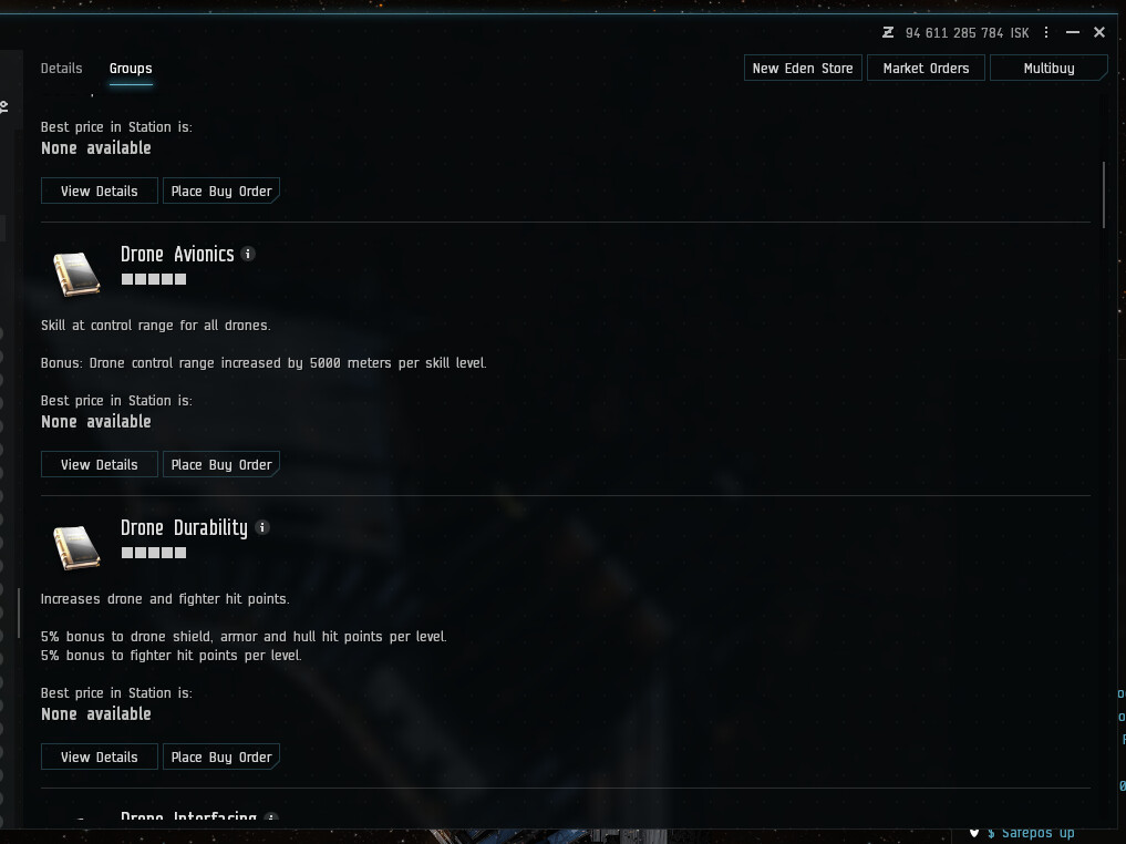
And after 10 ticks we get to the bottom.
Which skips some information, 10 ticks is not granular enough.
Silly enough, when we try scrolling through the “standard amarr battleships”, the results are the same. In terms of ticks:
top of the window:

after a single scroll tick:
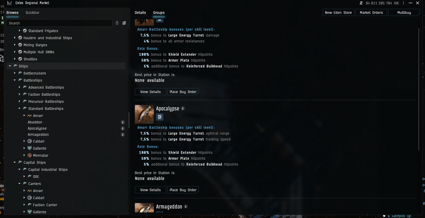
[and after 9 ticks we get to the bottom. Of a window that has 3 items.]
I’m sorry, but this design is ridiculous.
Depending on the window, we either scroll 1/10 of the screen, or even more than a whole screen.
No consistancy, except an arbitrary “need to scroll through the whole thing in 10 mouse scroll ticks”.
And if you think, this design is sound, then count how many mouse scroll ticks it takes to scroll through this post. Now imagine if it was 10.
14 Likes
This has probably been said 100 times already, but cutting off very important bits of information when windows are not full screen is terrible. This happens A LOT, but particularly egregious is the m3 number at the top of the inventory and asset windows. M3 total and max should always show completely and all the other crap should scale around it.
5 Likes
I wish I could give you more likes.
1 Like
I still dont like Photon UI… But i do realize your going to force us to use it ![]()
So can you add the darkmatter color theme to Photon ?
I’m new so not sure what the old one was like, but one problem with Photon is that when scrolling through windows, other than chats, it scrolls 10% of the way down each moose click. this means that if you have 1000 lines, its scrolling 100 lines every mouse wheel click. it should have a cap, like max 5 lines per click.
2 Likes
Currently compact mode does nothing for the “Log and Messages" window. I used to be able to fit 9 lines of logs on the screen and now only 7 because of the header being too high in Photon UI.


Please add compact mode for Log and Messages window. I can’t play the game properly because of this.
upd: It got added. Thank you so much! ![]()
3 Likes
And while I’m here, adding those arrows in Photon would be good too, I use them a lot, but in Photon they don’t exist.

5 Likes
Funny but annoying new quirk of Photon: If you sit in a place with lots of people moving about, like trade hub station, the scroll bar in the Guest tab keeps flashing every time something in the list changes. Same goes for chats like Local in those locations. The old UI does not do that (it only resizes the bars unnoticably) and I don’t see any reason why the UI should flash the scroll bar every time something changes even though I am not even in that window, and it only does it if the scroll bar is not at the very top of the list. This another instance of useless, flashy UI clutter and UI noise that serves no beneficial purpose and is inconsistent because why would you not want a flashy change indicator when the indicator is at the top of the list…
4 Likes
Photon IS NOT READY.
The human interface sections of the user (a human, in the intended case) interface look as if they are designed by 2nd rate mobile/tablet designers.
It is laggy as hell compared to the original UI, and provides LESS information yet takes up MORE SPACE, and with less options for customization.
The key issues continue to be ignored (usability, more clicks to do basic things, responsiveness) and the simple “move the box a few pixels to the left so the text doesn’t clip” are half assed in a way that adjusting the UI scale breaks things again. Removing functionality and replacing it with additional clutter hidden behind separate layers of menus is not an improvement. It isn’t worthy of being called an alternative – it is an objectively worse UI in key aspects, from information provided to the player, to the amount of effort the player needs to put in (clicks, menus, etc.) to perform the same tasks through the UI.
The original UI needs to remain until all of these key, major issues get resolved.
11 Likes

More button inconsistency. The left button should be facing the other direction. Just like the buttons in the contract window’s search window that face in opposite directions.
2 Likes

Look at all the useless padding. This list is now 3x as long as in the old UI just because of all the white space.
Same window (same height) in the old UI:

6 Likes
@CCP_Swift
Photon UI still feels like piece of unfinished unprofessional crap (( There is no synergy, its harder to spot elements, they are out of proportion and blantly take more space for no reason.
Here: Example, reported a while ago:
Search field was INTENDED to be that small and aligned to the right I assume? or was mislooked in the reviews? the wider the box, the further the search is.

and it not just the case… its just making you asking yourself WHY? every time.
why not make players click BIG NICE Reward button? Lets make them click this small, insignificant button underneath! For god sake!

9 Likes
More issues with Photon, just for record keeping:
3 Likes
One of the main problems which photon was meant to fix was “inconsistency” in the UI design.
IT
IS
STILL
WORSE
AT
THIS
THAN
WHAT
WE
HAD
BEFORE
How does anyone at CCP think that’s what “ready for launch” means? Because no it isn’t. I don’t care about your promised timelines. If this is your deadline to settle on the UI to move forward with, SCRAP THIS HEAP OF TRASH AND KEEP THE ONLY UI THAT CURRENTLY WORKS TO AN ACCEPTABLE LEVEL. If today is the day you have to stop working on photon, THROW IT OUT, IT ISN’T READY. Add the very, VERY short list of new features that actually work (like multiple overviews) to the old UI, where they belong. There are improvements the photon UI has made, but there are many, MANY more severe screwups that make the game experience objectively worse for its existence. If you’re not giving up on it, then until photon is actually ready for launch, DO NOT push it live without an option to opt out. That means, right now, while it’s VERY DEFINITELY NOT READY, let us roll it back like we have been able to previously.
PHOTON
IS
NOT
READY
FOR
THIS
YET.
8 Likes
and thi is “compact” mode??? On previus I had here 7 rows!
FFS not everyone has 2k+ monitor

8 Likes
Look over here I even did some quick job for you. Mb dev team should play EVE Online instead Fortnite dota or what ever are you doing there!

9 Likes